
Your landing page’s weakest score is Value props.
How Subtrace ranks
- 1.
Coroot76
- 2.
Odigos75
- 3.
Subtrace70
- 4.
Pixie67
- 5.
Beyla (Grafana)66
70Growth scoreupdated
category scores
category scoresShowHide
Score over time
Value props
58FairTitle, subtitle, hero — do they sell the product's true value?
Subtrace’s headline undersells
Zero Code Network Tracer
Working
- Names the category plainly
- "Zero Code" flags the differentiator
- One-command setup hints at speed
Could improve
- No subhead explaining the outcome
- Hero art decorates, shows no product
- No numbers or proof in the copy
Information hierarchy
68FairDoes the design help or inhibit what the page is trying to say?
 123
- Hero benefit bullets — "ONE COMMAND SETUP" bullet stack is tiny monospace caps at the fold's bottom edge — the supporting message barely registers.
- Adjacent GitHub/HN icons — Y Combinator and GitHub star links sit flush against "Try for free", pulling clicks away at the moment of decision.
- Headline dead gap — ~400px of unanchored pixel-grid animation separates the headline from the bullets and CTA, breaking the scan path into two disconnected clusters.
Trust
68FairProof that the product is real, competent, and safe to try.
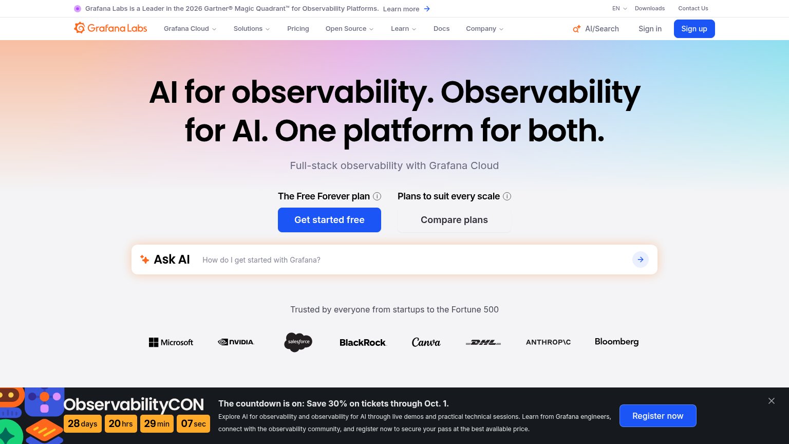
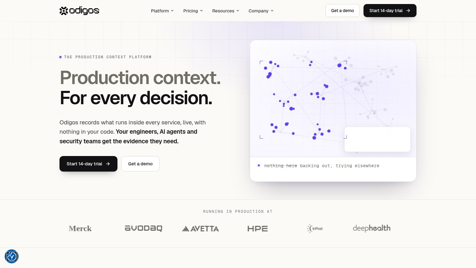
| Trust read | |
|---|---|
| Subtrace | Customer logo strip: Adobe, Aetna, Hinge Health, Trieve, Method, Pointer |
| Real product screenshots: live Pixie UI at work.withpixie.ai showing a pod list, service dependency graph, and terminal | |
| Real "Service Map" product screenshot showing live services with RPS/latency data | |
| "RUNNING IN PRODUCTION AT" logo strip with Merck, avodaq, Avetta, HPE, InPost, deepHealth | |
| "Grafana Labs is a Leader in the 2026 Gartner® Magic Quadrant™ for Observability Platforms" banner |
Mobile web
78FairThe phone experience as a first-class citizen.
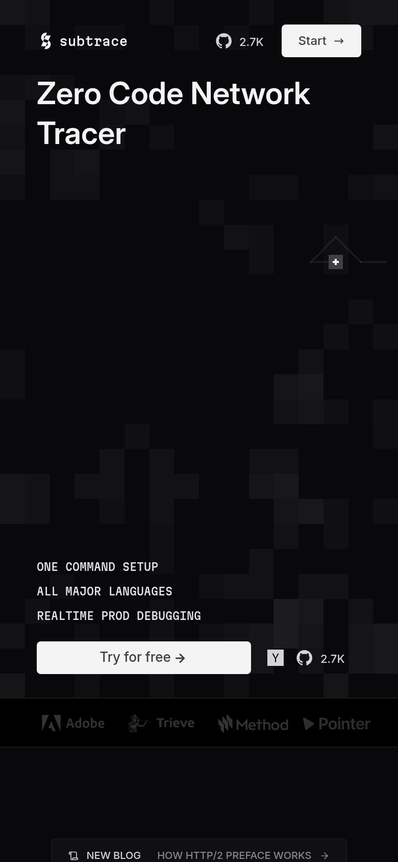 123
- Try for free CTA — Primary CTA sits well below the first mobile viewport, forcing a long scroll before any tap.
- Y and GitHub links — Tiny tap targets crowd the CTA row and duplicate the header's 2.7K GitHub badge.
- Stray plus marker — Orphaned decorative '+' widget floats mid-screen with no meaning, reading as a broken element.
CTA
80StrongCopy, size, verb, cost-feel — does the primary CTA earn the click?
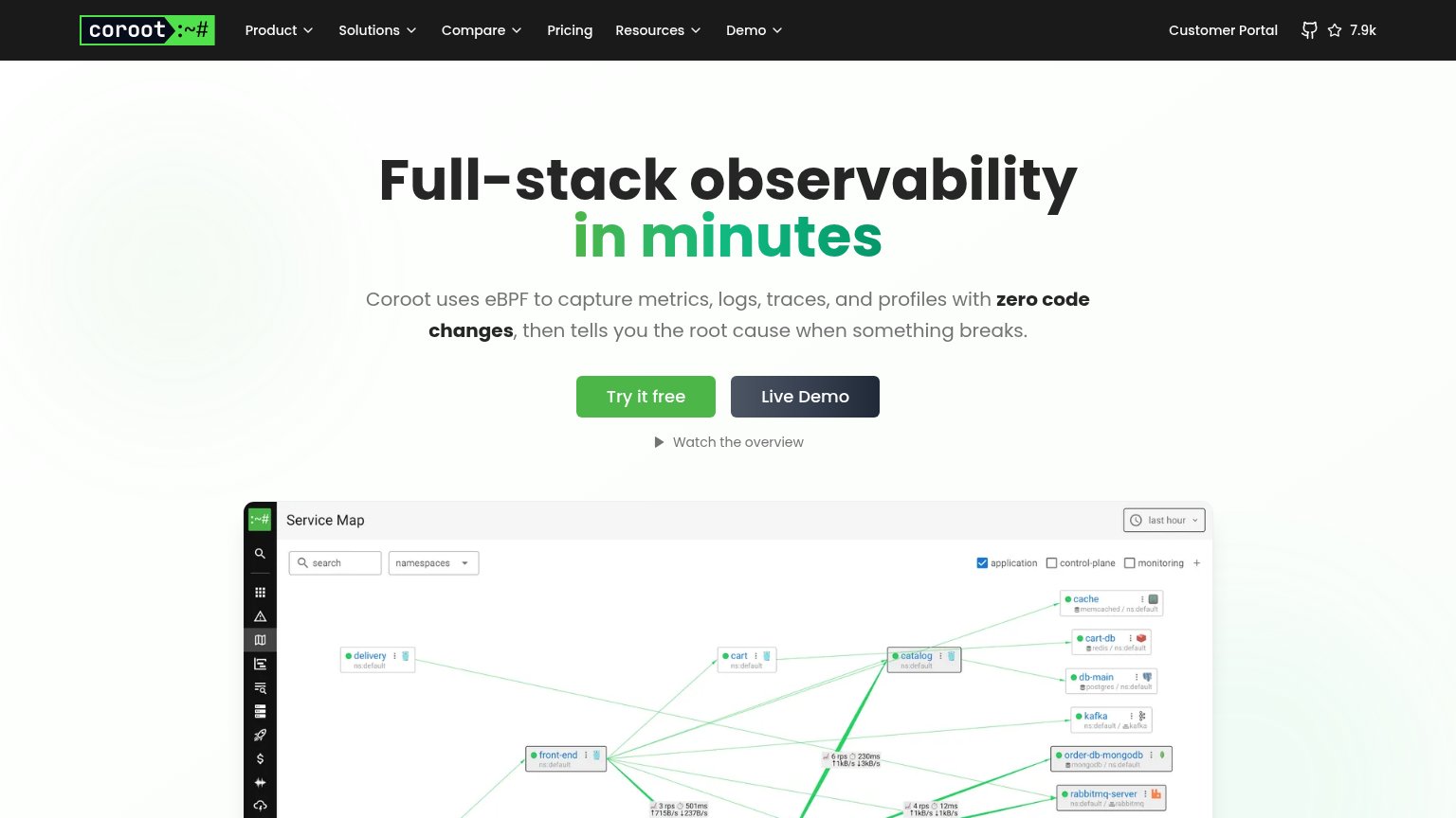
Problems
- header says 'Start', hero says 'Try'
- small footprint in empty desktop hero
- no echo of 'trace' headline promise