
Your landing page’s weakest score is Mobile web.
How Lopus ranks
56Growth scoreupdated
category scores
category scoresShowHide
Score over time
Mobile web
42PoorThe phone experience as a first-class citizen.
 123
- Overflowing testimonial quote — Quote text clips off the right edge and neighboring-slide fragments bleed in from the left.
- Hero headline below fold — "The Growth Data Platform" and any CTA land a full screen down; no primary action is tappable in the first viewport.
- Tiny product screenshot — Desktop dashboard imagery is shrunk to illegible thumbnail size in the phone column.
Information hierarchy
44PoorDoes the design help or inhibit what the page is trying to say?
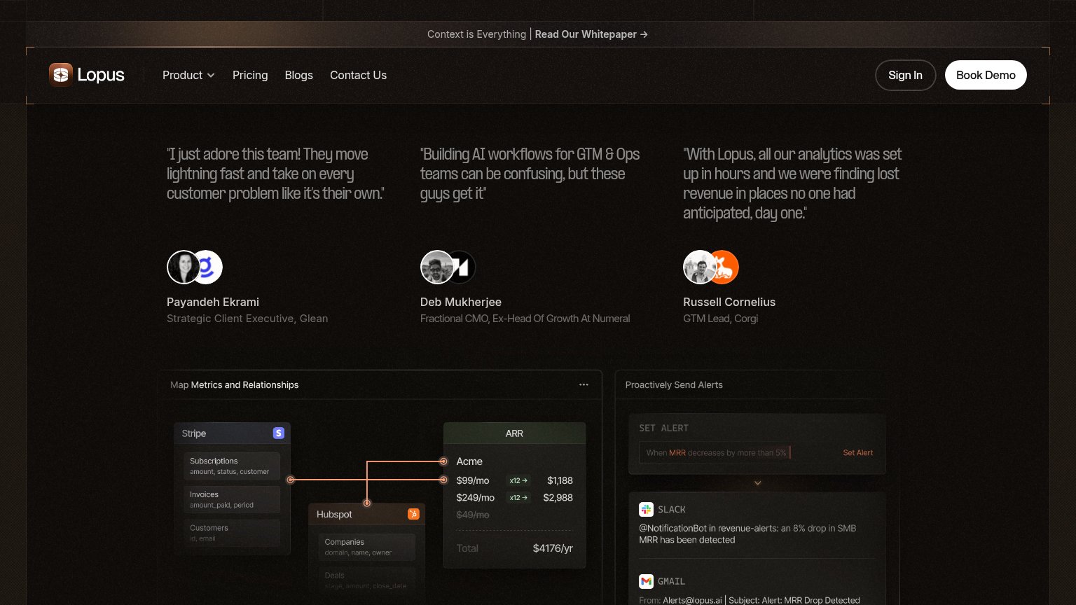 123
- Testimonial row leads fold — Three equal-weight quotes open the page before any headline says what Lopus is.
- Metrics and alerts panels — Two dense product panels compete at the same weight with no framing headline or CTA nearby.
- Whitepaper banner link — "Read Our Whitepaper" is the first clickable element, pulling attention away from Book Demo.
CTA
58FairCopy, size, verb, cost-feel — does the primary CTA earn the click?



Problems
- demo booking feels costly
- nav-sized, no hero button
- absent from mobile fold
- click delivers a call, not value
Value props
58FairTitle, subtitle, hero — do they sell the product's true value?
Trust
78FairProof that the product is real, competent, and safe to try.
| Trust read | |
|---|---|
| Lopus | "With Lopus, all our analytics was set up in hours and we were finding lost revenue in places no one had anticipated, da |
| Customer logo wall featuring Notion, Intercom, Cursor, Expo, Descript, Pylon, 11x, Bland, Thanx, and Sprig | |
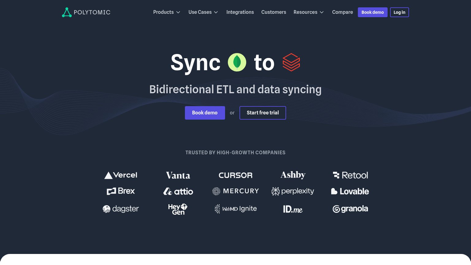
| "Trusted by high-growth companies" logo wall (Vercel, Vanta, Cursor, Brex, Perplexity, Retool, Mercury, Attio, Lovable, | |
| No visible trust signal identified. | |
| Interactive product query box showing "How much should we spend acquiring customers?" | |
| implicit context Baremetrics may benefit from pre-existing familiarity among its target audience. |