
Your landing page’s weakest score is Trust.
How ChartMogul ranks
Trust
42PoorProof that the product is real, competent, and safe to try.


| Trust read | |
|---|---|
| ChartMogul | Interactive product query box showing "How much should we spend acquiring customers?" |
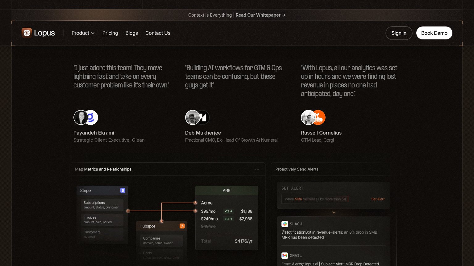
| "With Lopus, all our analytics was set up in hours and we were finding lost revenue in places no one had anticipated, da | |
| Customer logo wall featuring Notion, Intercom, Cursor, Expo, Descript, Pylon, 11x, Bland, Thanx, and Sprig | |
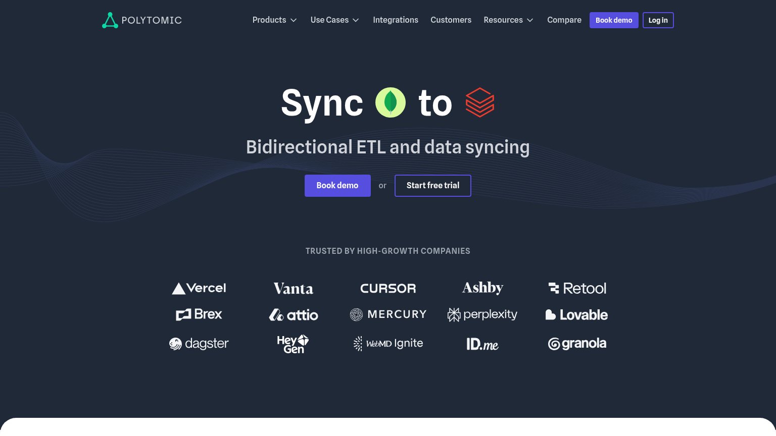
| "Trusted by high-growth companies" logo wall (Vercel, Vanta, Cursor, Brex, Perplexity, Retool, Mercury, Attio, Lovable, | |
| No visible trust signal identified. | |
| implicit context Baremetrics may benefit from pre-existing familiarity among its target audience. |
Mobile web
48PoorThe phone experience as a first-class citizen.
 123
- Cookie consent wall — Dead blocker covers over half the viewport and buries the primary interactive element under legal text.
- Cut-off query box — The page's main action peeks out half-clipped behind the banner, unreadable and untappable on first paint.
- Triple consent buttons — Three full-size buttons give the cookie prompt more tap targets than the product offers in the entire fold.
Information hierarchy
64FairDoes the design help or inhibit what the page is trying to say?
What works
What to improve
Value props
72FairTitle, subtitle, hero — do they sell the product's true value?
ChartMogul’s headline
Ask your subscription business anything
Ask the questions you’d normally take to your data team or spend hours answering in spreadsheets.
Working
Could improve
CTA
76FairCopy, size, verb, cost-feel — does the primary CTA earn the click?
How ChartMogul compares
Recommended rewrites