
Your landing page’s weakest score is Trust.
How Bild AI ranks
71Growth scoreupdated
category scores
category scoresShowHide
Score over time
Trust
44PoorProof that the product is real, competent, and safe to try.
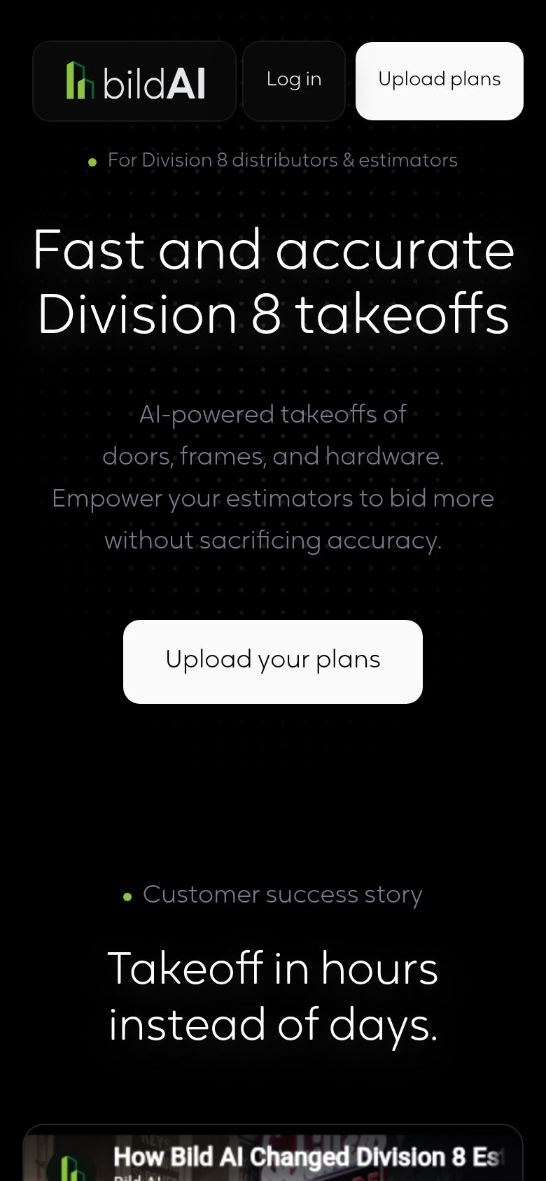




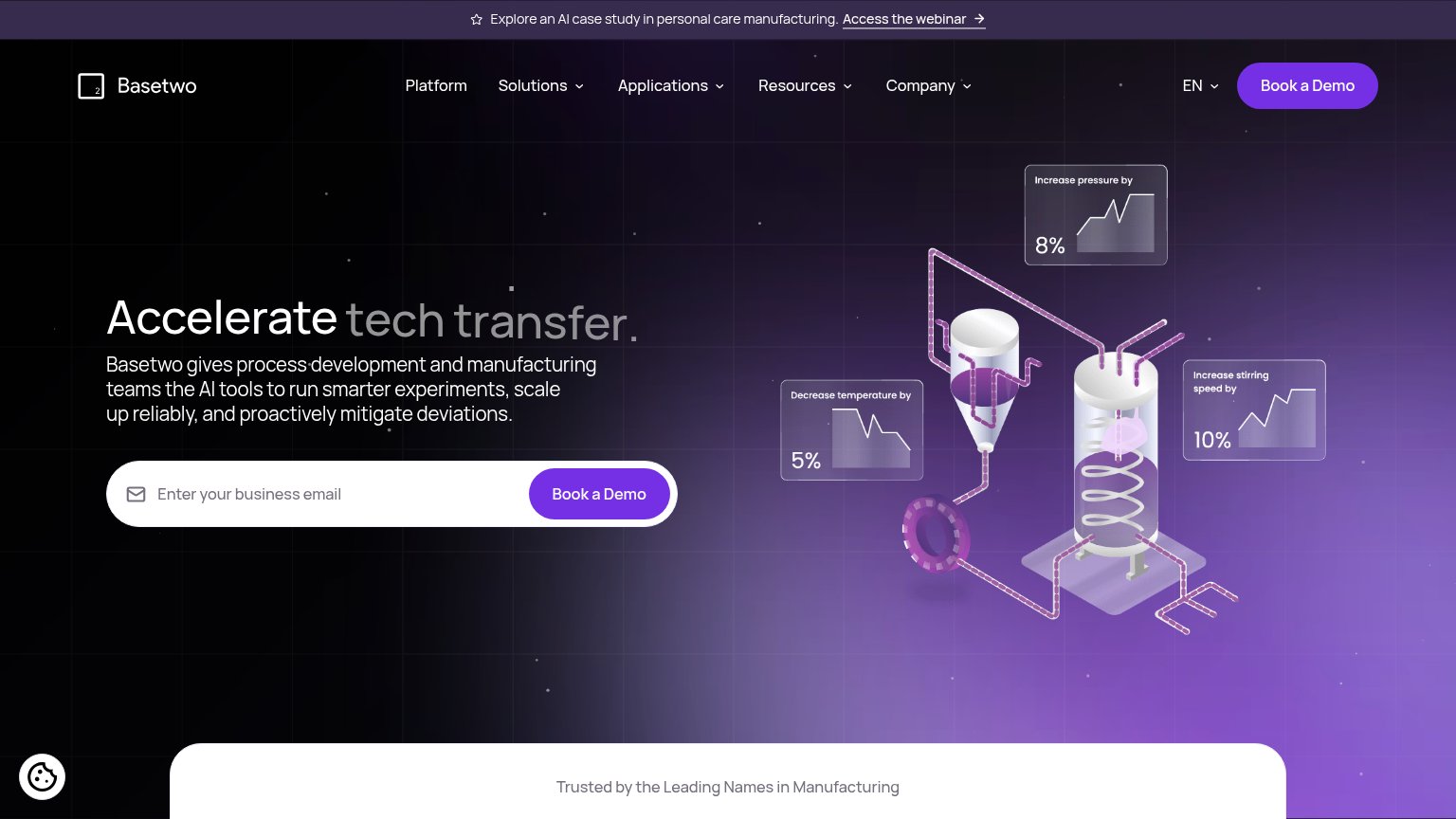
| Trust read | |
|---|---|
| Bild AI | "Customer success story" video: "How Bild AI Changed Division 8 Es…" (mobile capture) |
| "Backed by Y Combinator" badge above the hero headline | |
| Embedded product UI showing a conversation: "What critical path scheduled activities happen during the week of August 17 | |
| TRUSTED BY 300+ MEP DISTRIBUTORS AND REP AGENCIES | |
| Customer logo wall including Dish, Century, Ciena, Wipro, TTX, and CSA between the headline and CTAs | |
| "Explore an AI case study in personal care manufacturing" announcement bar |
Mobile web
72FairThe phone experience as a first-class citizen.
123- Uncollapsed header row — Desktop nav crammed into one mobile row; the 'Upload plans' pill is clipped at the right edge and duplicates the hero CTA.
- Subheadline paragraph — Low-contrast gray text wraps into four uneven lines, making the value copy strain to read on a phone.
- Upload Bild AI's plans CTA — Button floats at roughly half the column width instead of near-full-bleed, shrinking the tap target.
CTA
76FairCopy, size, verb, cost-feel — does the primary CTA earn the click?
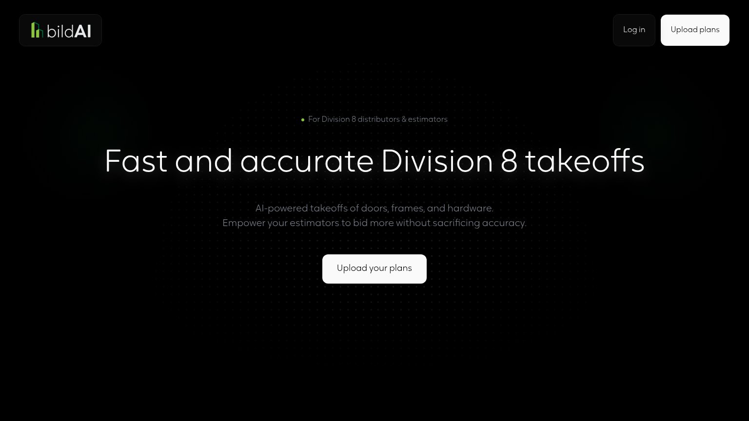
Problems
- asks for work before payoff
- nav label differs: 'Upload plans'
- no free/no-cost signal visible
Value props
76FairTitle, subtitle, hero — do they sell the product's true value?
Bild AI’s headline sells
Fast and accurate Division 8 takeoffs
AI-powered takeoffs of doors, frames, and hardware. Empower your estimators to bid more without sacrificing accuracy.
Working
- Names the exact job: Division 8 takeoffs
- Eyebrow targets distributors & estimators
- Subhead lists doors, frames, hardware
Could improve
- No numbers quantify 'fast' or 'accurate'
- Empty hero — no product shown working
- 'Hours instead of days' buried on mobile
Information hierarchy
86StrongDoes the design help or inhibit what the page is trying to say?
12- Nav Upload plans button — Styled at the same white weight as the hero CTA, creating two equal-rank primary buttons in one fold.
- Low-contrast subhead text — The gray subhead sits near the black background's contrast floor, weakening the only supporting explanation of the promise.