
Your landing page’s weakest score is Trust.
How Astro ranks
68Growth scoreupdated
category scores
category scoresShowHide
Score over time
Trust
42PoorProof that the product is real, competent, and safe to try.
| Trust read | |
|---|---|
| Astro | No visible trust signal identified. |
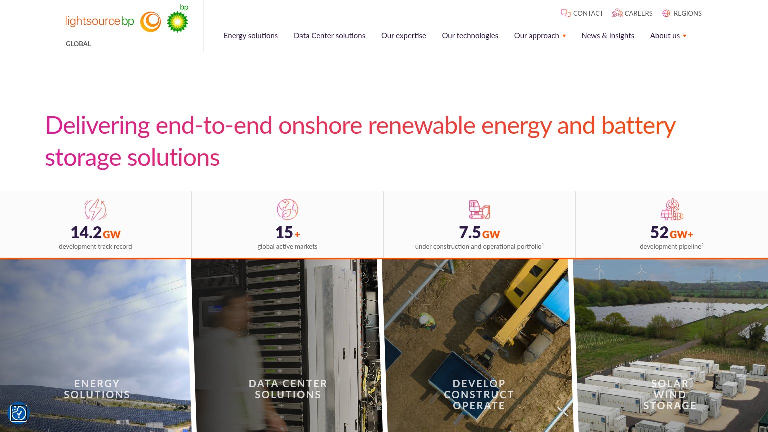
| "14.2 GW development track record" stat band with 15+ markets, 7.5 GW operational, 52 GW+ pipeline | |
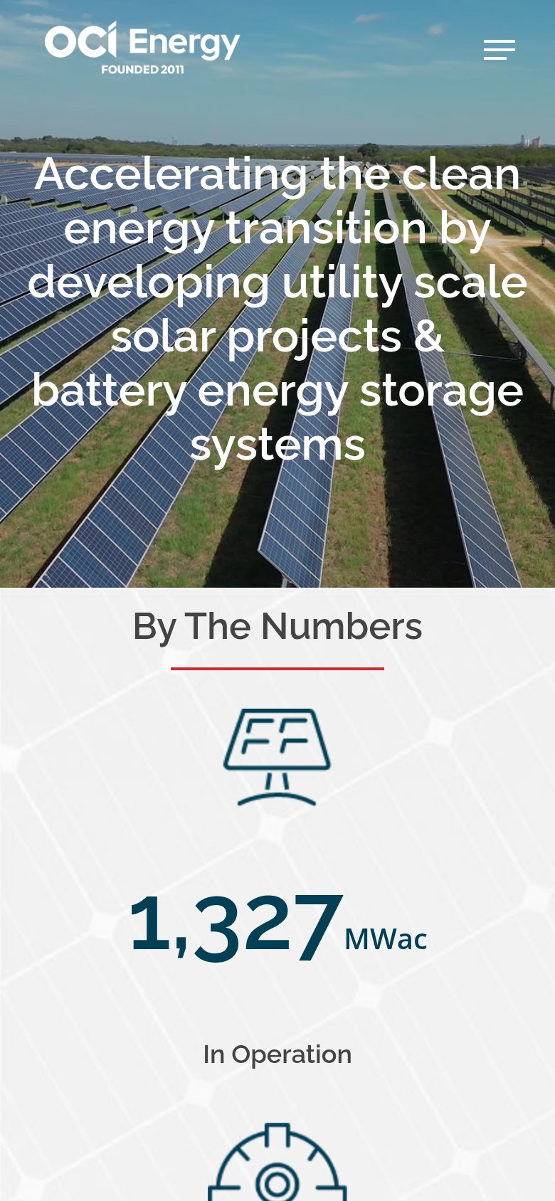
| "1,327 MWac In Operation" stat in the By The Numbers section (mobile) | |
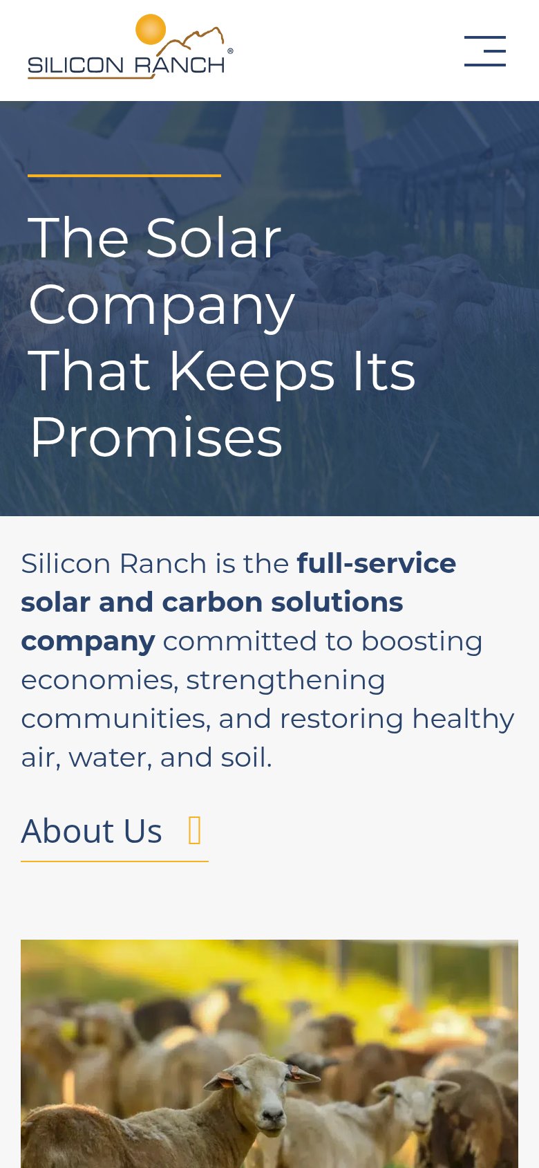
| Hero photo of sheep grazing among real utility-scale solar arrays | |
| No visible trust signal identified. | |
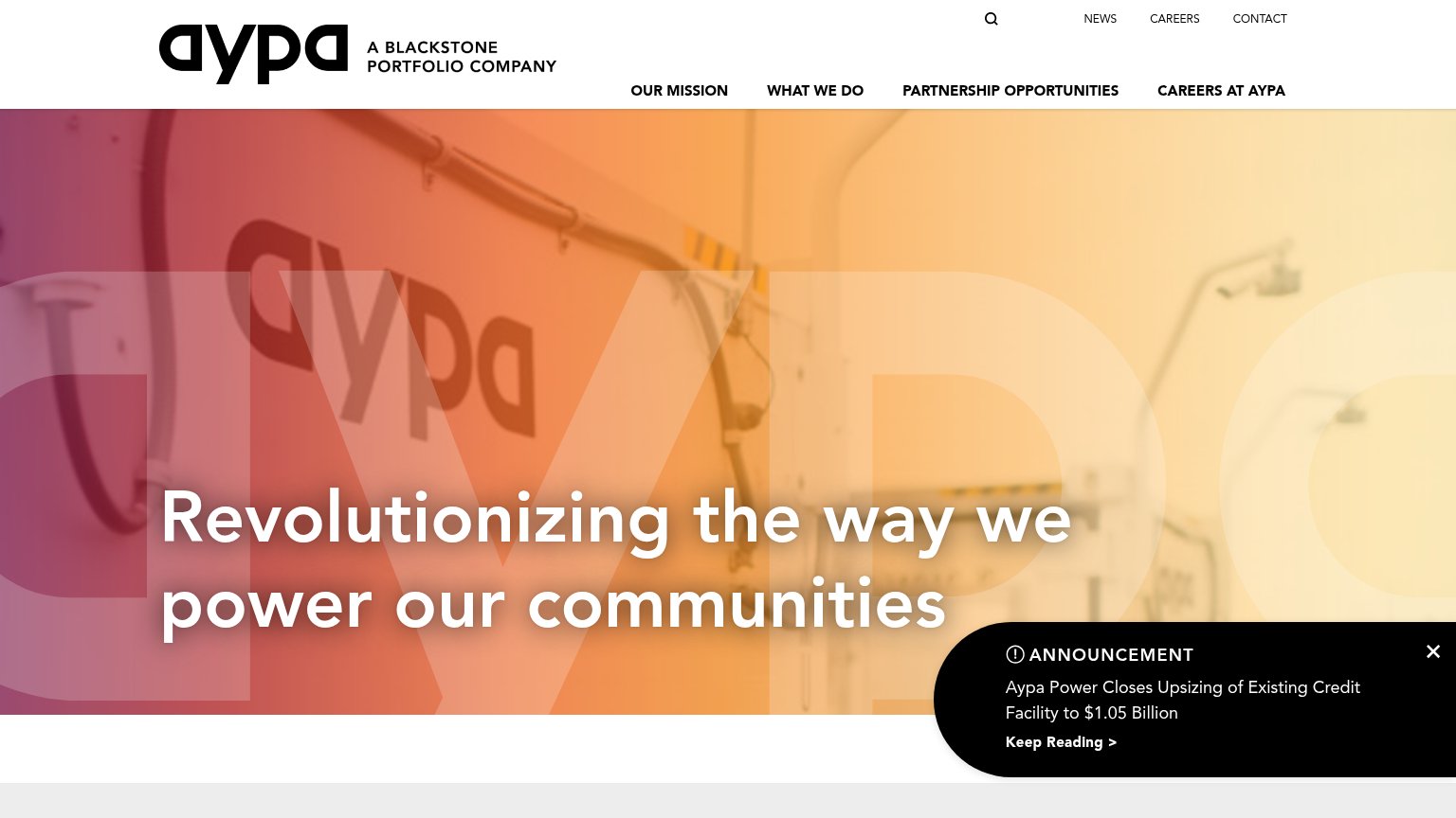
| "Aypa Power Closes Upsizing of Existing Credit Facility to $1.05 Billion" announcement |
CTA
68FairCopy, size, verb, cost-feel — does the primary CTA earn the click?
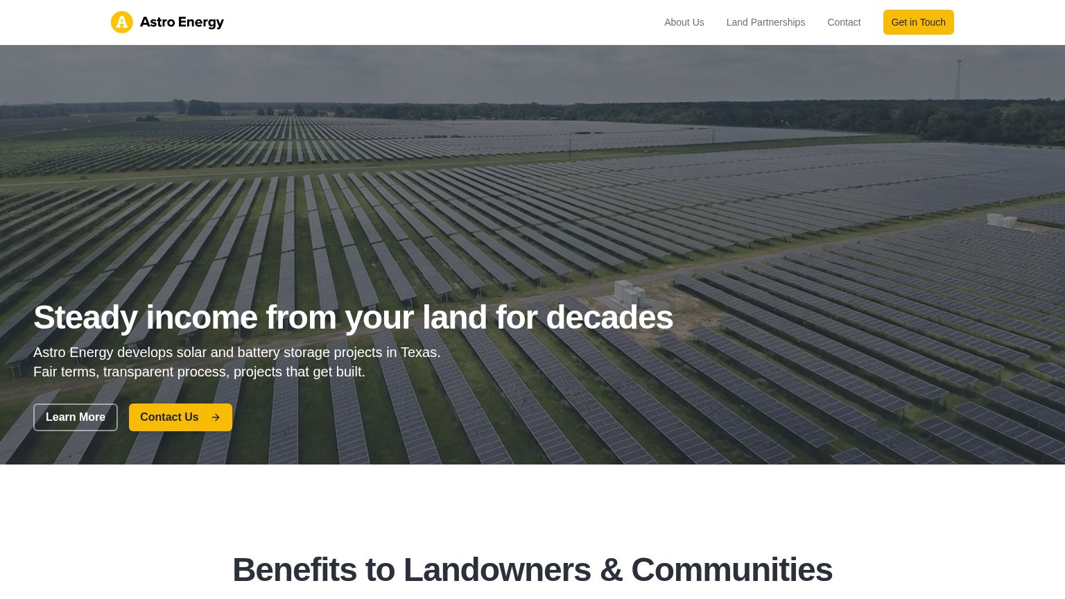
Problems
- click feels like work, not value
- nav says 'Get in Touch' instead
- generic label, ignores headline promise
Value props
74FairTitle, subtitle, hero — do they sell the product's true value?
Astro’s headline sells
Steady income from your land for decades
Astro Energy develops solar and battery storage projects in Texas. Fair terms, transparent process, projects that get built.
Working
- Outcome-led: income, not solar jargon
- Names Texas and project types plainly
- "Projects that get built" defuses stall fear
Could improve
- No dollar figure or per-acre number
- "Decades" vague — state lease term
- No proof: projects built, MW, acres
Mobile web
76FairThe phone experience as a first-class citizen.
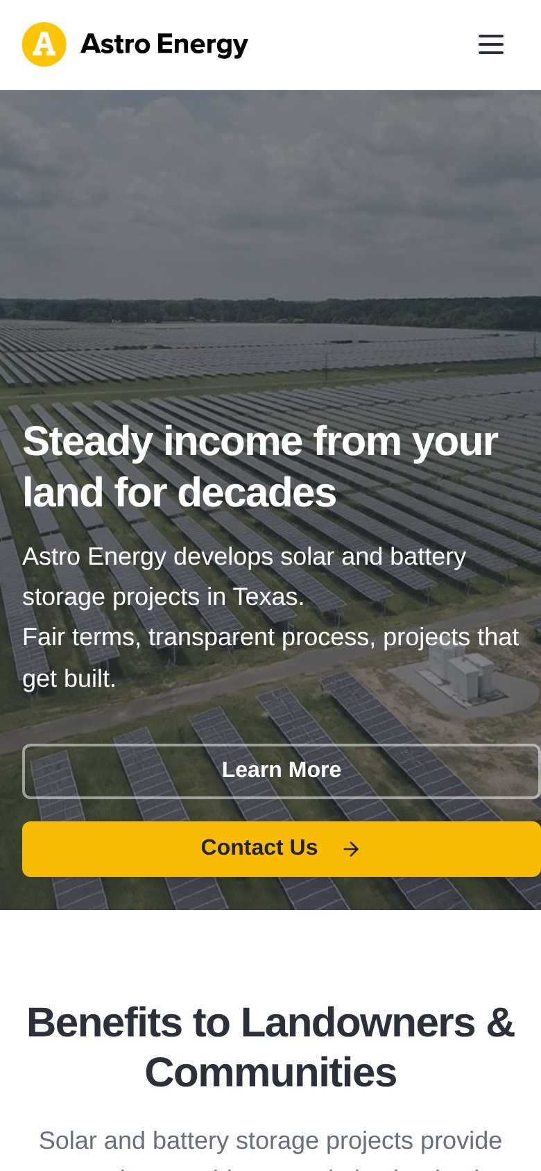 123
- Contact Us button — Primary CTA is clipped at the bottom edge of the first viewport, easy to miss without scrolling.
- Learn More button — Secondary action stacks above the primary CTA, pushing Contact Us down and stealing the first tap.
- Subhead paragraph — Two sentences wrap into four loose lines, eating vertical space that displaces the CTA pair.
Information hierarchy
78FairDoes the design help or inhibit what the page is trying to say?
123- Duplicate yellow CTA — Nav 'Get in Touch' matches the hero 'Contact Us' in color and weight, splitting the primary action between two buttons.
- Learn More ordered first — The ghost secondary button precedes 'Contact Us' in the scan path, so the exit link is read before the conversion action.
- Low-contrast ghost button — The thin outline of 'Learn More' nearly disappears against the busy panel-field photo, making the button pair hard to parse.