
Your landing page’s weakest score is Trust.
How TareBio ranks
44Growth scoreupdated
category scores
category scoresShowHide
Trust
22PoorProof that the product is real, competent, and safe to try.
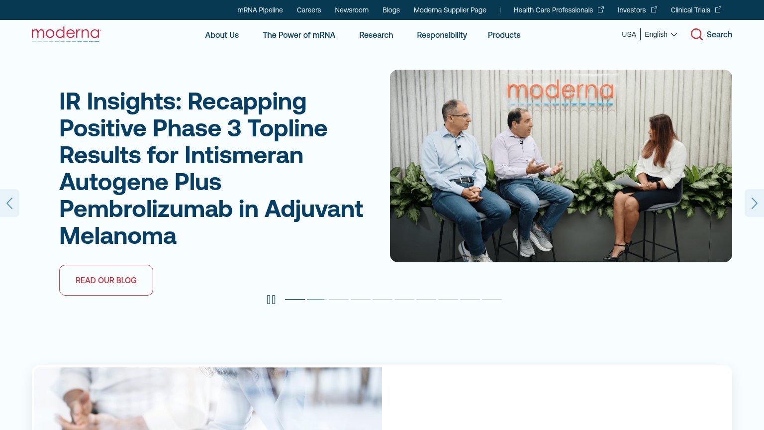

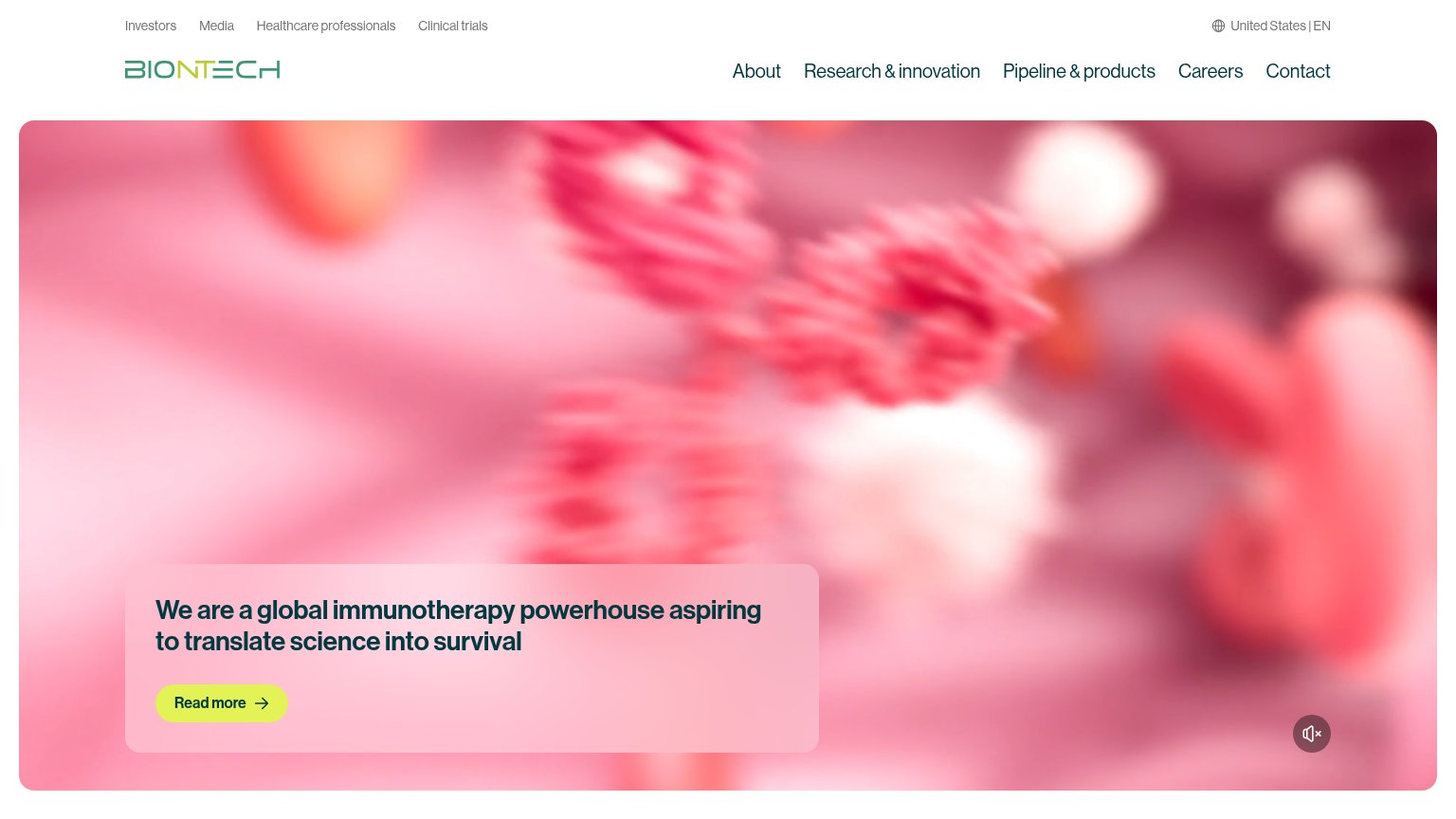
| Trust read | |
|---|---|
| TareBio | No visible trust signal identified. |
| Nav links to "Investors", "Clinical trials" and "Healthcare professionals" | |
| Headline "Recapping Positive Phase 3 Topline Results for Intismeran Autogene Plus Pembrolizumab in Adjuvant Melanoma" | |
| "CureVac is now part of the BioNTech Group (Nasdaq: BNTX)" acquisition statement on the desktop fold | |
| No visible trust signal identified. |
CTA
32PoorCopy, size, verb, cost-feel — does the primary CTA earn the click?
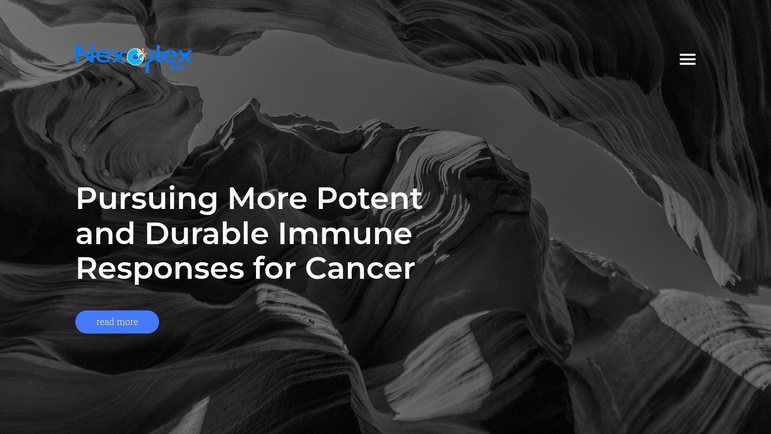
Problems
- no button, only a mailto link
- no action verb — reads as a label
- email click feels costly
- tiny footprint vs headline
Value props
48PoorTitle, subtitle, hero — do they sell the product's true value?
TareBio’s headline vague
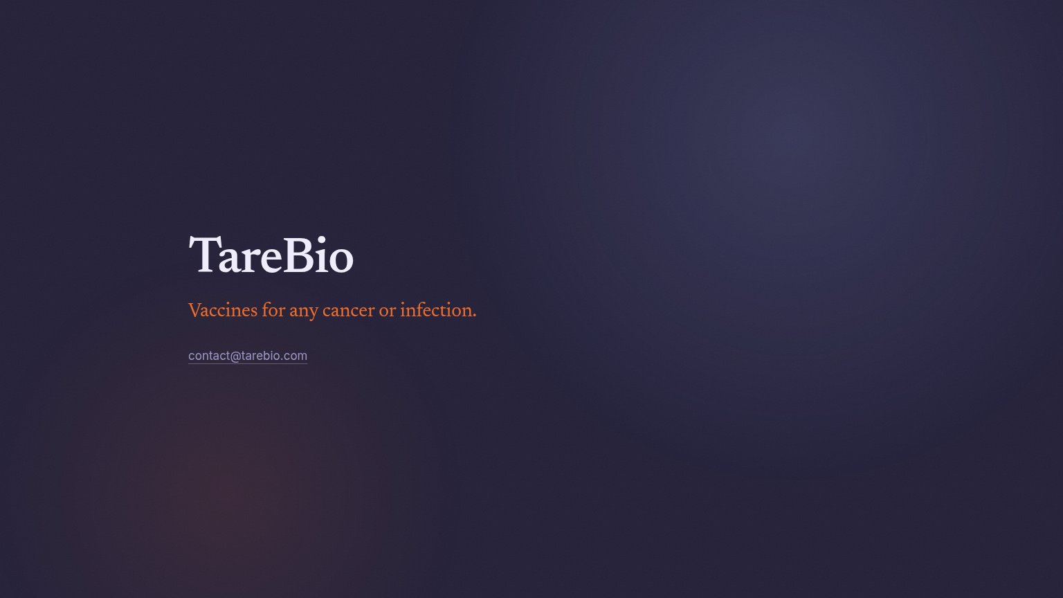
TareBio
Vaccines for any cancer or infection.
Working
- Bold, outcome-level claim
- One line, instantly readable
- No buzzword filler
Could improve
- No mechanism or proof for a huge claim
- Headline is just the company name
- No hero visual showing the science
Mobile web
58FairThe phone experience as a first-class citizen.
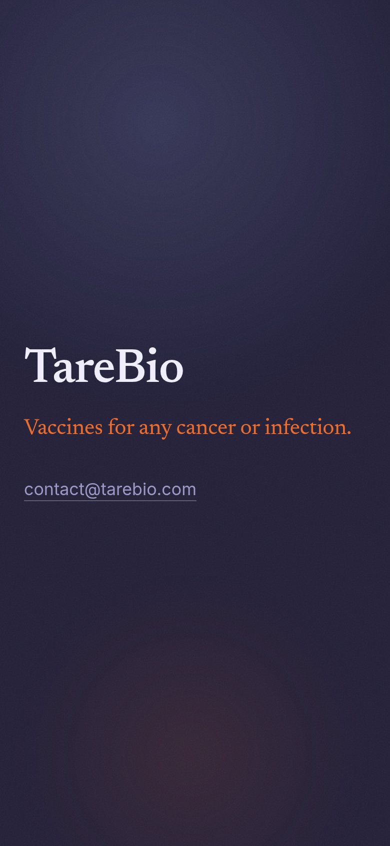 1
- Email text link — The only action is a small, low-contrast mailto link — no tappable button-sized CTA exists on the page.
Information hierarchy
62FairDoes the design help or inhibit what the page is trying to say?
 12
- contact@tarebio.com link — The only action on the page is a small grey text link with weak contrast; it reads as metadata, not a CTA.
- Orange subtitle line — The extraordinary claim stands alone with no supporting proof or descriptor beneath it, leaving the scan path with nowhere to go.