Past reportsShow past reportsHide past reports
- Sep 20, 202663LiveOverall −4 · CTA −14 · Mobile web −6Viewing
- Aug 15, 202667First tracked report — strongest Value props 76, weakest Trust 48View →

Your landing page’s weakest score is Trust.
How Qlo ranks
category scores
Proof that the product is real, competent, and safe to try.

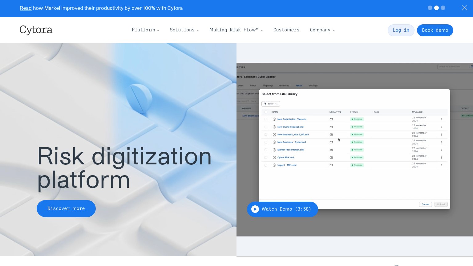
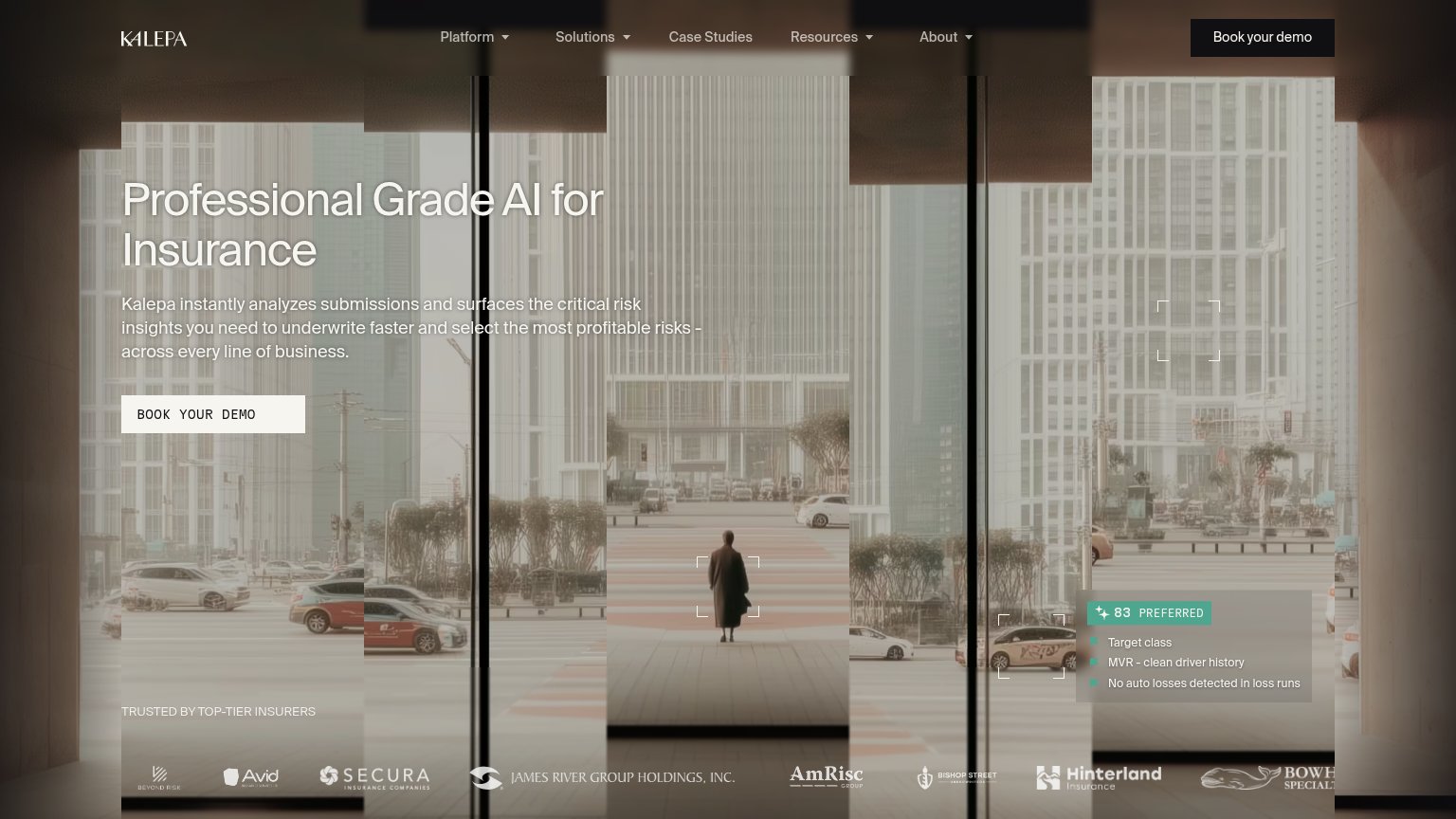

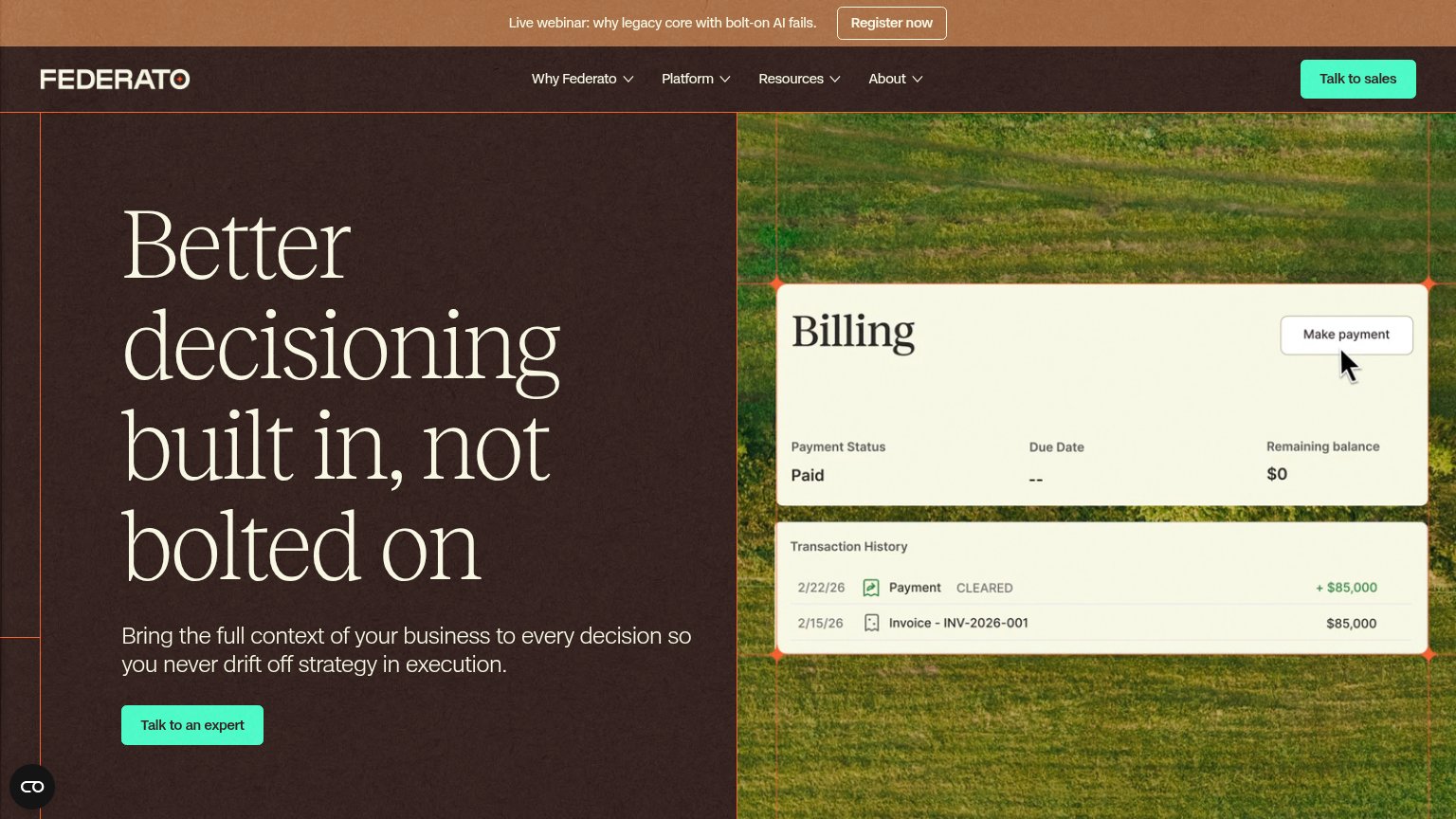
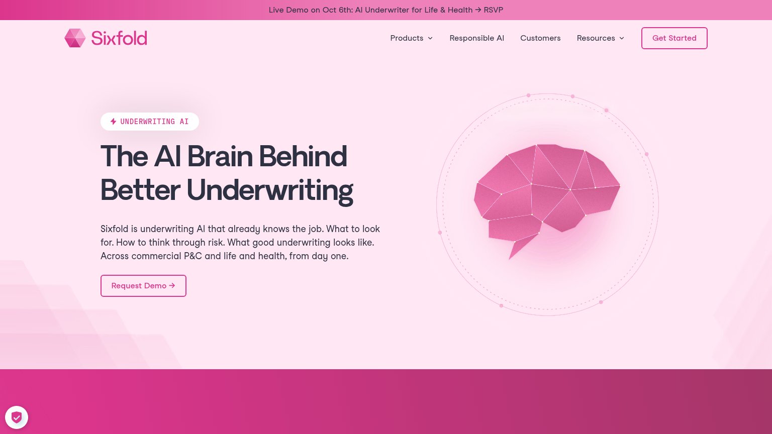
| Trust read | |
|---|---|
| Qlo | Product UI card showing "Worth writing — In appetite" with real submission fields (EPL, Assets $79,636,000, policy dates |
| "TRUSTED BY TOP-TIER INSURERS" logo strip (Secura, James River Group Holdings, AmRisc, Hinterland) | |
| No visible trust signal identified. | |
| Announcement bar: "Live Demo on Oct 6th: AI Underwriter for Life & Health → RSVP" | |
| Banner: "Read how Markel improved their productivity by over 100% with Cytora" | |
| "Duck Creek has acquired Send" announcement with READ PRESS RELEASE link |
Copy, size, verb, cost-feel — does the primary CTA earn the click?
Problems
The phone experience as a first-class citizen.
 123
Does the design help or inhibit what the page is trying to say?
123Title, subtitle, hero — do they sell the product's true value?
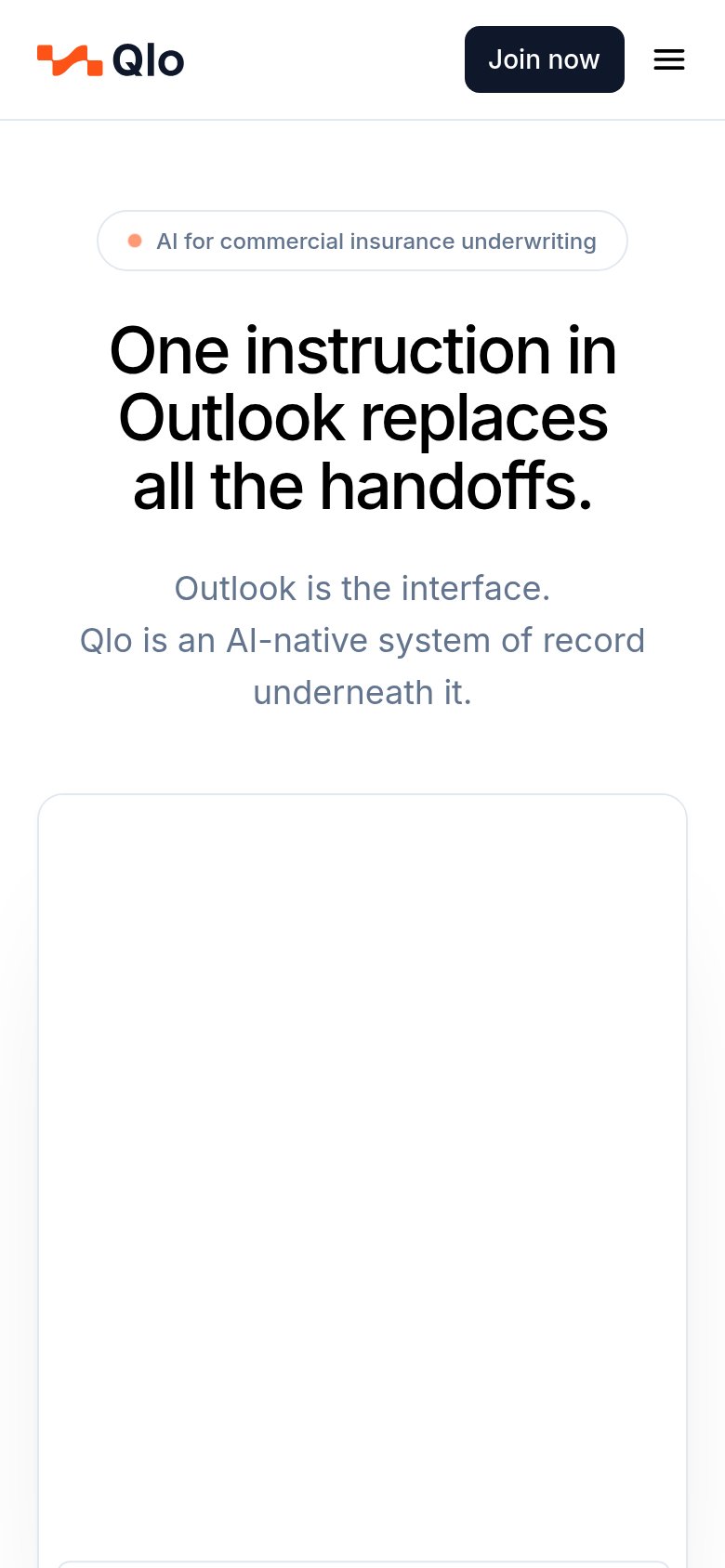
One instruction in Outlook replaces all the handoffs.
Outlook is the interface. Qlo is an AI-native system of record underneath it.
Working
Could improve
You need a lazyweb account to add your product, do a growth audit, create backlog and more
Sign me in to my Lazyweb report hub. Fetch https://www.lazyweb.com/hub/agent/sign-in.md and follow its instructions exactly. If you can't fetch URLs, tell me and I'll paste the instructions instead.
Lazyweb MCP
Step 1 of 2 · your login
Where should we send your reports? This email becomes your login on lazyweb.com — everything your agent makes lands in your workspace.
That doesn't look like an email — check it and try again.
No password, no spam — one workspace link now, then your agent command.
Step 2 of 2 · your agent
Paste this into your agent. Claude Code, Codex, Cursor, or another MCP-capable agent opens the link and sets itself up. Data access is plan-dependent.
Generating your agent command...
Free account
We’ll add Qlo as your product and bring this score into your workspace. You can change it later in Settings.