
Your landing page’s weakest score is Trust.
How Peer ranks
73Growth scoreupdated
category scores
category scoresShowHide
Score over time
Trust
52FairProof that the product is real, competent, and safe to try.

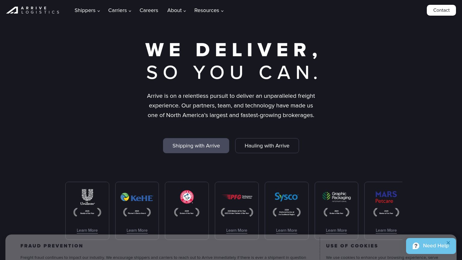

| Trust read | |
|---|---|
| Peer | Loads dashboard screenshot with load IDs, lanes, and "98% ON TIME" stat |
| "DAT has acquired the Convoy Platform—a major step forward for the future of truckload." banner | |
| "Tap into one of North America's largest managed transportation and multimodal capacity networks" headline | |
| Stylized network diagram with live event cards ("Driver checked in · gate 3", "Invoice audited · $4,120", "Spot rate neg | |
| Customer award cards: Unilever "2025 Rookie of the Year," KeHE "2025 Planner's Choice Award," Sysco "2024 Preferred Carr | |
| Product demo video showing real platform UI: carrier scorecard "Happy Haulers LLC" with 4.6 rating and 95.8% on-time, ap |
Value props
76FairTitle, subtitle, hero — do they sell the product's true value?
Peer’s headline sells
Difficult freight handled right
A new brokerage built on modern technology. We use AI to get quotes back fast, vet carriers in more depth, and catch problems before they reach you. Track every load live, with a human in the loop whenever you need one.
Working
- Names real pain: difficult freight, caught problems
- Subhead lists concrete mechanisms, not buzzwords
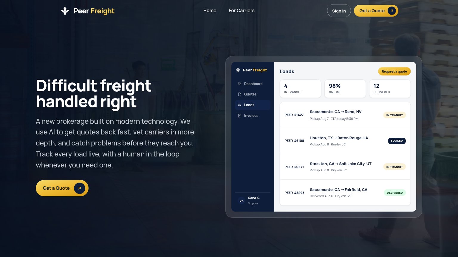
- Dashboard hero shows tracking promise in action
Could improve
- No numbers in copy; 'fast' is unquantified
- Headline is a vibe, not a measurable claim
- 98% on-time proof stays buried in the mockup
Information hierarchy
78FairDoes the design help or inhibit what the page is trying to say?
 123
- Duplicate Get a Quote — Two identically styled yellow 'Get a Quote' buttons in the fold (nav and hero) split scan attention; only one should carry the primary weight.
- Request a quote chip — The yellow 'Request a quote' chip inside the dashboard mock mimics the real CTA styling, adding a third yellow button visitors may try to click.
- Dense dashboard mock — Four load rows, three stat cards and a sidebar pack fine-print detail that competes with the headline at first glance.
CTA
78FairCopy, size, verb, cost-feel — does the primary CTA earn the click?
Problems
- generic label, no speed payoff
- ignores headline's promise
- app mock says 'Request a quote'
Mobile web
80StrongThe phone experience as a first-class citizen.
123- Six-line body paragraph — Long subhead pushes the primary Get a Quote button to the bottom of the fold.
- Header without menu — No hamburger — the Home and For Carriers links from desktop are unreachable on mobile.
- Hero Get a Quote button — Sits at roughly half the column width; a full-bleed button would be a bigger thumb target.