
Your landing page’s weakest score is Trust.
How Mentlio ranks
70Growth scoreupdated
category scores
category scoresShowHide
Score over time
Trust
62FairProof that the product is real, competent, and safe to try.

| Trust read | |
|---|---|
| Mentlio | "Backed by Y Combinator" badge above the hero headline |
| Customer logo strip: Autodesk, "TOP 5 US BANK", Riskified, Coursera, Discord | |
| Customer logo strip under "POWERING THE WORLD'S TOP COMPANIES" (Fiserv, Indeed, ABInBev, Sony) visible in the mobile cap | |
| Product dashboard screenshot showing "AI Spend" metrics: "$4,583.14 cost per month" and "737,897,142 token usage per mon | |
| implicit context LinearB may benefit from pre-existing familiarity among its target audience. | |
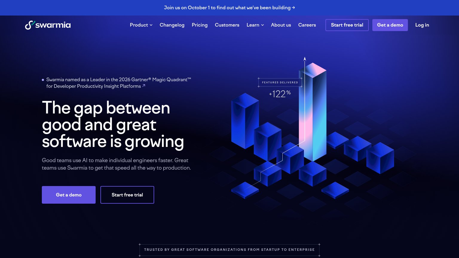
| "Swarmia named as a Leader in the 2026 Gartner® Magic Quadrant™ for Developer Productivity Insight Platforms" |
Mobile web
68FairThe phone experience as a first-class citizen.
 123
- Get a Demo button — Primary CTA sits well below the first viewport, pushed down by the badge, three-line headline, and four-line paragraph.
- YC badge pill — Oversized badge occupies a full band above the headline, spending prime fold space before the value statement.
- Body paragraph — Four long lines of copy delay the CTA; low-contrast text over the busy grid background hurts readability.
CTA
72FairCopy, size, verb, cost-feel — does the primary CTA earn the click?
Problems
- demo = sales call, costly click
- no self-serve or trial path
- generic label, ignores headline promise
Value props
72FairTitle, subtitle, hero — do they sell the product's true value?
Mentlio’s headline undersells
Take command of your AI velocity
See what AI costs, what it produces, and prove AI ROI. Mentlio measures locally, cuts token waste, and keeps prompts and source code on-device.
Working
- Subhead names three concrete jobs
- Hero dashboard shows real $ figures
- On-device privacy claim is specific
Could improve
- 'AI velocity' is a vague buzzword
- Headline needs the subhead to parse
- No number in headline or subhead copy
Information hierarchy
76FairDoes the design help or inhibit what the page is trying to say?
1234- Research announcement banner — Top-of-page banner with a bold 'Read the research' link pulls the first click away from the demo path before the headline is read.
- Six-item nav row — Platform, Token Savers, Docs, Security, Blog, and Integrations sit at equal weight, giving six exit paths before the primary CTA.
- Get a Demo duplicate — The nav 'Get a Demo' duplicates the hero button at identical blue weight, splitting the single primary action into two competing targets.
- Dashboard preview cropped — The product screenshot enters the fold as a thin sliver, showing partial stat cards that add visual noise without communicating the outcome.