
Your landing page’s weakest score is Trust.
How Levocred AI ranks
68Growth scoreupdated
category scores
category scoresShowHide
Score over time
Trust
52FairProof that the product is real, competent, and safe to try.

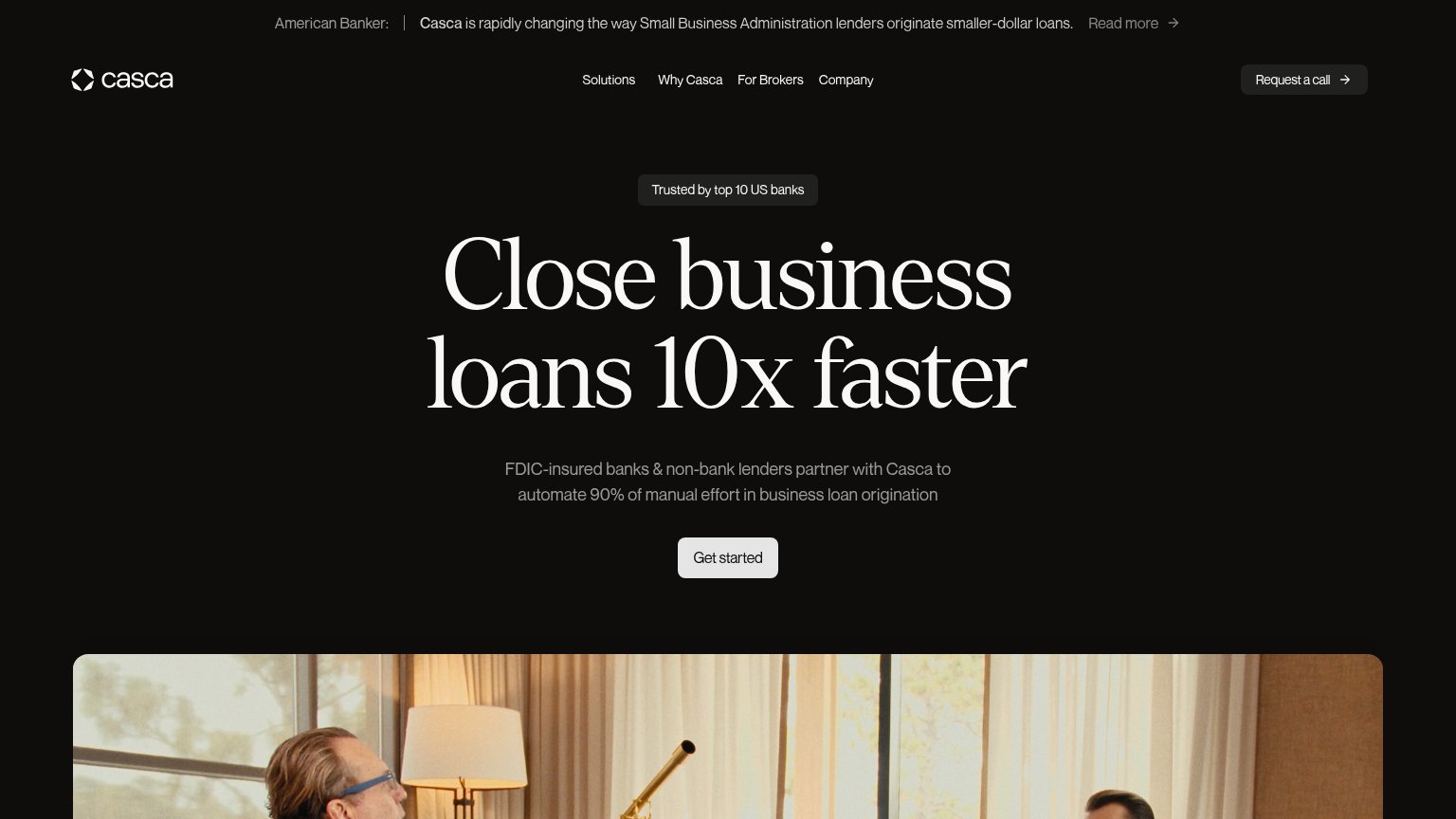
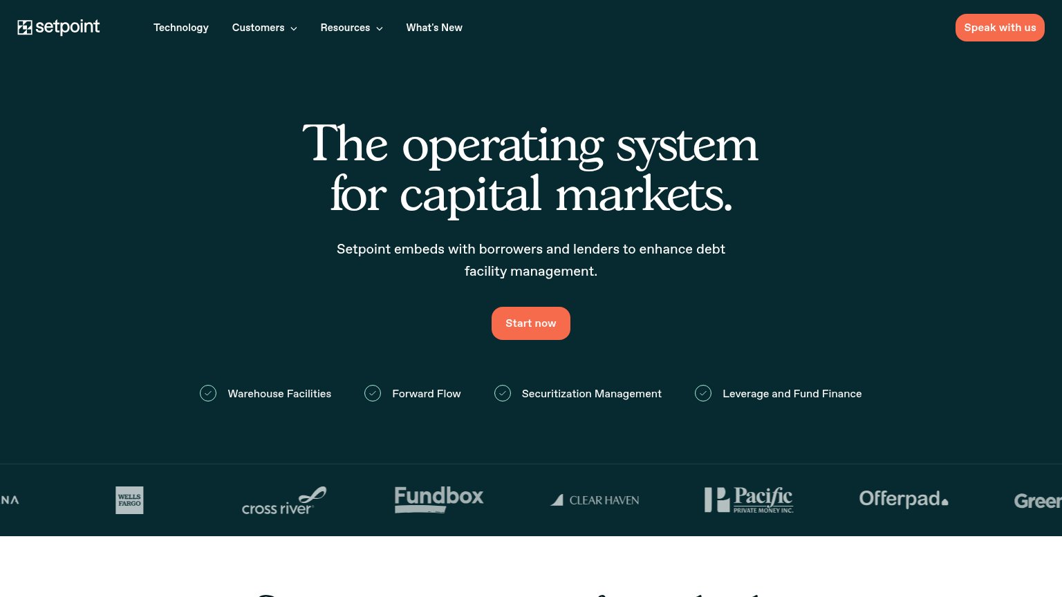
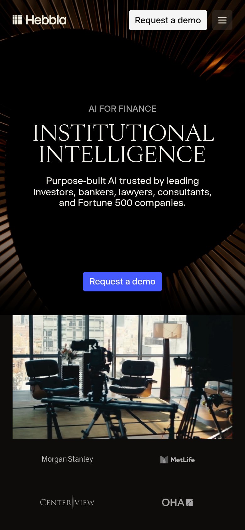
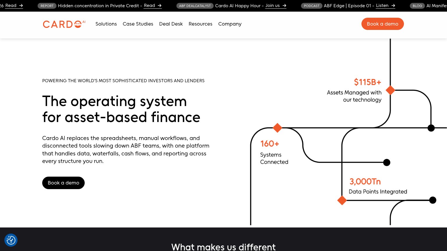
| Trust read | |
|---|---|
| Levocred AI | "Backed by Y Combinator" badge above the hero headline |
| American Banker press bar: "Casca is rapidly changing the way Small Business Administration lenders originate smaller-do | |
| "$115B+ Assets Managed with our technology" hero stat | |
| Customer logo strip featuring Wells Fargo, Cross River, Fundbox, Clear Haven, Pacific Private Money, Offerpad, and Green | |
| "200+ Credit agreement fields digitized and stored and managed by Finley" metric tile | |
| Customer logo row: Morgan Stanley, MetLife, Centerview, OHA (mobile capture) |
CTA
68FairCopy, size, verb, cost-feel — does the primary CTA earn the click?
Problems
- demo request feels costly
- low-friction 'Try now' demoted
- 'Request' implies waiting, not value
Value props
68FairTitle, subtitle, hero — do they sell the product's true value?
Levocred AI’s headline undersells
The AI Workforce for Lenders
Automate workflows like back-office tasks, portfolio monitoring, compliance and underwriting.
Working
- Names the audience: lenders
- "Workforce" frames labor replacement
- Persona toggle segments by desk
Could improve
- Subhead lists tasks, no outcome
- Zero numbers or proof points
- Best line (IC memo) buried below hero
Information hierarchy
76FairDoes the design help or inhibit what the page is trying to say?
123- Duplicate demo CTAs — "Request a demo" appears at equal weight in both nav and hero, splitting the primary action's focus.
- Left file-list column — Vertical stack of file chips (loan_tape_q2, cert_jun) pulls the eye off the centered headline without explanation.
- Nav Try now button — Secondary "Try now" duplicated in nav and hero gives four buttons above the fold competing for one click.
Mobile web
76FairThe phone experience as a first-class citizen.
 123
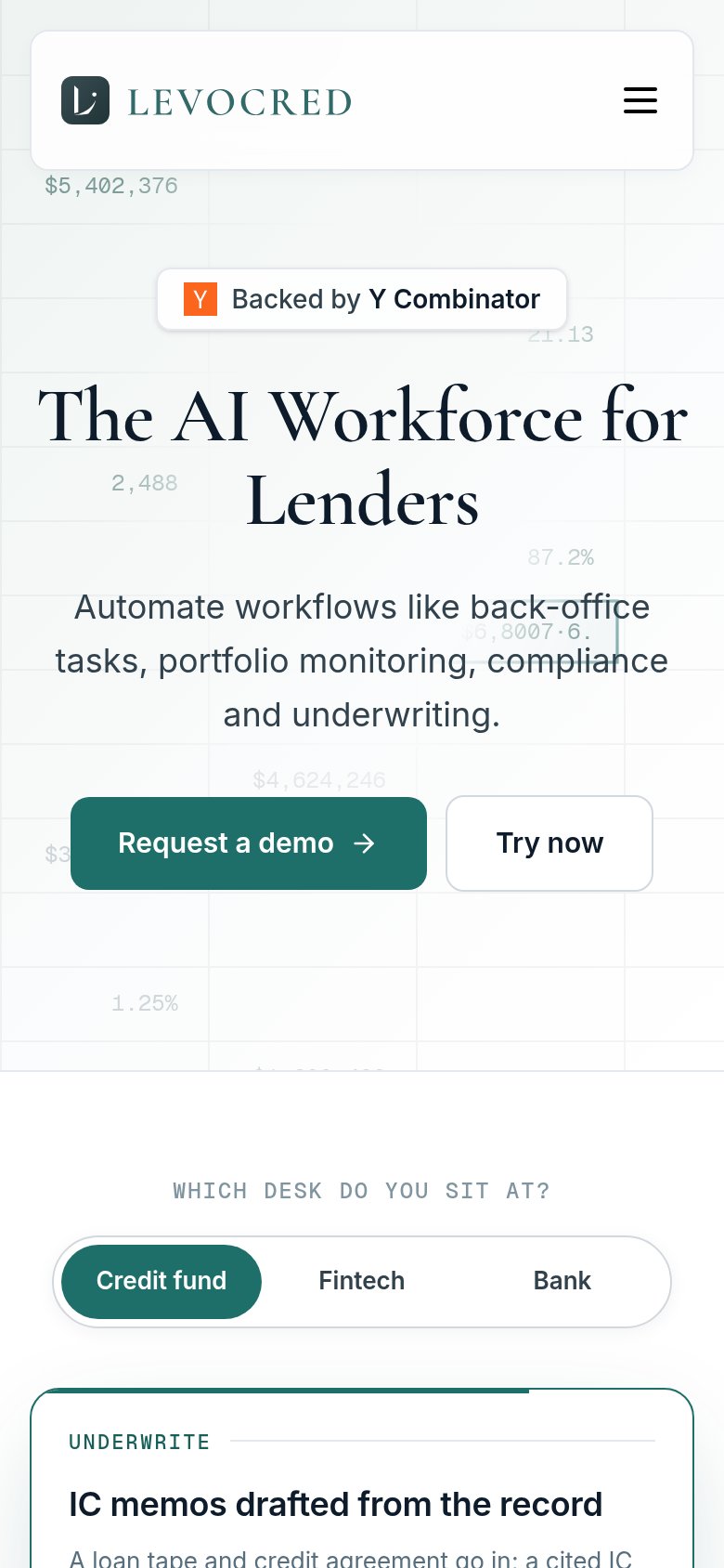
- Serif headline wrap — "The AI Workforce for Lenders" scales down too little and wraps to two tall serif lines, eating the fold with the subhead squeezed below.
- Split CTA row — "Request a demo" shares the row with "Try now" at roughly 60% width instead of a full-bleed thumb-friendly button, splitting attention between two actions.
- Background data noise — Ghost spreadsheet figures like "$6,8007·6." collide with the subhead text, adding visual clutter behind the copy.