
Your landing page’s weakest score is Trust.
How Illume Labs ranks
- 1.
Guava Health71
- 2.
Welltory67
- 3.
Bearable66
- 4.
Illume Labs65
65Growth scoreupdated
category scores
category scoresShowHide
Score over time
Trust
48PoorProof that the product is real, competent, and safe to try.
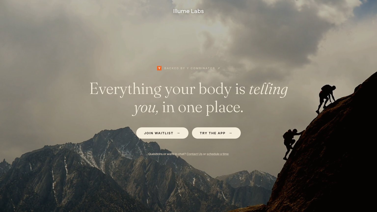
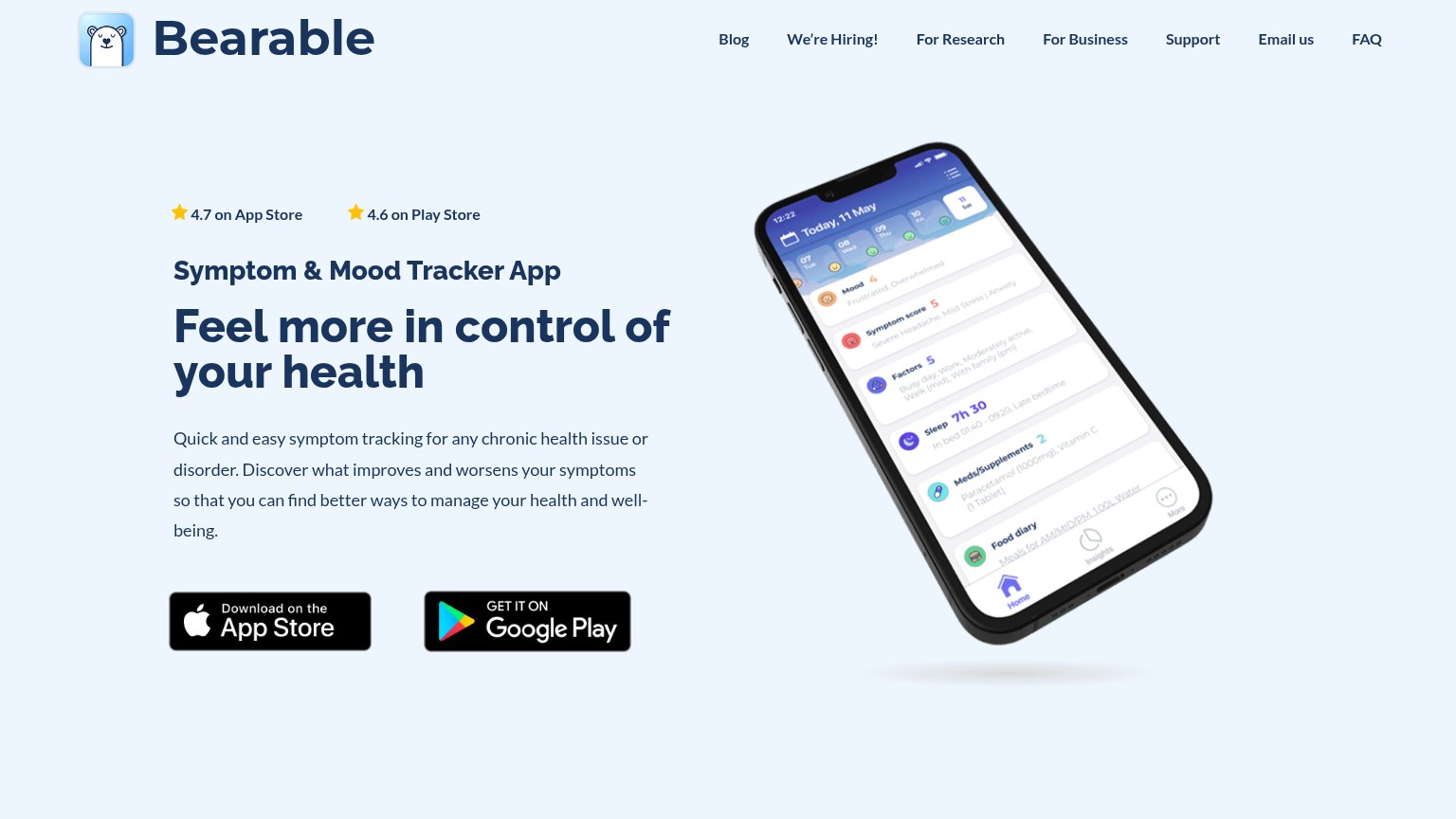
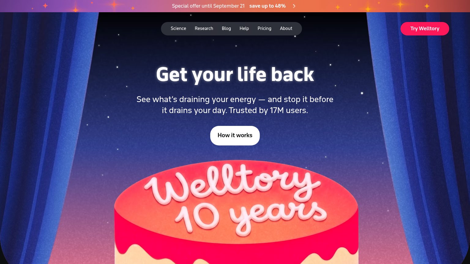
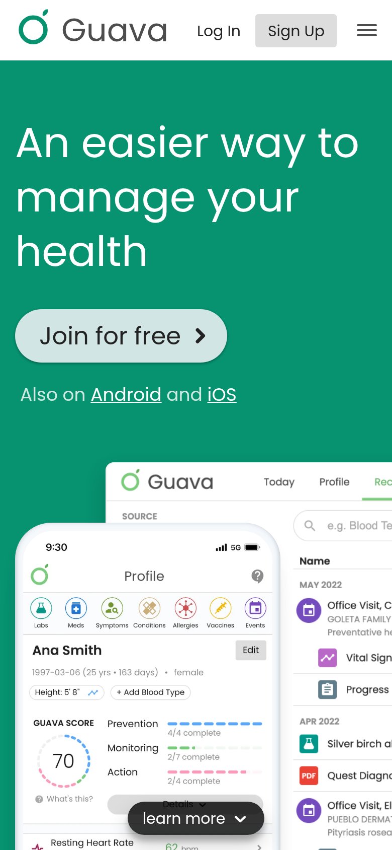
| Trust read | |
|---|---|
| Illume Labs | "BACKED BY Y COMBINATOR" badge above the headline |
| "4.7 on App Store" and "4.6 on Play Store" star ratings above the headline | |
| Detailed app UI screenshots showing a health records table with entries like 'Quest Diagnostics Lipid Panel' and a profi | |
| "Trusted by 17M users." in the hero subhead |
Value props
54FairTitle, subtitle, hero — do they sell the product's true value?
Illume Labs’s headline vague
Everything your body is telling you, in one place.
Working
- Taps real pain of scattered health data
- "One place" implies consolidation outcome
- YC badge adds credibility
Could improve
- No subhead to add specifics
- Hero image shows scenery, not product
- No data sources or outcomes named
CTA
68FairCopy, size, verb, cost-feel — does the primary CTA earn the click?
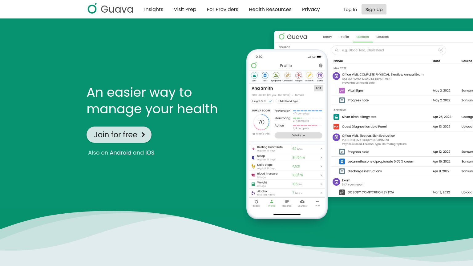
Problems
- two equal-weight CTAs compete
- 'waitlist' = delayed payoff
- contradicts 'try the app' offer
- no payoff language in label
Information hierarchy
72FairDoes the design help or inhibit what the page is trying to say?
1234- Twin equal-weight CTAs — "JOIN WAITLIST" and "TRY THE APP" share identical styling, so no single primary action wins the one-second scan.
- Contact/schedule link line — Two underlined exit links sit directly beneath the CTAs, in the scan path where the conversion decision happens.
- Y Combinator badge link — An outbound link with an arrow sits directly above the headline, inviting a click away before the value prop lands.
- Low-contrast headline text — Thin cream serif over a busy grey sky loses legibility around "telling Illume Labs" where the background lightens.
Mobile web
84StrongThe phone experience as a first-class citizen.
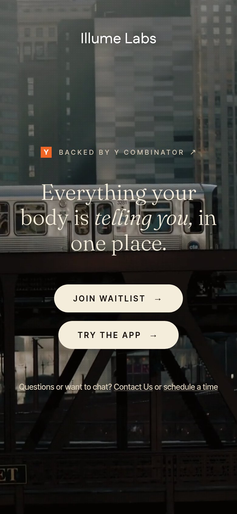 123
- Dual equal CTAs — "JOIN WAITLIST" and "TRY THE APP" carry identical weight, splitting the tap decision with no clear primary.
- Headline over train — Light serif text sits on the bright train car with little scrim, hurting legibility of the core value line.
- CTA button width — Buttons float at partial width instead of the thumb-friendly near-full-bleed expected on a phone.