
Your landing page’s weakest score is Trust.
How Derya ranks
57Growth scoreupdated
category scores
category scoresShowHide
Score over time
Trust
48PoorProof that the product is real, competent, and safe to try.



| Trust read | |
|---|---|
| Derya | Logo strip at bottom of fold (Stella Shipping Agency, Trans Orient, Umut Marine, Ande Log, TVO, Hyzmatdalar) |
| Dashboard UI showing 'Exceptions' (Mechanical Delay, Under FDA Review) and 'SKUs in Transit' table with amounts, destina | |
| No visible trust signal identified. | |
| Product demo UI: "Maersk has been most reliable Shanghai → Felixstowe, with 91% of containers on time across 28 sailings | |
| Customer logo strip (Swoon, SLG, Gelmart, Beauty Pie) on the mobile capture |
Mobile web
52FairThe phone experience as a first-class citizen.
 12
- Eyebrow text over ship — 'ONE PLACE TO SOURCE, BOOK, AND OPERATE EVERY SHIPMENT' sits on the busy container-ship image with weak contrast and awkward wrapping around the dark pill.
- Cropped logo strip — Partner logos are cut off at the left edge, signaling an unchecked responsive breakpoint.
CTA
54FairCopy, size, verb, cost-feel — does the primary CTA earn the click?
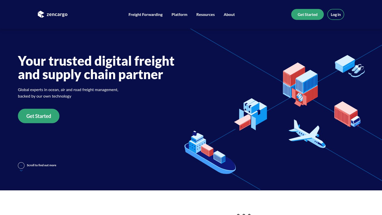
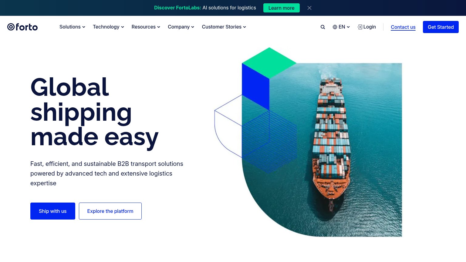
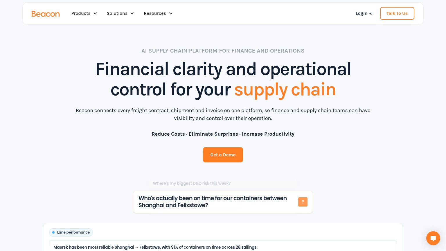

Problems
- no CTA visible on mobile fold
- no hero CTA — nav-only button
- generic label, no payoff named
- small footprint vs. headline
Value props
58FairTitle, subtitle, hero — do they sell the product's true value?
Derya’s headline vague
Derya operates your industrial sales, start to finish.
ONE PLACE TO PROCURE, SHIP, AND OPERATE
Working
- Eyebrow lists three concrete verbs
- "Start to finish" claims a full outcome
- Hero image matches the shipping category
Could improve
- Desktop says "sales", mobile says "logistics"
- No numbers or proof points anywhere
- No subhead explaining how it works
Information hierarchy
72FairDoes the design help or inhibit what the page is trying to say?
1234- Hero headline contrast — 'sales, start to finish' fades to low-contrast grey against the water, weakening the value prop's second half.
- Kicker copy legibility — 'ONE PLACE TO PROCURE, SHIP, AND OPERATE' is small monospace text over a busy wake — the positioning line nearly disappears.
- Logo marquee strip — A row of nine dim client logos crowds the fold's bottom edge and competes with the headline directly above it.
- GET STARTED isolation — The only CTA sits in the far top-right corner, outside the scan path of the bottom-left headline block, with no hero-level counterpart.