
Your landing page’s weakest score is Trust.
How Care GP ranks
64Growth scoreupdated
category scores
category scoresShowHide
Score over time
Trust
48PoorProof that the product is real, competent, and safe to try.
| Trust read | |
|---|---|
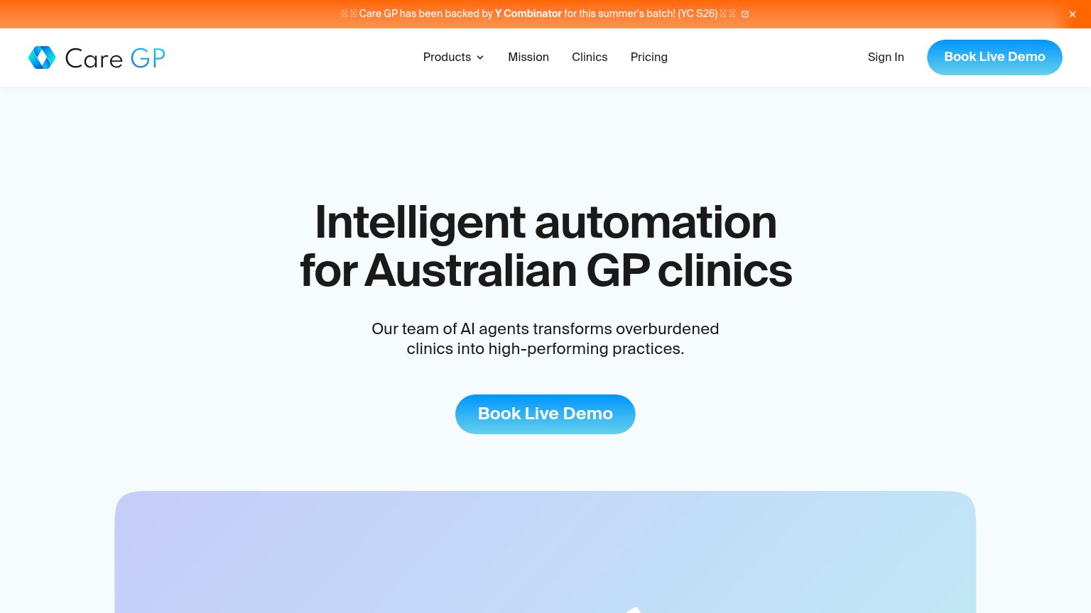
| Care GP | "Care GP has been backed by Y Combinator for this summer's batch! (YC S26)" banner |
| Interactive product widget with prompt bar "What should a patient know be…" and clinical chips (Look up, Research, Treat | |
| No visible trust signal identified. | |
| No visible trust signal identified. | |
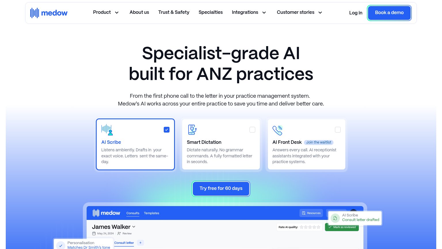
| Product UI screenshot showing a consult for "James Walker" with "AI Scribe — Consult letter drafted" toast and "Rate AI |
Value props
58FairTitle, subtitle, hero — do they sell the product's true value?
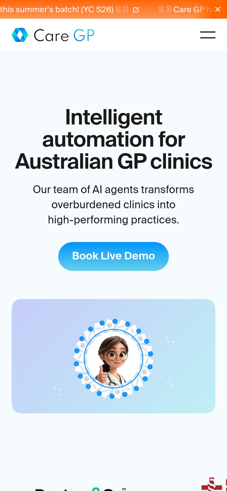
Care GP’s headline vague
Intelligent automation for Australian GP clinics
Our team of AI agents transforms overburdened clinics into high-performing practices.
Working
- Names exact audience: Australian GP clinics
- "Overburdened" hits the real pain
- Clean, single message with one CTA
Could improve
- "Intelligent automation" is a category, not a value
- No task, number, or outcome named
- Cartoon avatar hero shows nothing real
CTA
68FairCopy, size, verb, cost-feel — does the primary CTA earn the click?

Problems
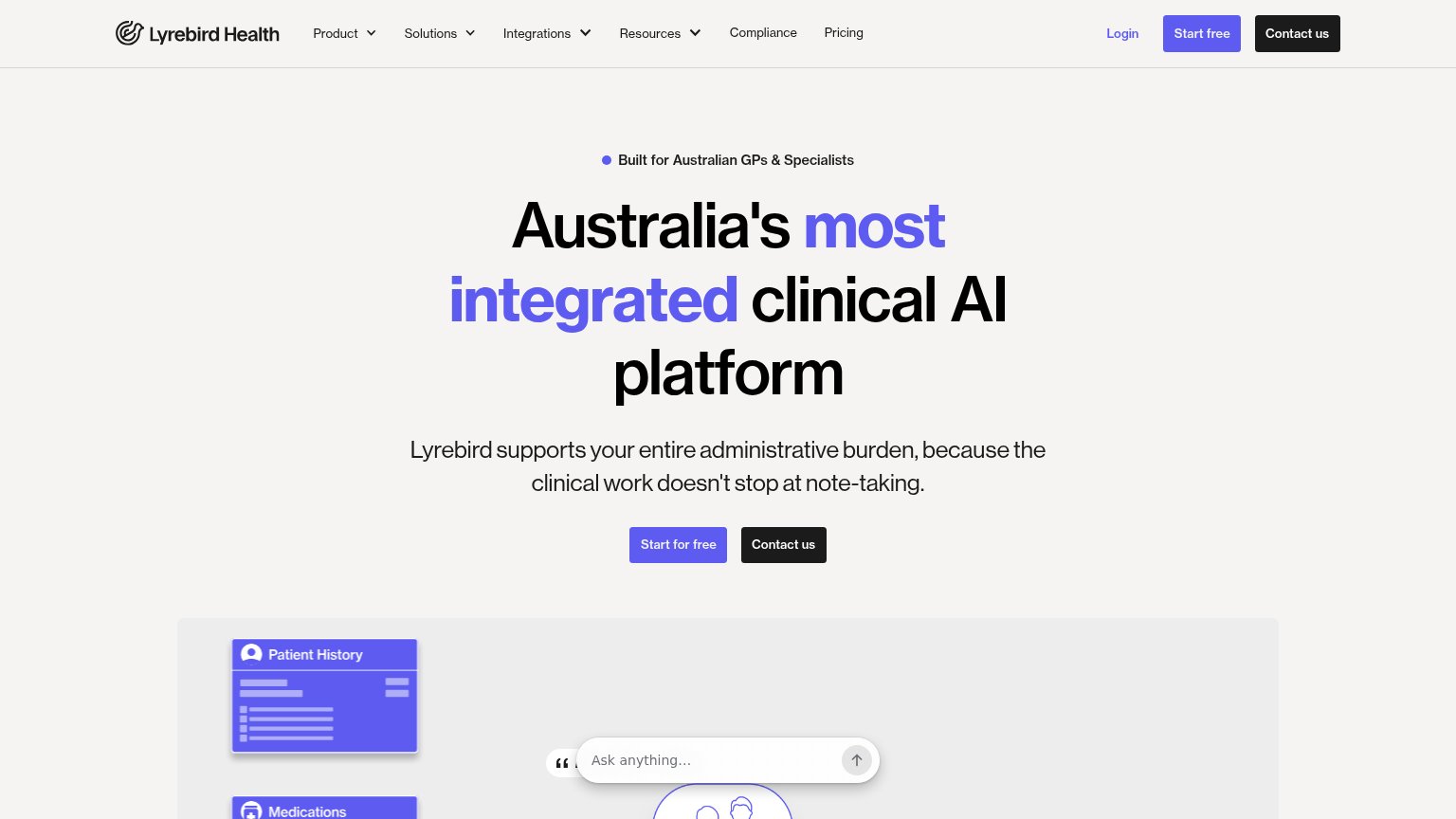
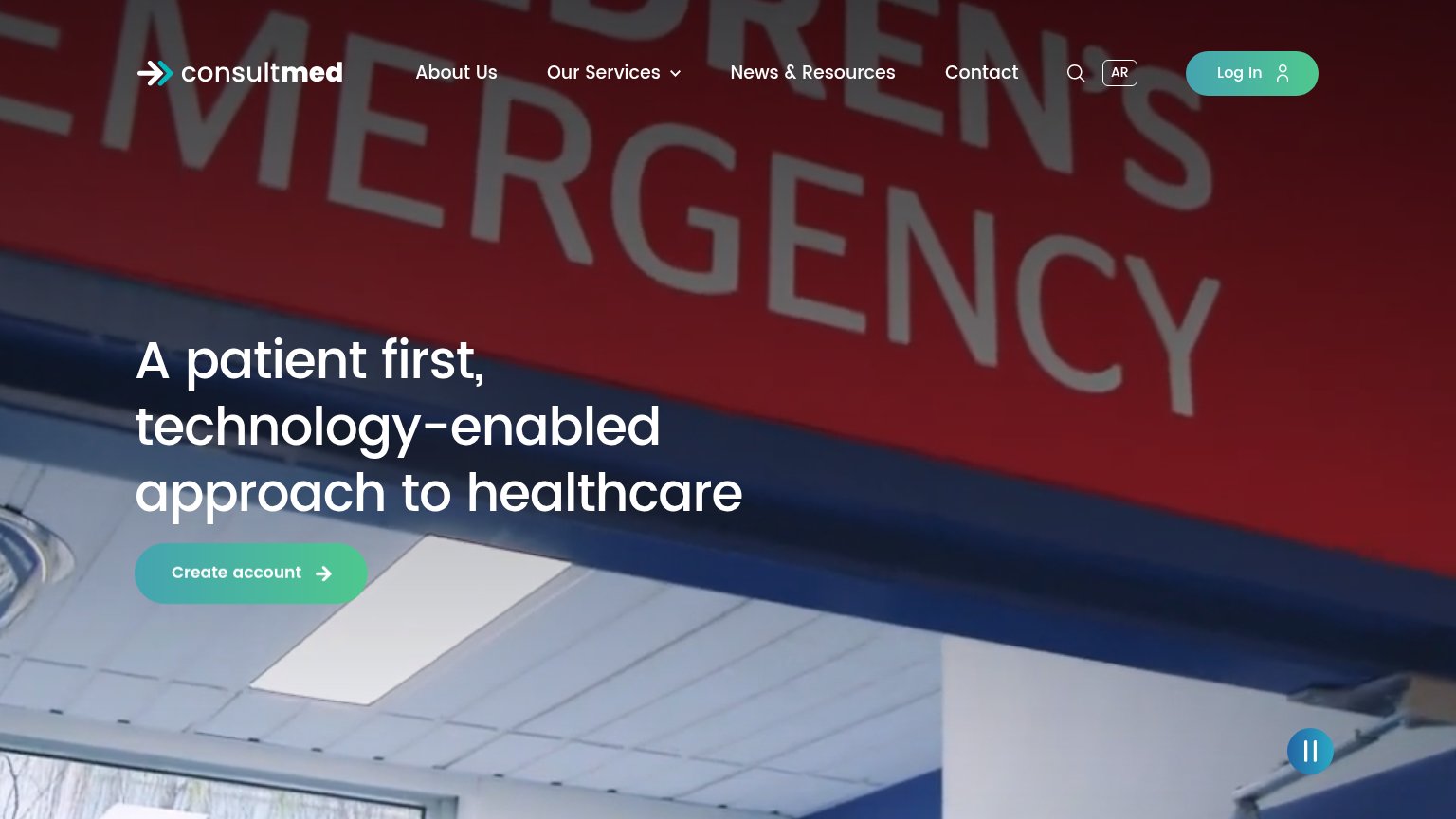
- 'Book Demo' feels costly/committal
- no low-friction alternative path
- implies sales call, not instant value
Mobile web
72FairThe phone experience as a first-class citizen.
 12
- YC announcement bar — Text is truncated mid-sentence and renders broken emoji as tofu boxes, making the first pixels of the page look broken.
- Book Live Demo button — Desktop-proportioned button floats at half the column width instead of the thumb-friendly near-full-bleed size mobile expects.
Information hierarchy
74FairDoes the design help or inhibit what the page is trying to say?
123- YC announcement banner — Broken emoji glyphs (tofu boxes) render on both captures, making the top strip look buggy and undermining trust before the headline.
- Duplicate Book Live Demo — The nav CTA repeats the hero CTA at equal weight, splitting attention between two identical actions in one viewport.
- Nav link row — Products, Mission, Clinics, Pricing and Sign In offer five exits before the demo booking, each styled at readable weight in the scan path.