
Your landing page’s weakest score is Trust.
How Consultmed ranks
59Growth scoreupdated
category scores
category scoresShowHide
Trust
38PoorProof that the product is real, competent, and safe to try.
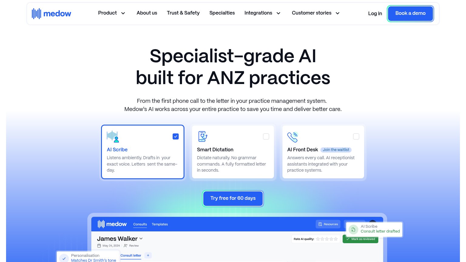
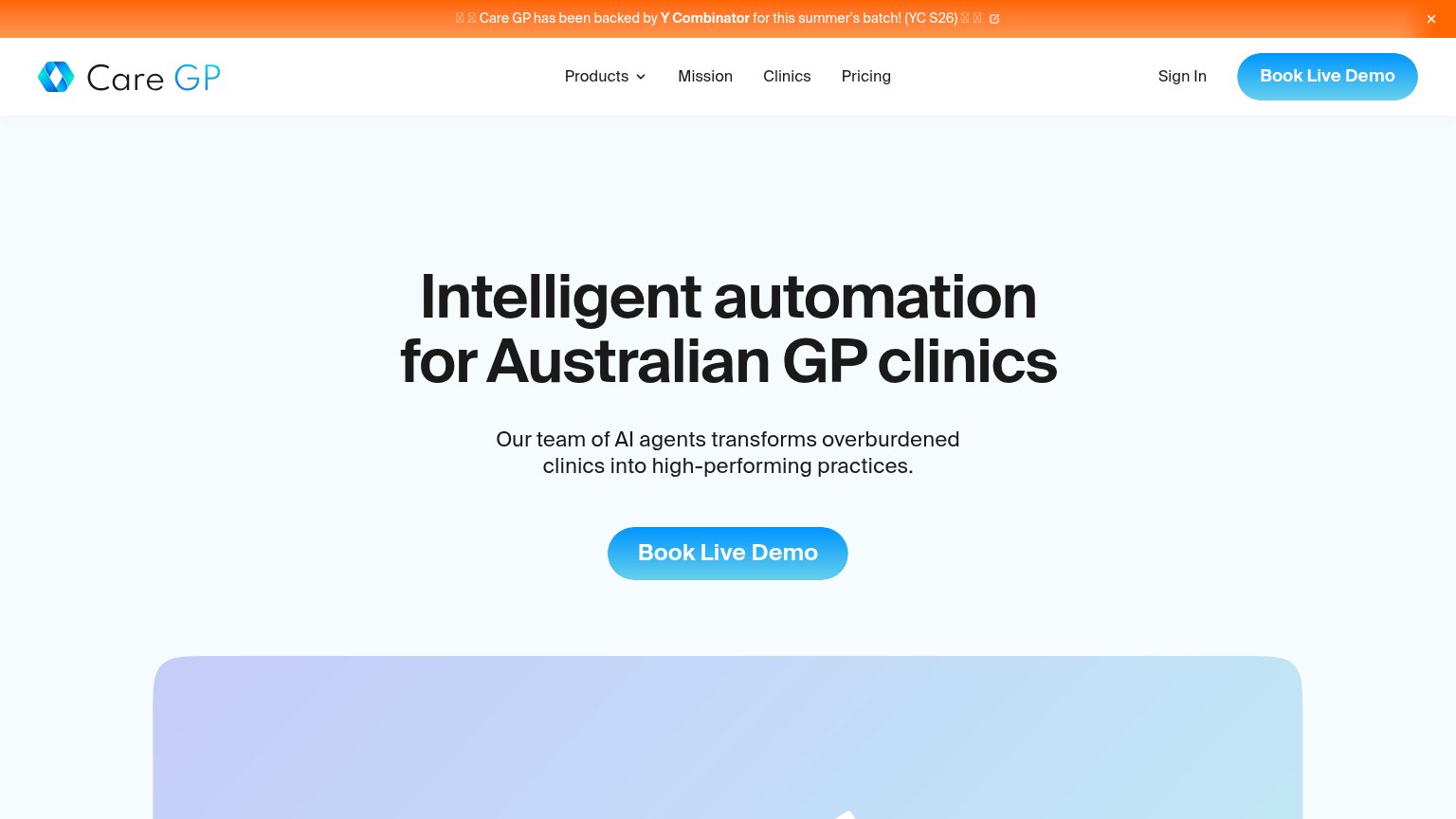

| Trust read | |
|---|---|
| Consultmed | No visible trust signal identified. |
| "Care GP has been backed by Y Combinator for this summer's batch! (YC S26)" banner | |
| Interactive product widget with prompt bar "What should a patient know be…" and clinical chips (Look up, Research, Treat | |
| No visible trust signal identified. | |
| Product UI screenshot showing a consult for "James Walker" with "AI Scribe — Consult letter drafted" toast and "Rate AI |
Value props
42PoorTitle, subtitle, hero — do they sell the product's true value?
Consultmed’s headline vague
A patient first, technology-enabled approach to healthcare
Working
- Signals healthcare domain instantly
- Patient-first framing feels humane
- Single clear CTA under headline
Could improve
- Headline could caption any health co
- No subhead — zero product specifics
- Video decorates, doesn't demonstrate
Information hierarchy
62FairDoes the design help or inhibit what the page is trying to say?
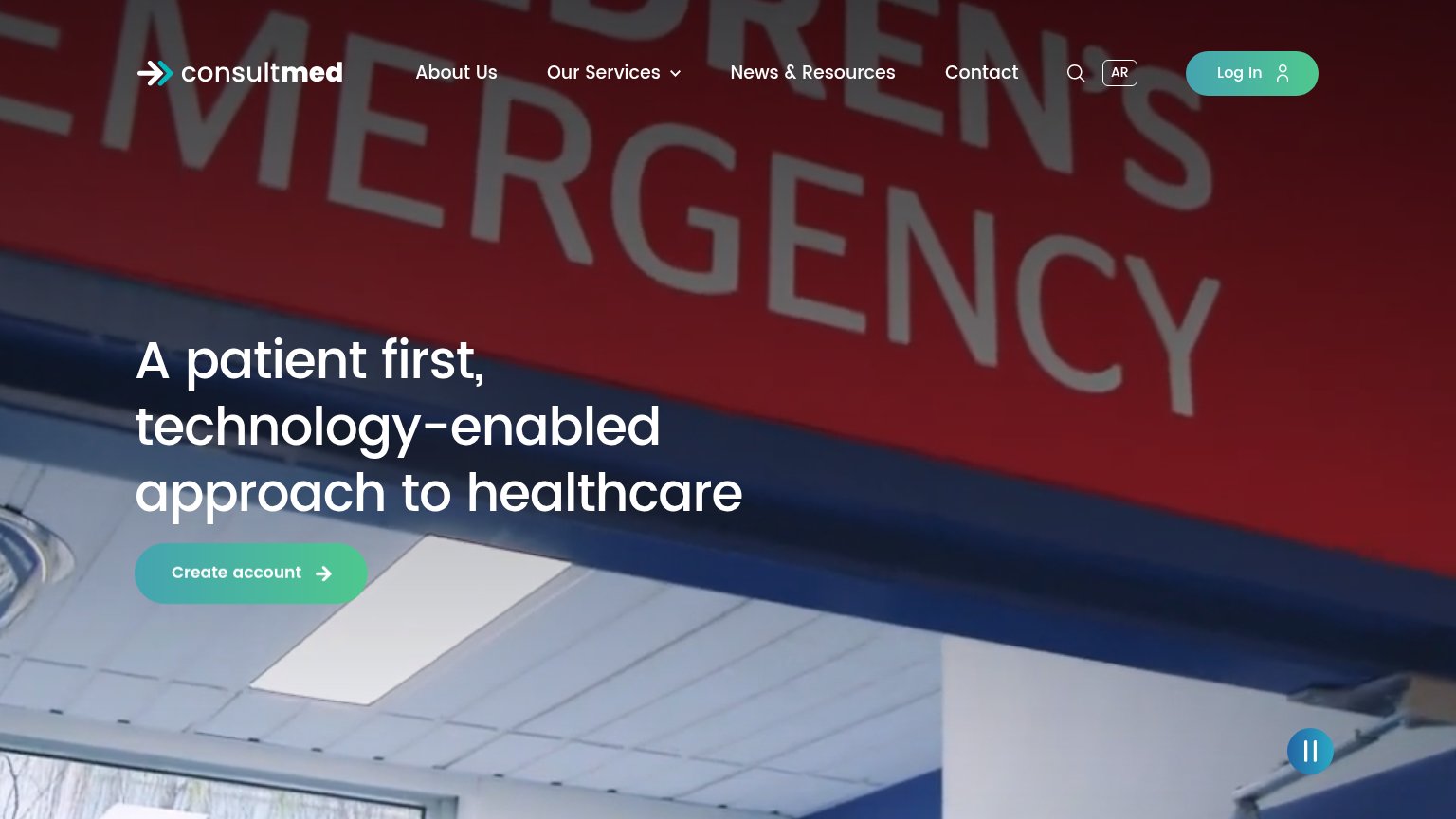
What works
What to improve
CTA
70FairCopy, size, verb, cost-feel — does the primary CTA earn the click?
How Consultmed compares
Recommended rewrites
Mobile web
82StrongThe phone experience as a first-class citizen.
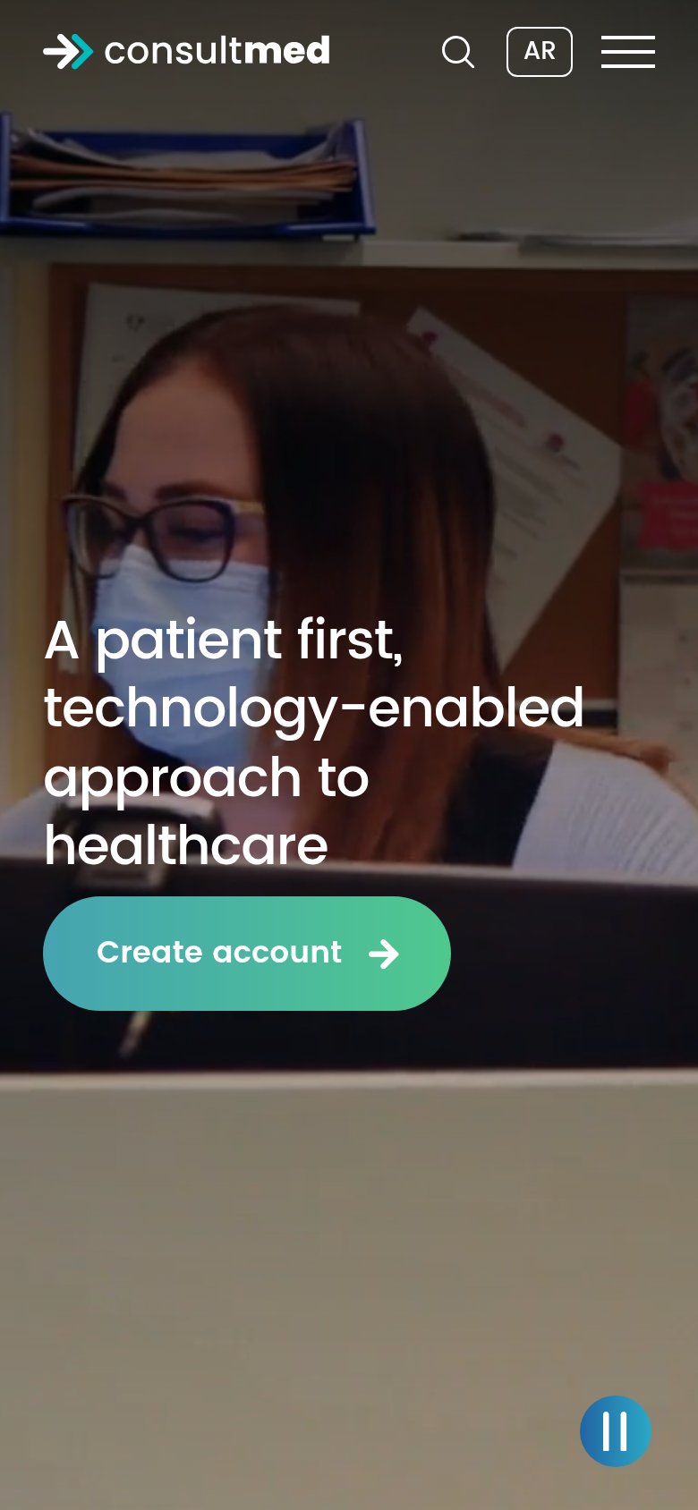
What works
What to improve