
Your landing page’s weakest score is Trust.
How Medow Health AI ranks
- 1.
Medow Health AI73
- 2.
Heidi Health70
- 3.
Care GP64
- 4.
Lyrebird Health64
- 5.
Consultmed59
73Growth scoreupdated
category scores
category scoresShowHide
Trust
58FairProof that the product is real, competent, and safe to try.
| Trust read | |
|---|---|
| Medow Health AI | Product UI screenshot showing a consult for "James Walker" with "AI Scribe — Consult letter drafted" toast and "Rate AI |
| "Care GP has been backed by Y Combinator for this summer's batch! (YC S26)" banner | |
| Interactive product widget with prompt bar "What should a patient know be…" and clinical chips (Look up, Research, Treat | |
| No visible trust signal identified. | |
| No visible trust signal identified. |
Information hierarchy
72FairDoes the design help or inhibit what the page is trying to say?
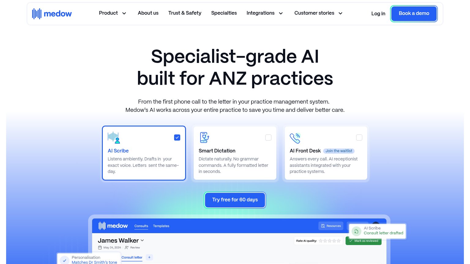 1234
- Book a demo button — Styled at identical weight and color to "Try free for 60 days", splitting the fold into two competing primary actions.
- Navigation link row — Seven nav items, three with dropdowns, plus Log in — a dense exit strip above the headline that leaks attention before the promise lands.
- Three feature cards — Checkbox-style toggles read as an interactive form, not a summary — visitors pause to decode what checking a card does before reaching the CTA.
- Product screenshot crop — The dashboard preview is cut mid-header at the fold line, so the strongest proof-of-product visual delivers no legible information above the fold.
Value props
76FairTitle, subtitle, hero — do they sell the product's true value?
Medow Health AI’s headline
Specialist-grade AI built for ANZ practices
From the first phone call to the letter in your practice management system. Medow's AI works across your entire practice to save you time and deliver better care.
Working
Could improve
CTA
78FairCopy, size, verb, cost-feel — does the primary CTA earn the click?
How Medow Health AI compares
Recommended rewrites
Mobile web
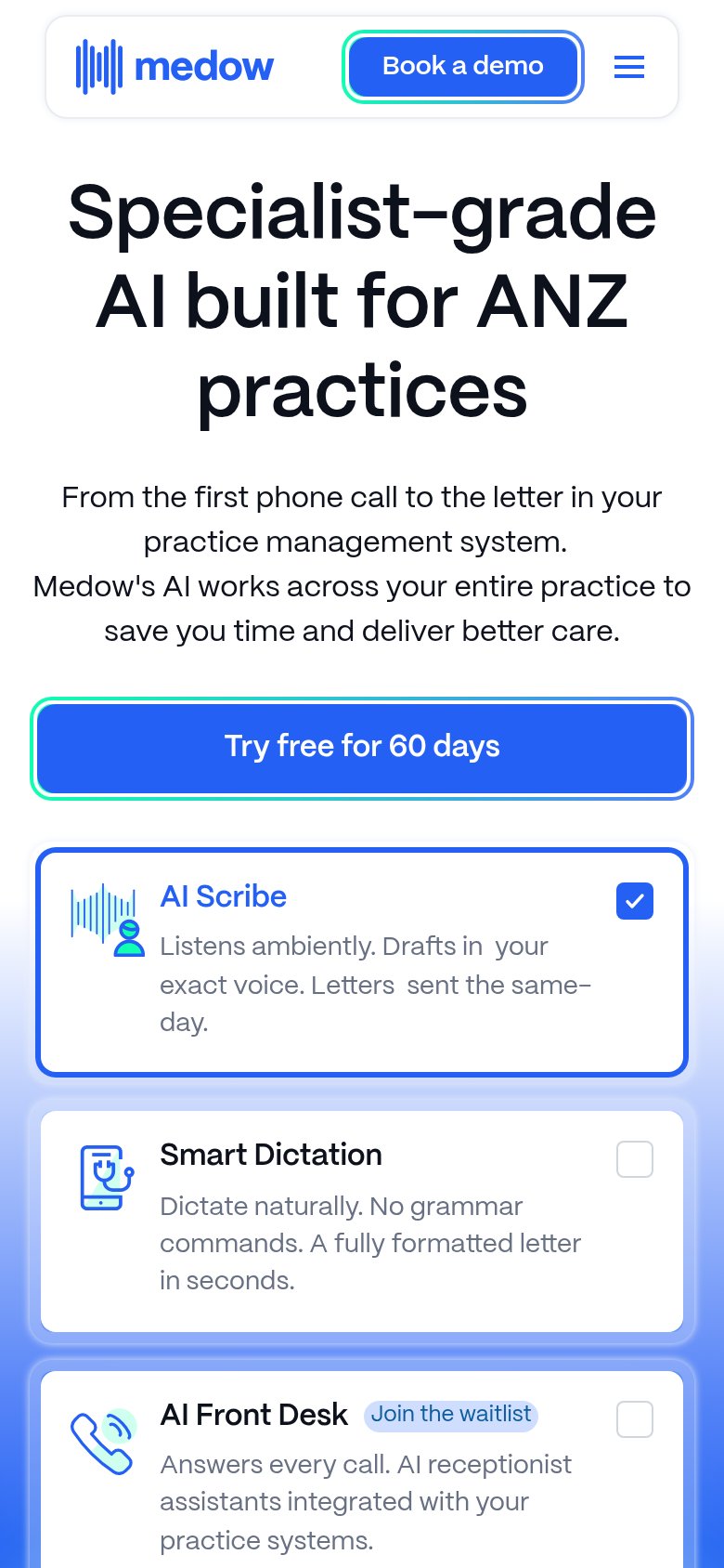
80StrongThe phone experience as a first-class citizen.
What works
What to improve