
Your landing page’s weakest score is CTA.
How Assemble ranks
64Growth scoreupdated
category scores
category scoresShowHide
Score over time
CTA
52FairCopy, size, verb, cost-feel — does the primary CTA earn the click?

Problems
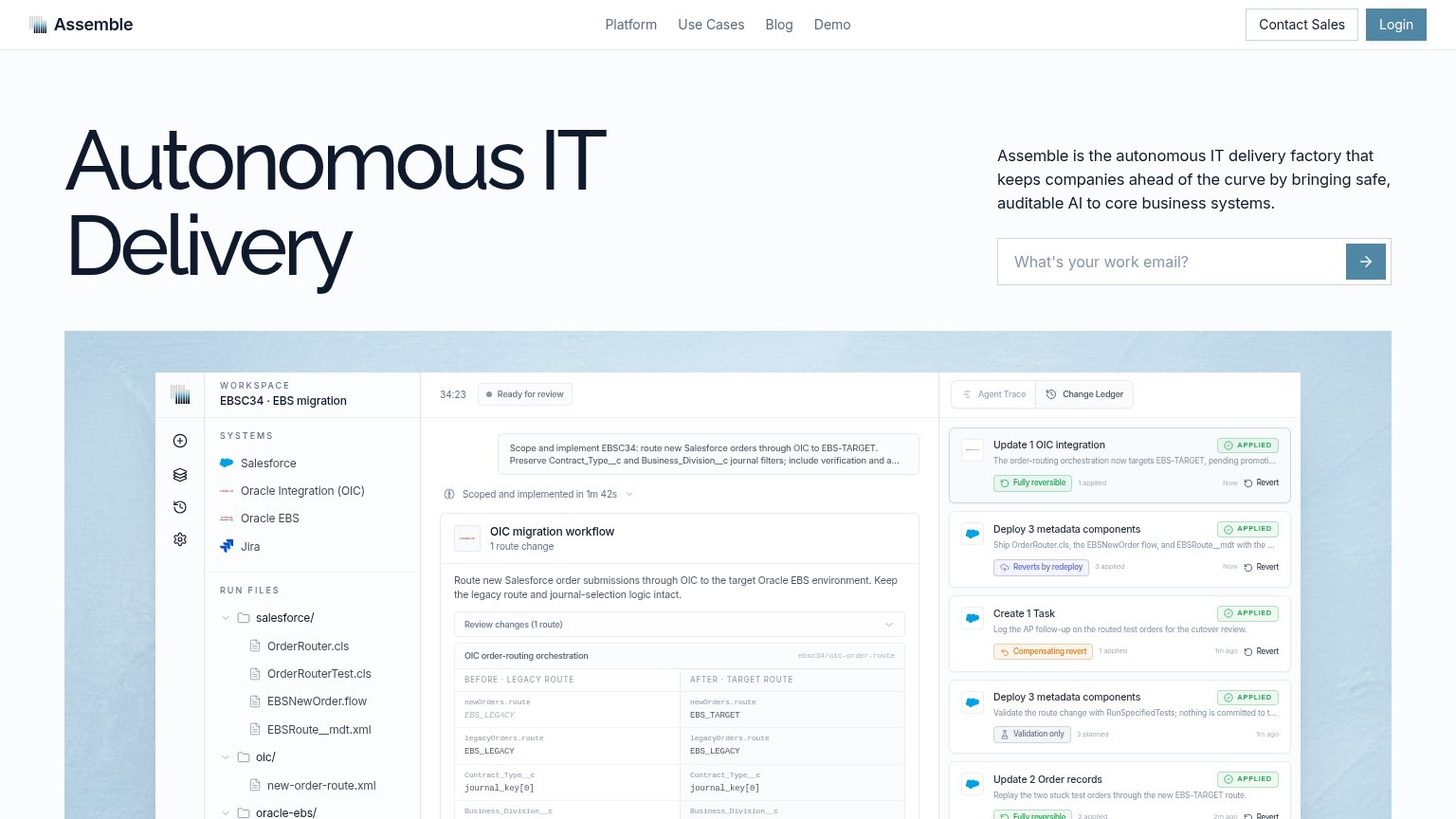
- unlabeled arrow submit
- asks for email, promises nothing
- no payoff stated near form
- sales-led with no self-serve path
Trust
56FairProof that the product is real, competent, and safe to try.
| Trust read | |
|---|---|
| Assemble | Product UI showing the EBS migration change ledger with "Fully reversible" and "Reverts by redeploy" badges and a before |
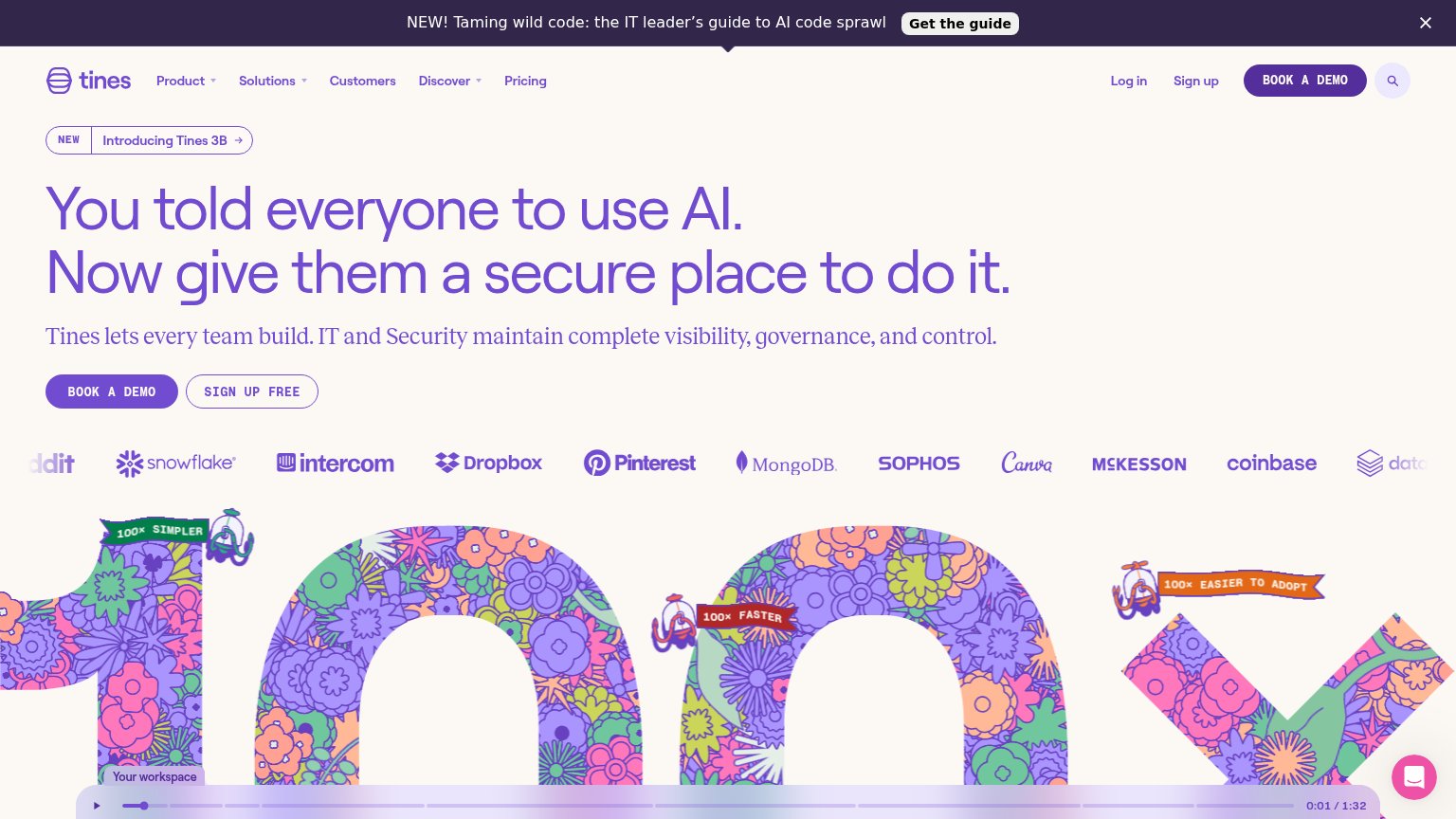
| Customer logo wall (Snowflake, Intercom, Dropbox, Pinterest, MongoDB, Sophos, Canva, McKesson, Coinbase) beneath the her | |
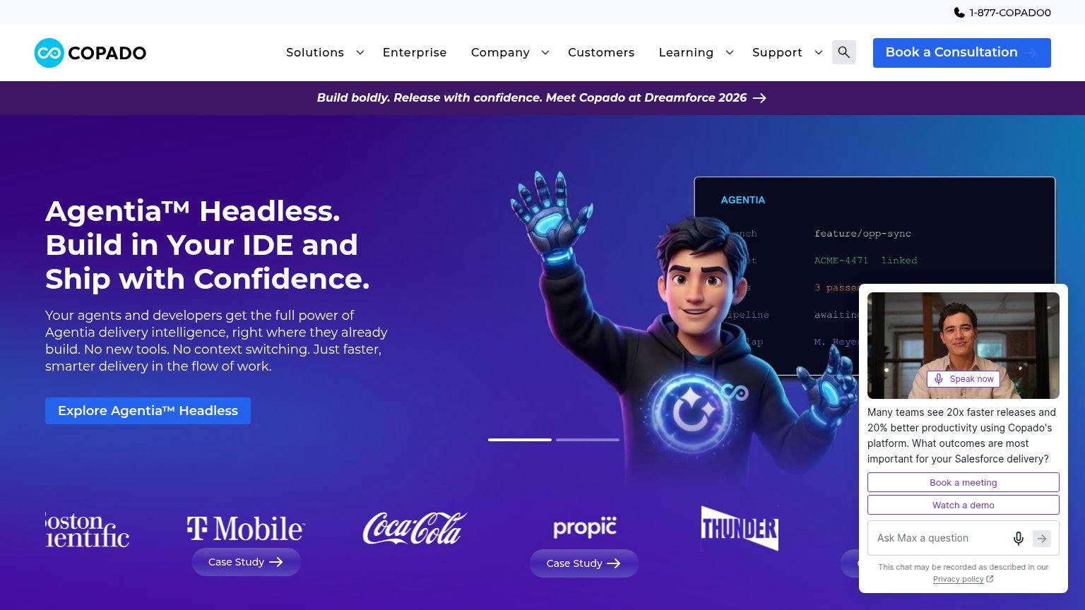
| Customer logo wall with T-Mobile, Coca-Cola, Boston Scientific and attached "Case Study" links | |
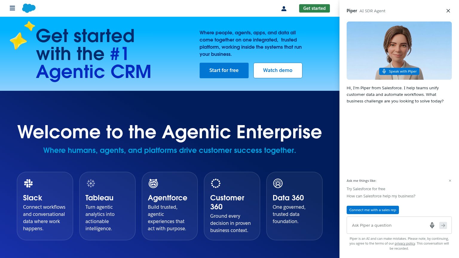
| "#1 Agentic CRM" headline claim | |
| implicit context Moveworks may benefit from pre-existing familiarity among its target audience. |
Value props
62FairTitle, subtitle, hero — do they sell the product's true value?
Assemble’s headline vague
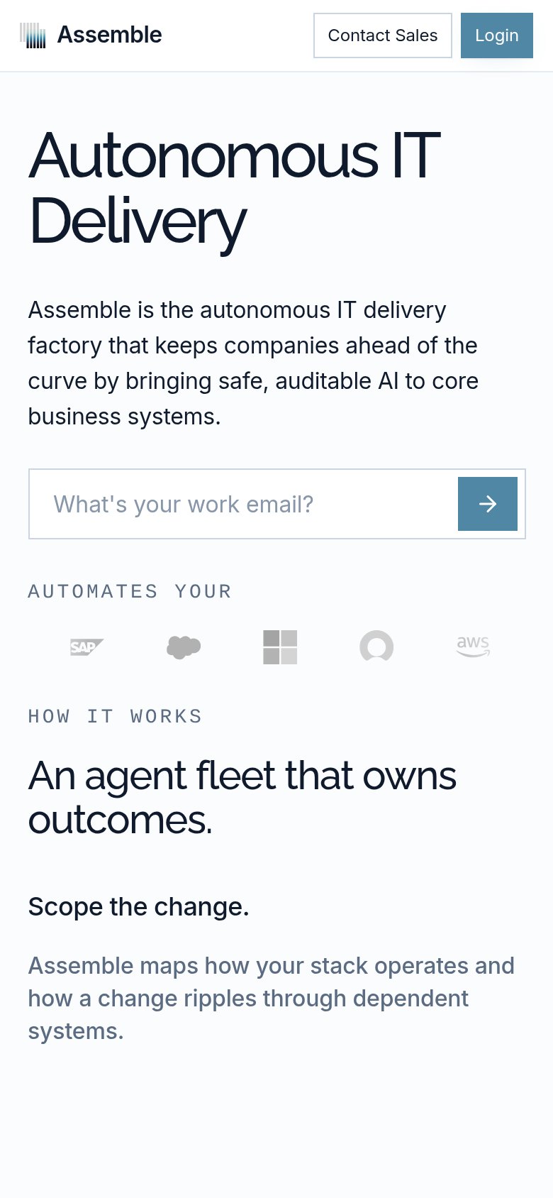
Autonomous IT Delivery
Assemble is the autonomous IT delivery factory that keeps companies ahead of the curve by bringing safe, auditable AI to core business systems.
Working
- Hero screenshot shows the agent doing real work
- 'Safe, auditable' addresses the key enterprise fear
- Reversible/Revert UI proves the safety claim
Could improve
- Headline is a category label, not an outcome
- 'Ahead of the curve' is generic filler
- No numbers or proof points anywhere in fold
Information hierarchy
72FairDoes the design help or inhibit what the page is trying to say?
1234- Header nav links — Four nav links plus 'Contact Sales' and 'Login' create six exit paths before the email capture gets a chance.
- Email submit arrow — Primary CTA is an unlabeled arrow icon — the single conversion action on the page has no verb and low visual weight.
- Contact Sales button — Outlined button styled at near-equal weight to the primary conversion, splitting attention at the top-right scan terminus.
- Product screenshot ledger panel — Dense three-column UI with dozens of micro-labels sits directly under the hero and pulls the eye into unreadable detail.
Mobile web
76FairThe phone experience as a first-class citizen.
 12
- Arrow-only submit button — Small unlabeled arrow square is a weak tap target; a full-width labeled button would convert better.
- Header button pair — Contact Sales and Login crowd the top bar with secondary actions while the main nav links vanish with no hamburger.