
Your landing page’s weakest score is Information hierarchy.
How Copado ranks
61Growth scoreupdated
category scores
category scoresShowHide
Information hierarchy
54FairDoes the design help or inhibit what the page is trying to say?
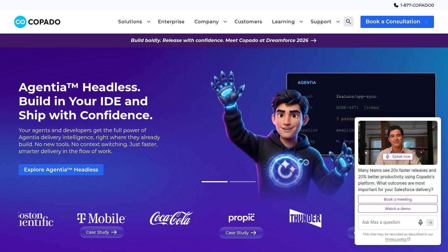 1234
- Chatbot widget panel — Auto-expanded panel with 'Book a meeting' and 'Watch a demo' buttons competes directly with the primary CTA and covers the hero visual.
- Top navigation bar — Six nav items plus search and phone number create a dozen exit paths before the visitor reaches 'Book a Consultation'.
- Dreamforce banner — Full-width announcement with its own arrow link sits between the nav and headline, adding a competing message and exit.
- Case Study buttons — Multiple 'Case Study' CTAs in the logo strip pull attention away from 'Explore Agentia™ Headless'.
Mobile web
58FairThe phone experience as a first-class citizen.
 1234
- Ask Max chat bubble — Proactive chat message covers a large slice of the fold and blocks the product screenshot with no conversion-valuable CTA.
- Headline block — Six lines of oversized headline plus a five-line subhead push the CTA to the very bottom of the first viewport.
- Explore Agentia button — Desktop-proportioned button floats at roughly half the column width instead of thumb-friendly full-bleed.
- Dreamforce promo banner — Two-line promo strip stacks under an already tall header, eating the top of the hero.
Value props
62FairTitle, subtitle, hero — do they sell the product's true value?
Copado’s headline
Agentia™ Headless. Build in Your IDE and Ship with Confidence.
Your agents and developers get the full power of Agentia delivery intelligence, right where they already build. No new tools. No context switching. Just faster, smarter delivery in the flow of work.
Working
Could improve
CTA
63FairCopy, size, verb, cost-feel — does the primary CTA earn the click?
How Copado compares
Recommended rewrites
Trust
68FairProof that the product is real, competent, and safe to try.
How Copado compares
Trust read