
Your landing page’s weakest score is CTA.
How Tines ranks
73Growth scoreupdated
category scores
category scoresShowHide
CTA
70FairCopy, size, verb, cost-feel — does the primary CTA earn the click?
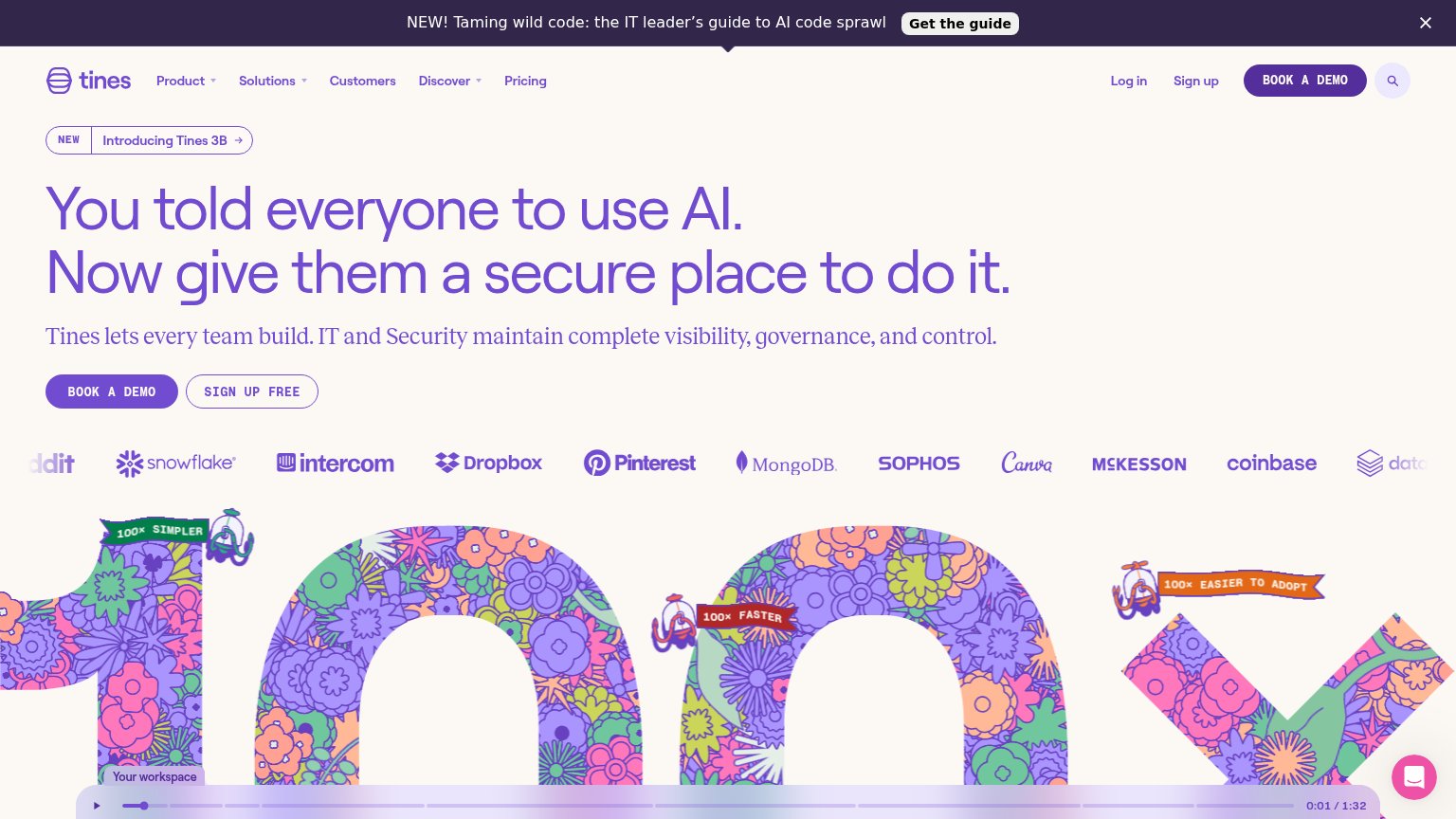
Problems
- demo booking feels costly
- free path demoted to secondary
- no 'free' despite visible free tier
Information hierarchy
72FairDoes the design help or inhibit what the page is trying to say?
1234- Announcement banner — "Get the guide" sits above the headline and diverts first attention to a content download instead of the demo.
- Tines 3B pill — The "Introducing Tines 3B" link is the first element in the hero column, adding an exit before the value prop is read.
- Header BOOK A DEMO — Duplicates the hero's primary button at equal weight, splitting the one action across two same-styled targets.
- Log in / Sign up cluster — Three same-weight account links plus search stack more exits beside the header CTA, diluting the scan path.
Trust
72FairProof that the product is real, competent, and safe to try.
How Tines compares
Trust read
Mobile web
72FairThe phone experience as a first-class citizen.
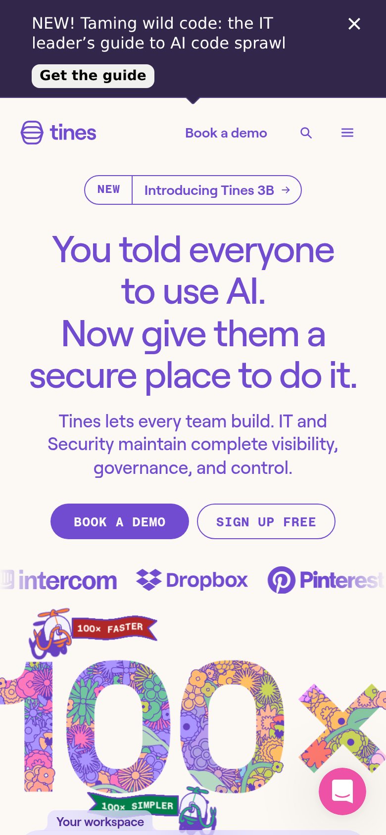
What works
What to improve
Value props
78FairTitle, subtitle, hero — do they sell the product's true value?
Tines’s headline
You told everyone to use AI. Now give them a secure place to do it.
Tines lets every team build. IT and Security maintain complete visibility, governance, and control.
Working
Could improve