
Your landing page’s weakest score is Trust.
How Alloovium ranks
66Growth scoreupdated
category scores
category scoresShowHide
Score over time
Trust
42PoorProof that the product is real, competent, and safe to try.

| Trust read | |
|---|---|
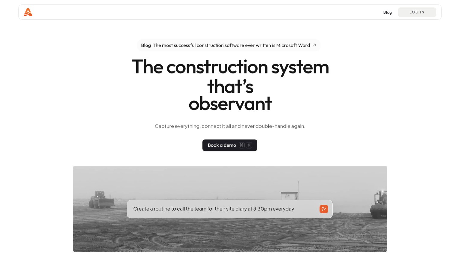
| Alloovium | Prompt-input demo overlay reading "Create a routine to call the team for their site diary at 3:30pm everyday" on the her |
| "STORM" product UI overlay on the hero photo showing weather/time data capture | |
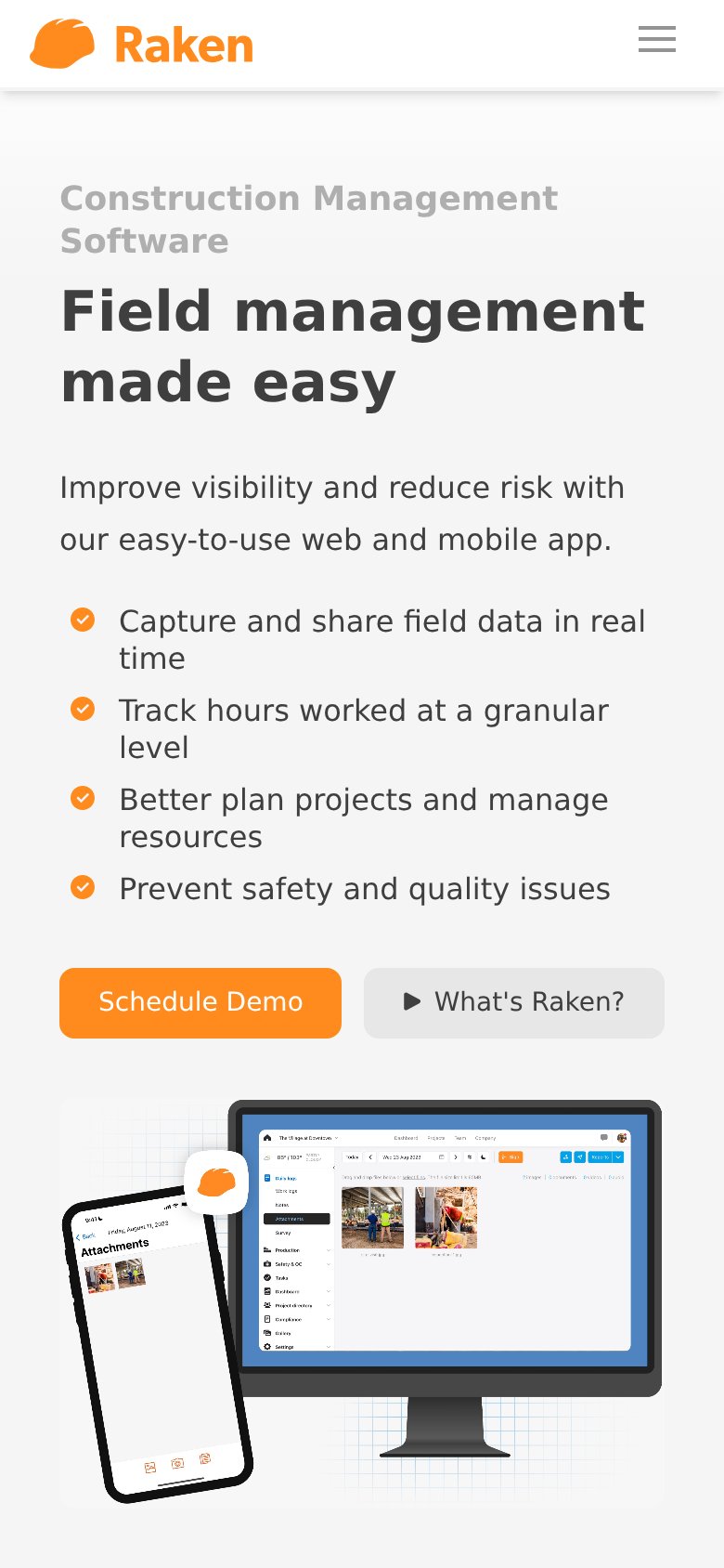
| Real product UI screenshots: web dashboard with daily logs, attachments, and jobsite photos plus the mobile field-captur | |
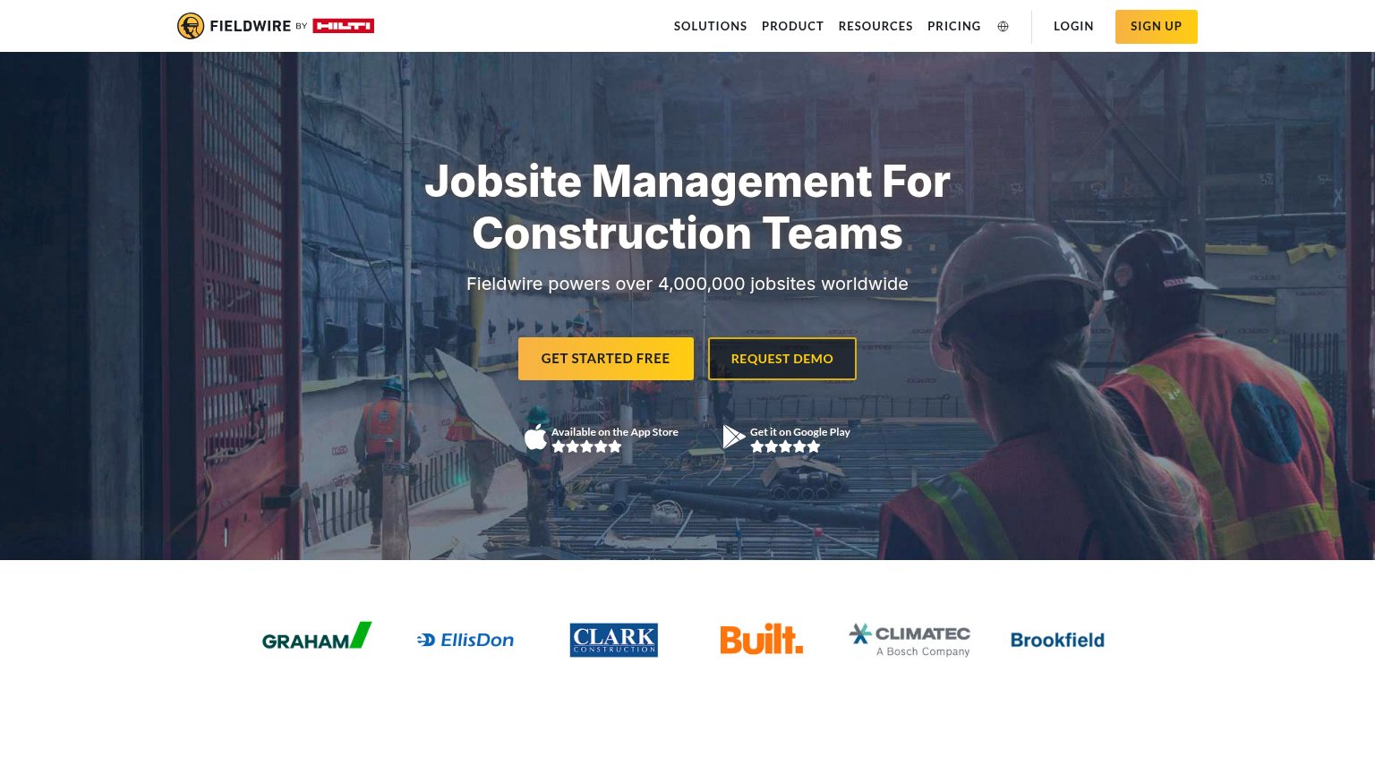
| Fieldwire powers over 4,000,000 jobsites worldwide | |
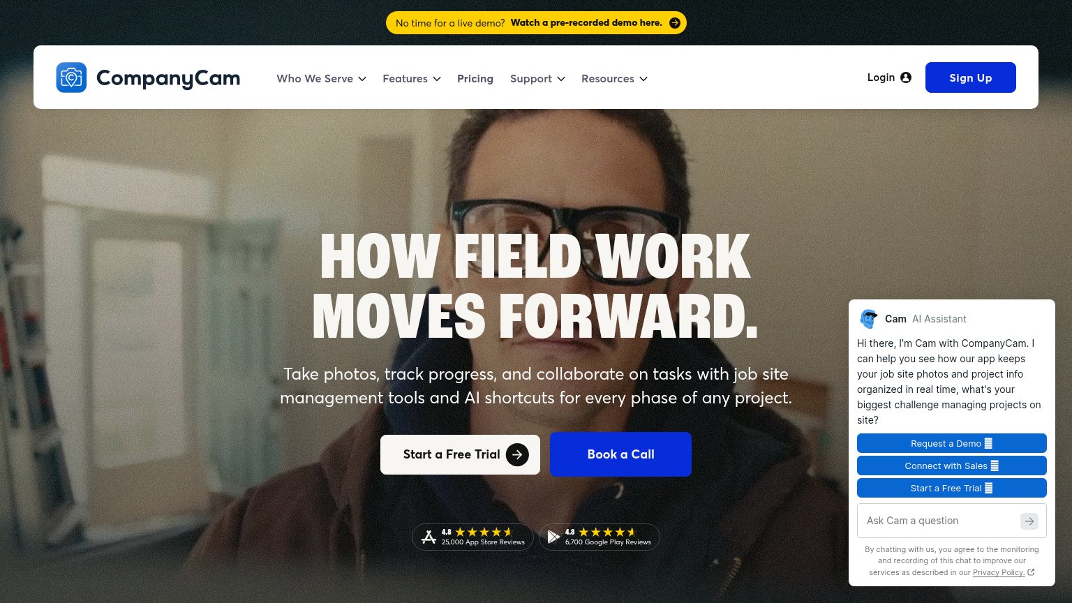
| 4.8 ★ 25,000 App Store Reviews / 4.8 ★ 6,700 Google Play Reviews badges under the hero CTAs | |
| Hero video showing an 'Ask a question' product UI overlay on real jobsite footage |
Value props
62FairTitle, subtitle, hero — do they sell the product's true value?
Alloovium’s headline undersells
The construction system that's observant
Capture everything, connect it all and never double-handle again.
Working
- "Never double-handle again" hits a real GC pain
- Hero demo shows a real command, not decoration
- Names the audience's category: construction
Could improve
- Headline sells an adjective, not an outcome
- No numbers or proof points in the fold
- Clearest positioning line buried below hero
CTA
68FairCopy, size, verb, cost-feel — does the primary CTA earn the click?

Problems
- 'demo' click feels like a sales call
- prompt input below isn't actionable
- bare arrow submit on the input
- no self-serve path visible
Mobile web
76FairThe phone experience as a first-class citizen.
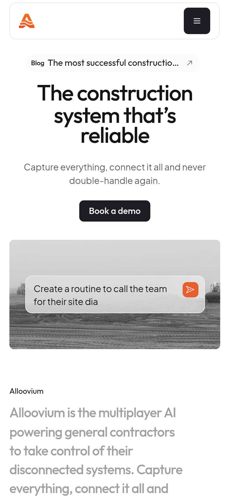
No specific callouts
Alloovium's mobile fold is clean and focused: the nav collapses to a logo plus a single hamburger, the "The construction system that's reliable" headline scales to three comfortable lines, and the "Book a demo" CTA is visible and tappable in the first viewport with no pop-ups or banners in the way. The main gaps are execution details — the "Book a demo" button stays at desktop proportions instead of stretching near full-width, the blog pill above the headline truncates to "The most successful constructio...", and the embedded product prompt clips mid-word at "site dia", which makes the flagship AI demo look broken on the device most visitors use. The biggest lever is widening the primary CTA to a full-bleed, thumb-height button so the one action on the page matches mobile tap conventions.
Information hierarchy
82StrongDoes the design help or inhibit what the page is trying to say?
123- Blog announcement pill — Sits above the headline in the scan path and links attention out to an article before the value prop is read.
- Log in pill — Low-contrast gray-on-gray label reads as a disabled control rather than a deliberate secondary action.
- Keyboard shortcut badge — The ⌘K hint inside 'Book a demo' adds developer-tool noise that dilutes a construction audience's one action.