
Your landing page’s weakest score is Information hierarchy.
How CompanyCam ranks
73Growth scoreupdated
category scores
category scoresShowHide
Information hierarchy
68FairDoes the design help or inhibit what the page is trying to say?
 1234
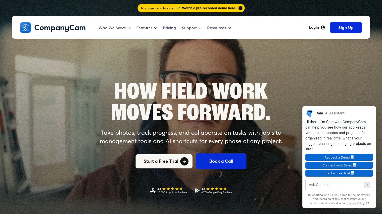
- Open Cam chat widget — Auto-expanded panel adds three same-weight blue CTAs that duplicate and compete with the hero's trial button.
- Book a Call button — Solid blue styling gives it equal or greater weight than 'Start a Free Trial', splitting the primary action.
- Yellow demo banner — Highest-contrast element on the page pulls the first glance to a pre-recorded demo exit before the headline.
- Nav plus Sign Up — Six dropdown items, Login, and Sign Up create eight exits before the visitor reaches the hero CTA.
Value props
72FairTitle, subtitle, hero — do they sell the product's true value?
CompanyCam’s headline undersells
HOW FIELD WORK MOVES FORWARD.
Take photos, track progress, and collaborate on tasks with job site management tools and AI shortcuts for every phase of any project.
Working
- Subhead names photos, tasks, job sites
- Strong review counts: 25,000 + 6,700
- Mobile cards hit pain: 'No More Delays'
Could improve
- H1 is a tagline with no value claim
- Hero photo decorates, never demos app
- No outcome or number in headline
Trust
72FairProof that the product is real, competent, and safe to try.
How CompanyCam compares
Trust read
Mobile web
72FairThe phone experience as a first-class citizen.
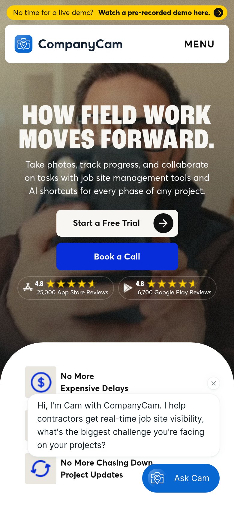
What works
What to improve
CTA
82StrongCopy, size, verb, cost-feel — does the primary CTA earn the click?
How CompanyCam compares
Recommended rewrites