
Your landing page’s weakest score is Trust.
How Slashy ranks
73Growth scoreupdated
category scores
category scoresShowHide
Score over time
Trust
52FairProof that the product is real, competent, and safe to try.

| Trust read | |
|---|---|
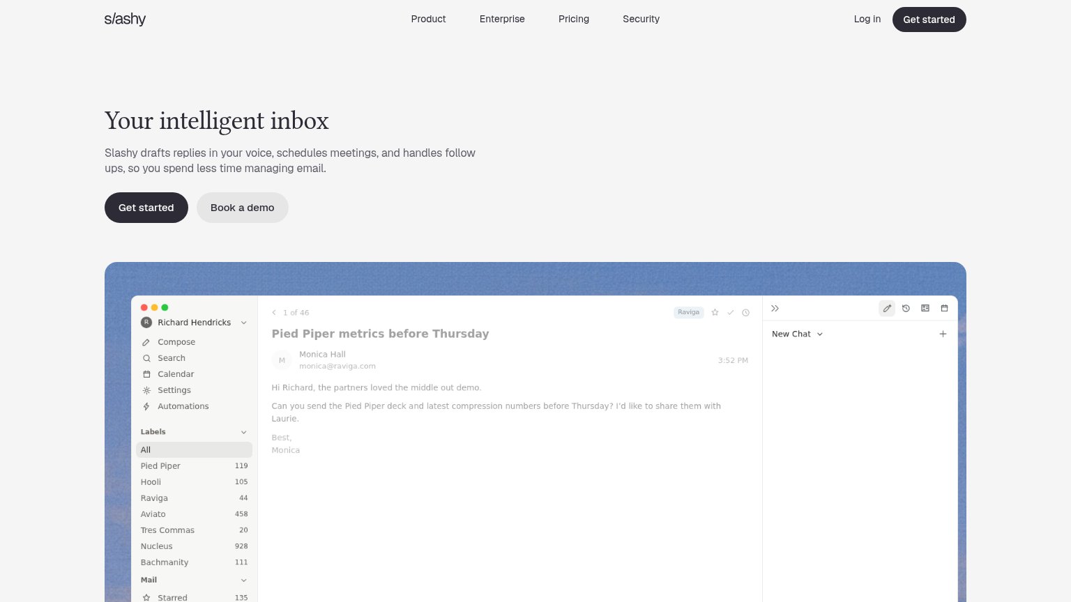
| Slashy | Detailed product screenshot showing the Slashy inbox UI with an email thread and AI chat panel drafting a reply |
| Rendered inbox UI with split tabs (Important 8, Calendar 18, Team 15, Docs 40) and an "Auto Draft to Karl" AI-composed r | |
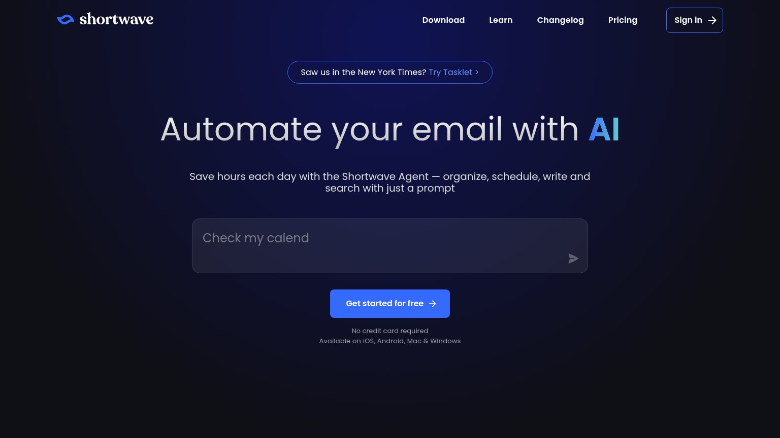
| "Saw us in the New York Times?" press banner | |
| Product UI demo with INBOX/MEETINGS/PRIORITIES/ACTIONS tabs showing a real email tagged "To Respond" from Elena Marsh | |
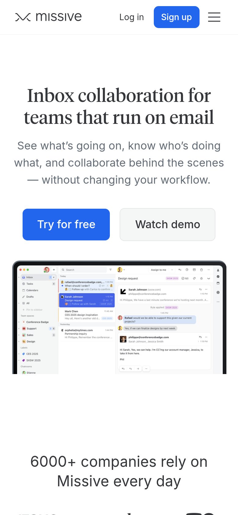
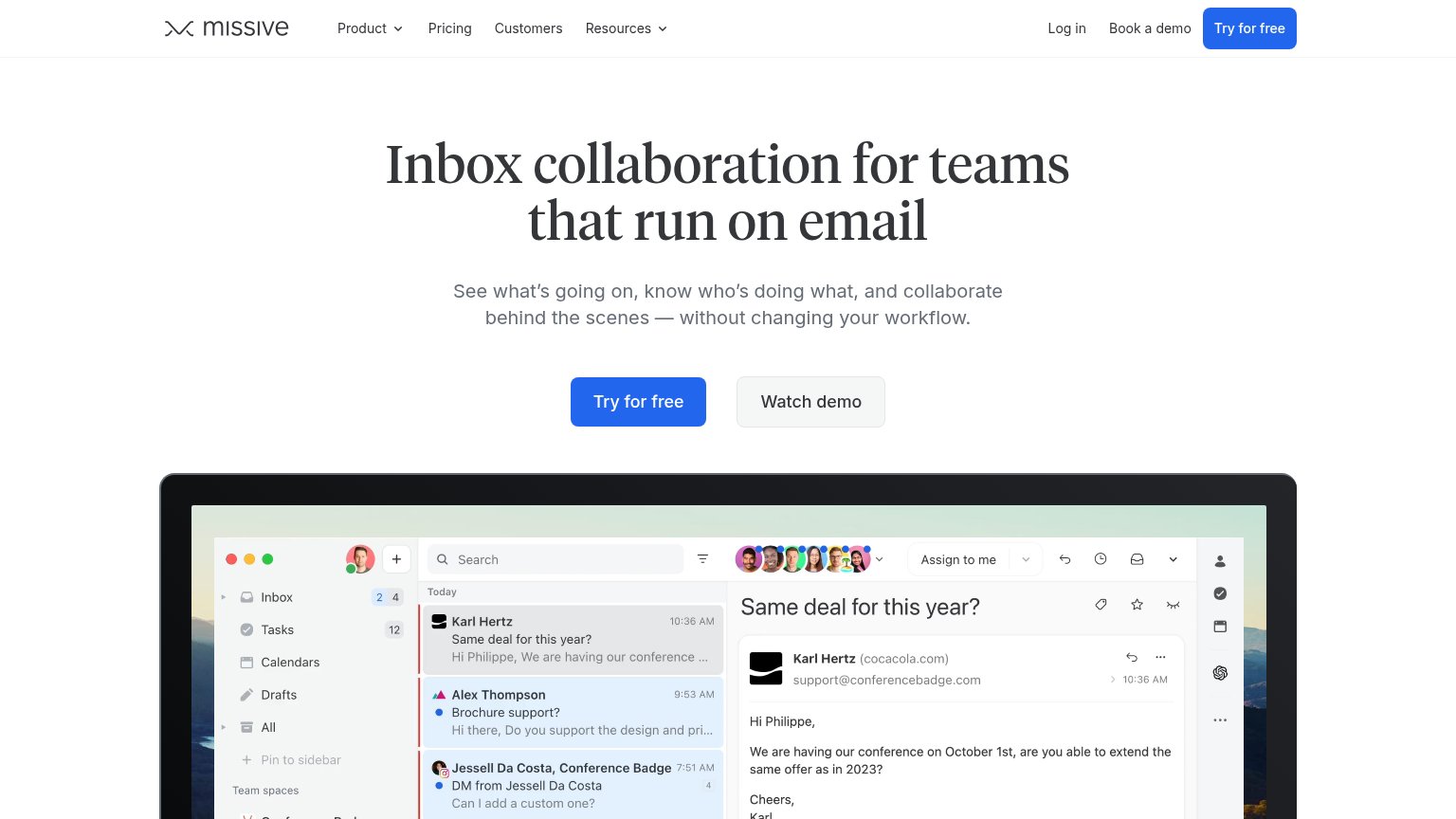
| "6000+ companies rely on Missive every day" usage claim (mobile capture) |
CTA
72FairCopy, size, verb, cost-feel — does the primary CTA earn the click?
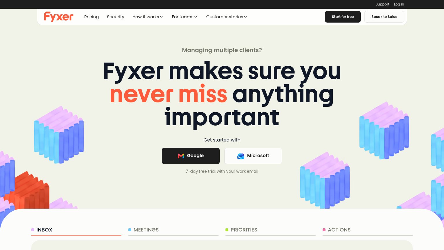
Problems
- generic label, no payoff named
- no echo of headline promise
- click implies signup, not value
Value props
78FairTitle, subtitle, hero — do they sell the product's true value?
Slashy’s headline sells
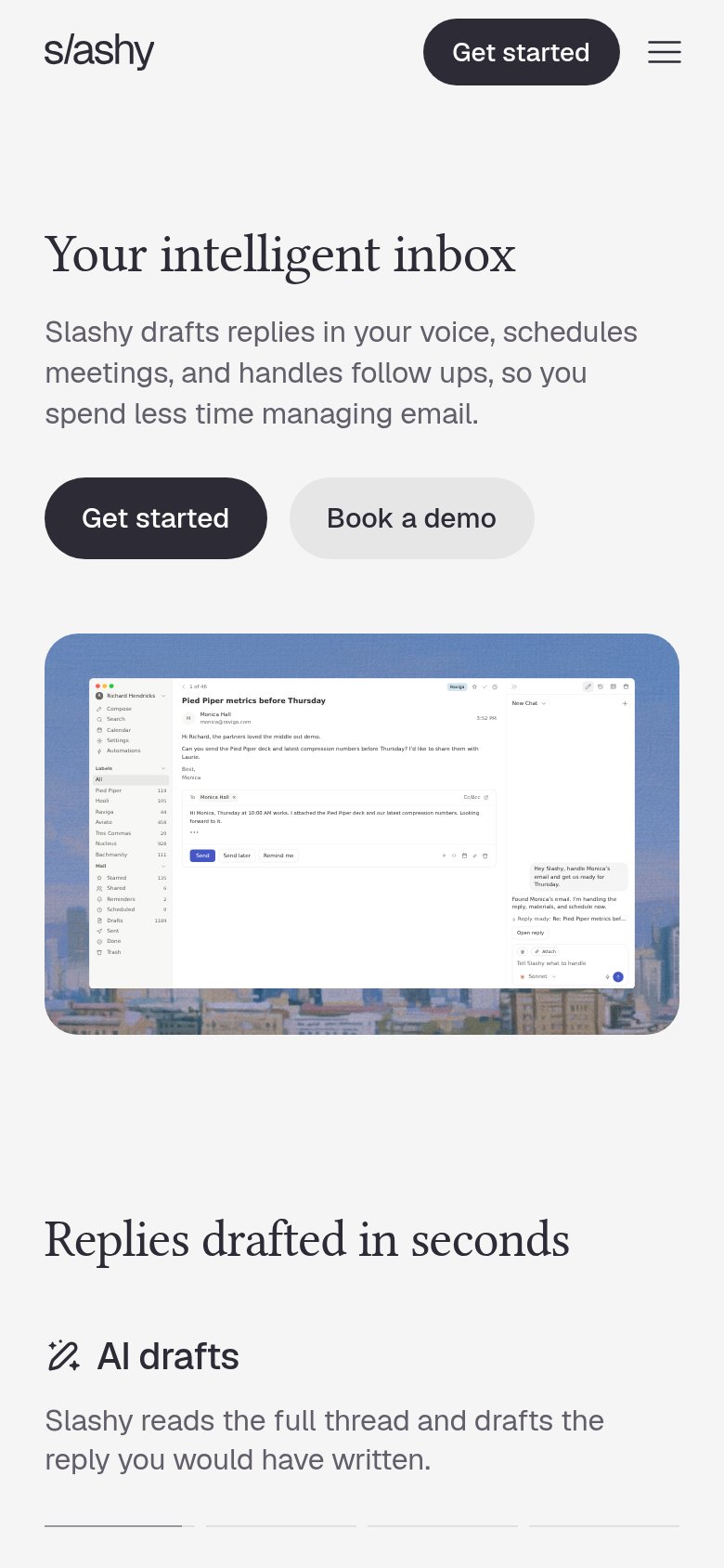
Your intelligent inbox
Slashy drafts replies in your voice, schedules meetings, and handles follow ups, so you spend less time managing email.
Working
- Subhead names three concrete jobs
- Outcome stated: less time on email
- Hero shows real inbox, not decoration
Could improve
- 'Intelligent inbox' is a soft abstraction
- No numbers anywhere in the fold
- Best line sits below the fold
Mobile web
80StrongThe phone experience as a first-class citizen.
 12
- Shrunken desktop screenshot — Full three-pane desktop UI scaled into a phone column; all text inside is illegibly small.
- Split CTA row — Primary Get started shares the row with Book a demo instead of taking a full-width, thumb-first tap target.
Information hierarchy
82StrongDoes the design help or inhibit what the page is trying to say?
12- Nav Get started button — Duplicates the hero CTA at equal visual weight, splitting the single conversion focus.
- Four-item nav links — Product, Enterprise, Pricing, Security plus Log in create five exits before the hero CTA.