
Your landing page’s weakest score is Trust.
How Superhuman ranks
- 1.
Shortwave78
- 2.
Missive76
- 3.
Slashy73
- 4.
Superhuman71
- 5.
Fyxer71
71Growth scoreupdated
category scores
category scoresShowHide
Trust
58FairProof that the product is real, competent, and safe to try.

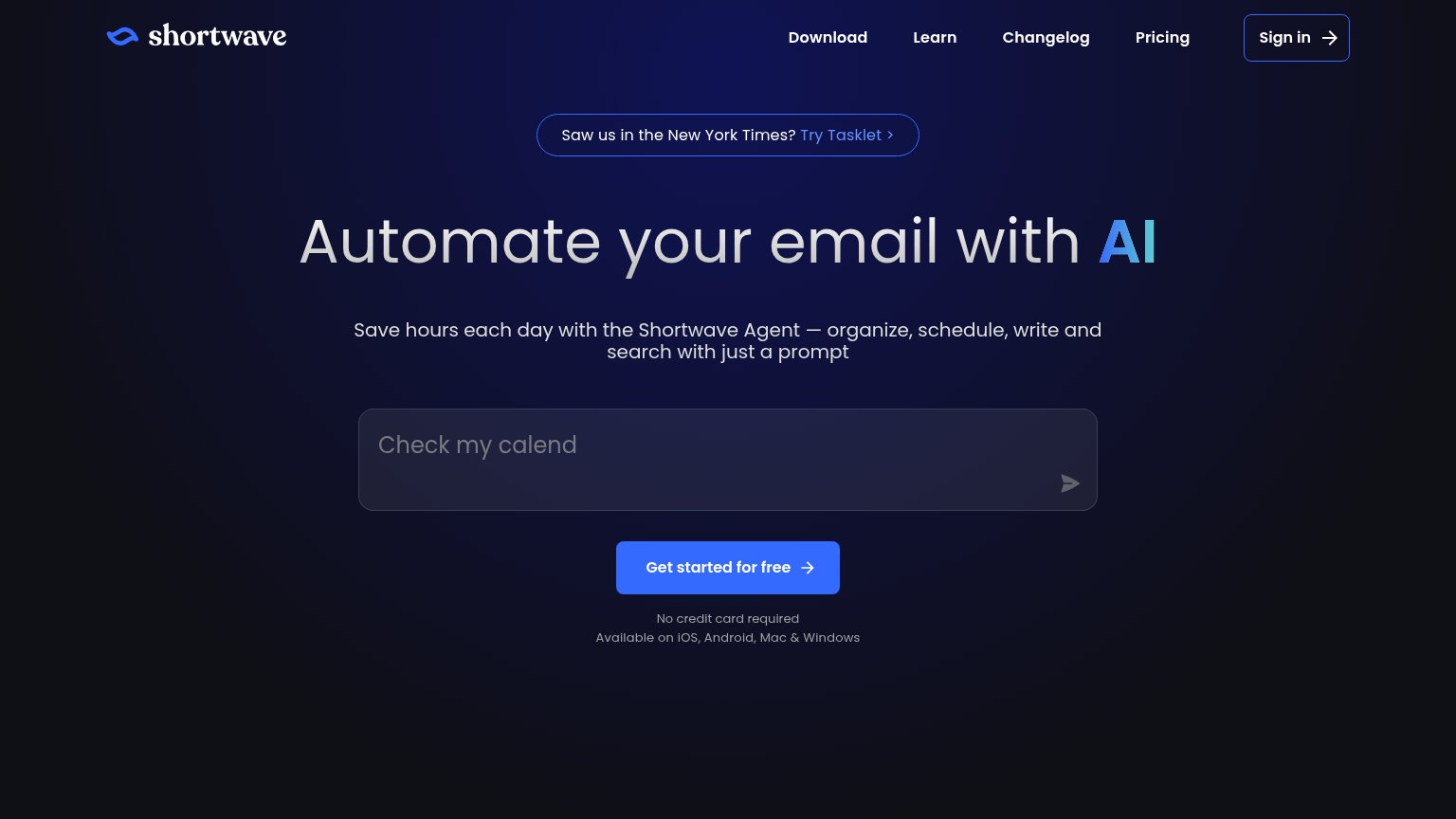
| Trust read | |
|---|---|
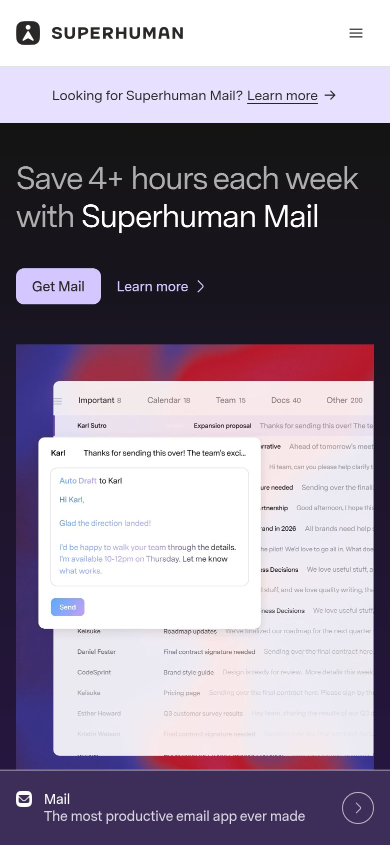
| Superhuman | Rendered inbox UI with split tabs (Important 8, Calendar 18, Team 15, Docs 40) and an "Auto Draft to Karl" AI-composed r |
| Detailed product screenshot showing the Slashy inbox UI with an email thread and AI chat panel drafting a reply | |
| "Saw us in the New York Times?" press banner | |
| Product UI demo with INBOX/MEETINGS/PRIORITIES/ACTIONS tabs showing a real email tagged "To Respond" from Elena Marsh | |
| "6000+ companies rely on Missive every day" usage claim (mobile capture) |
Information hierarchy
64FairDoes the design help or inhibit what the page is trying to say?
1234- Superhuman Mail banner — Full-width lavender banner outranks the hero and pulls first attention to a 'Learn more' exit before the value prop registers.
- Get Mail button — Small pale-lavender pill nearly matches the banner color; the adjacent 'Learn more' link splits clicks at equal scan weight.
- Top navigation bar — Six dropdown menus plus 'Contact sales' and 'Sign in' create nine exit paths before the fold's single action.
- Product toolkit list — Mail/Go/Docs rows introduce three competing product messages in the same fold as the Mail-only headline.
CTA
72FairCopy, size, verb, cost-feel — does the primary CTA earn the click?
How Superhuman compares
Recommended rewrites
Mobile web
78FairThe phone experience as a first-class citizen.
What works
What to improve
Value props
82StrongTitle, subtitle, hero — do they sell the product's true value?
Superhuman’s headline
Save 4+ hours each week with Superhuman Mail
One toolkit to win your workday
Working
Could improve