
Your landing page’s weakest score is Trust.
How Missive ranks
76Growth scoreupdated
category scores
category scoresShowHide
Trust
58FairProof that the product is real, competent, and safe to try.
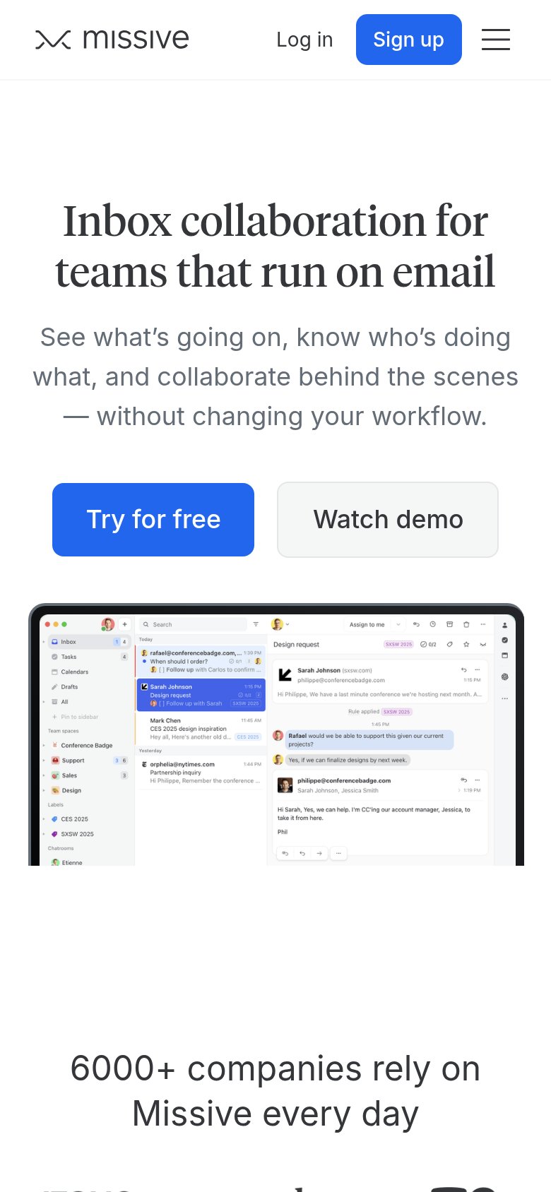
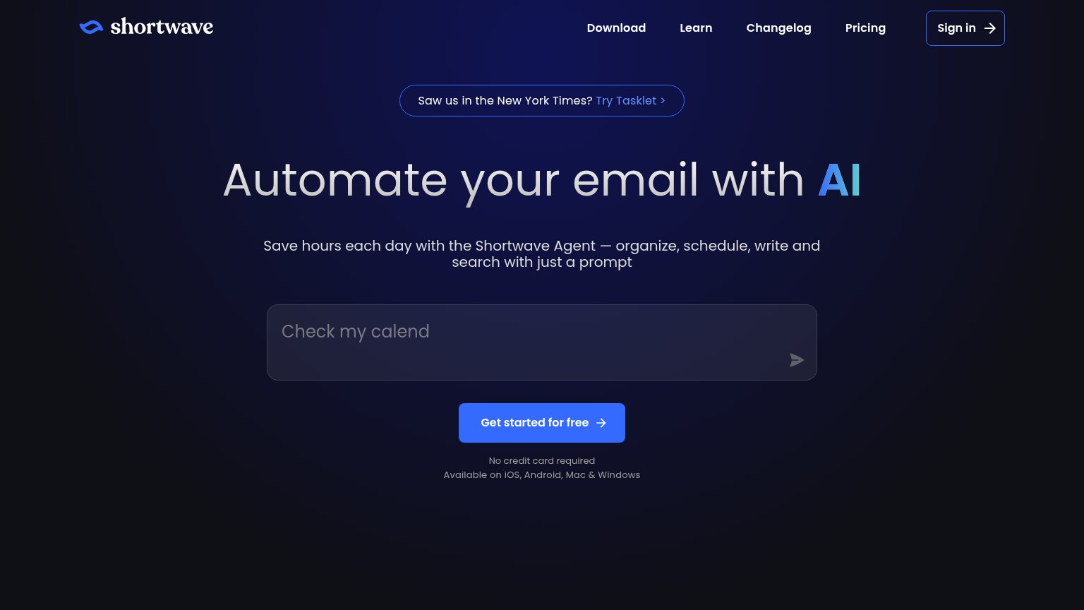
| Trust read | |
|---|---|
| Missive | "6000+ companies rely on Missive every day" usage claim (mobile capture) |
| Detailed product screenshot showing the Slashy inbox UI with an email thread and AI chat panel drafting a reply | |
| Rendered inbox UI with split tabs (Important 8, Calendar 18, Team 15, Docs 40) and an "Auto Draft to Karl" AI-composed r | |
| "Saw us in the New York Times?" press banner | |
| Product UI demo with INBOX/MEETINGS/PRIORITIES/ACTIONS tabs showing a real email tagged "To Respond" from Elena Marsh |
Value props
76FairTitle, subtitle, hero — do they sell the product's true value?
Missive’s headline sells
Inbox collaboration for teams that run on email
See what's going on, know who's doing what, and collaborate behind the scenes — without changing your workflow.
Working
- Names category and audience precisely
- Subhead defuses switching-cost fear
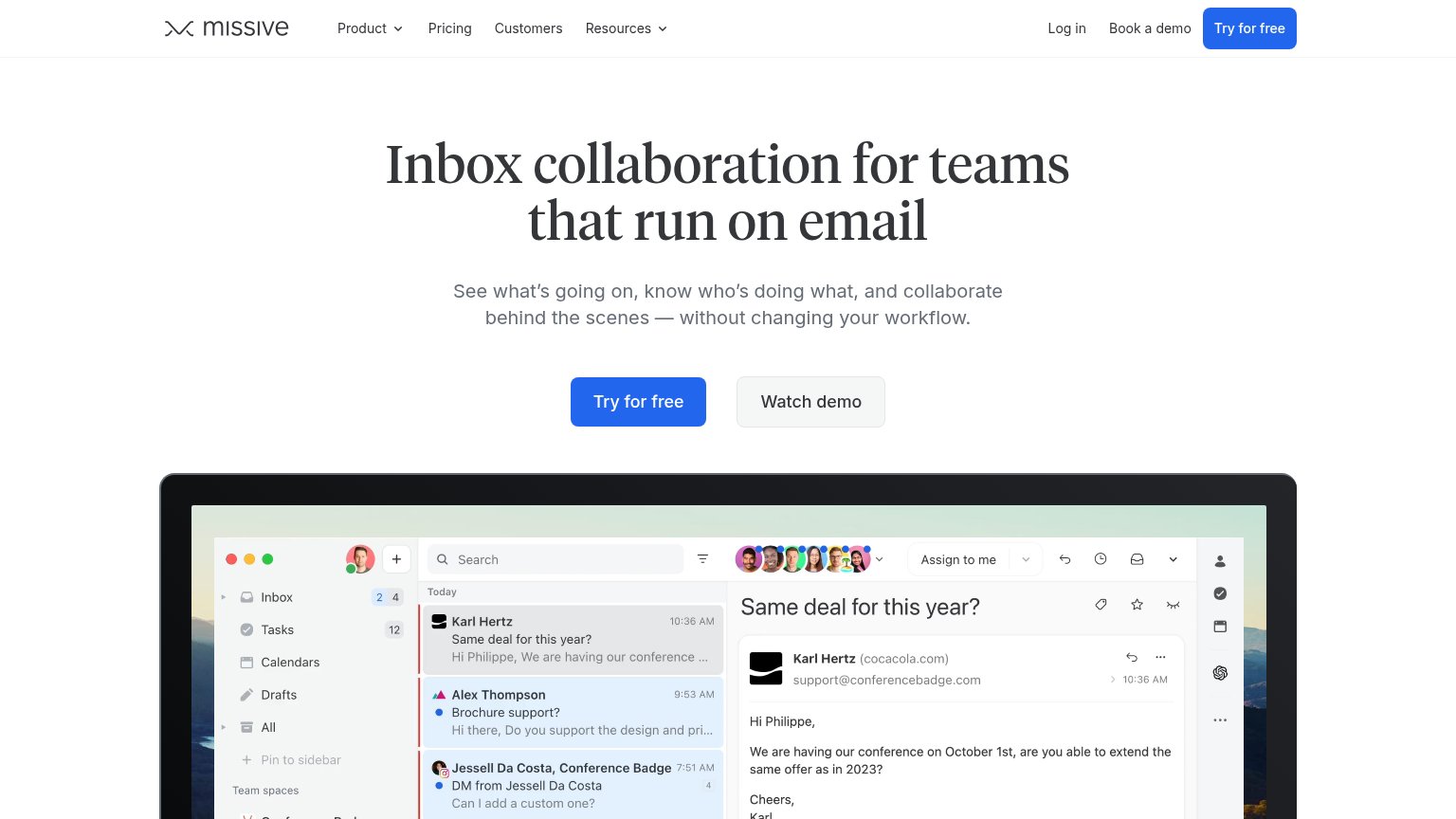
- Hero screenshot shows the shared inbox working
Could improve
- No numbers or proof in desktop fold
- Copy is flat — no felt pain or relief
- '6000+ companies' proof buried on mobile only
Information hierarchy
78FairDoes the design help or inhibit what the page is trying to say?
What works
What to improve
Mobile web
82StrongThe phone experience as a first-class citizen.
What works
What to improve
CTA
84StrongCopy, size, verb, cost-feel — does the primary CTA earn the click?
How Missive compares
Recommended rewrites