
Your landing page’s weakest score is Trust.
How Munify ranks
65Growth scoreupdated
category scores
category scoresShowHide
Score over time
Trust
38PoorProof that the product is real, competent, and safe to try.

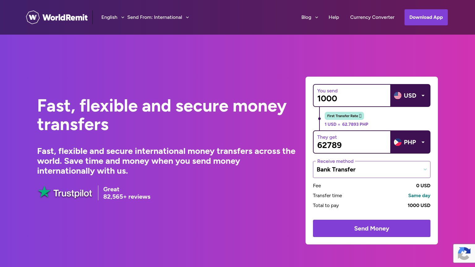

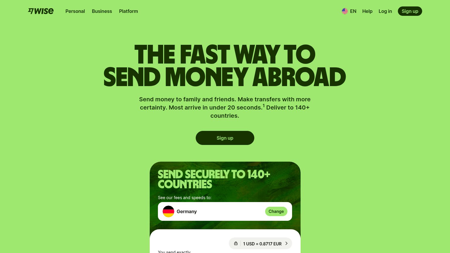
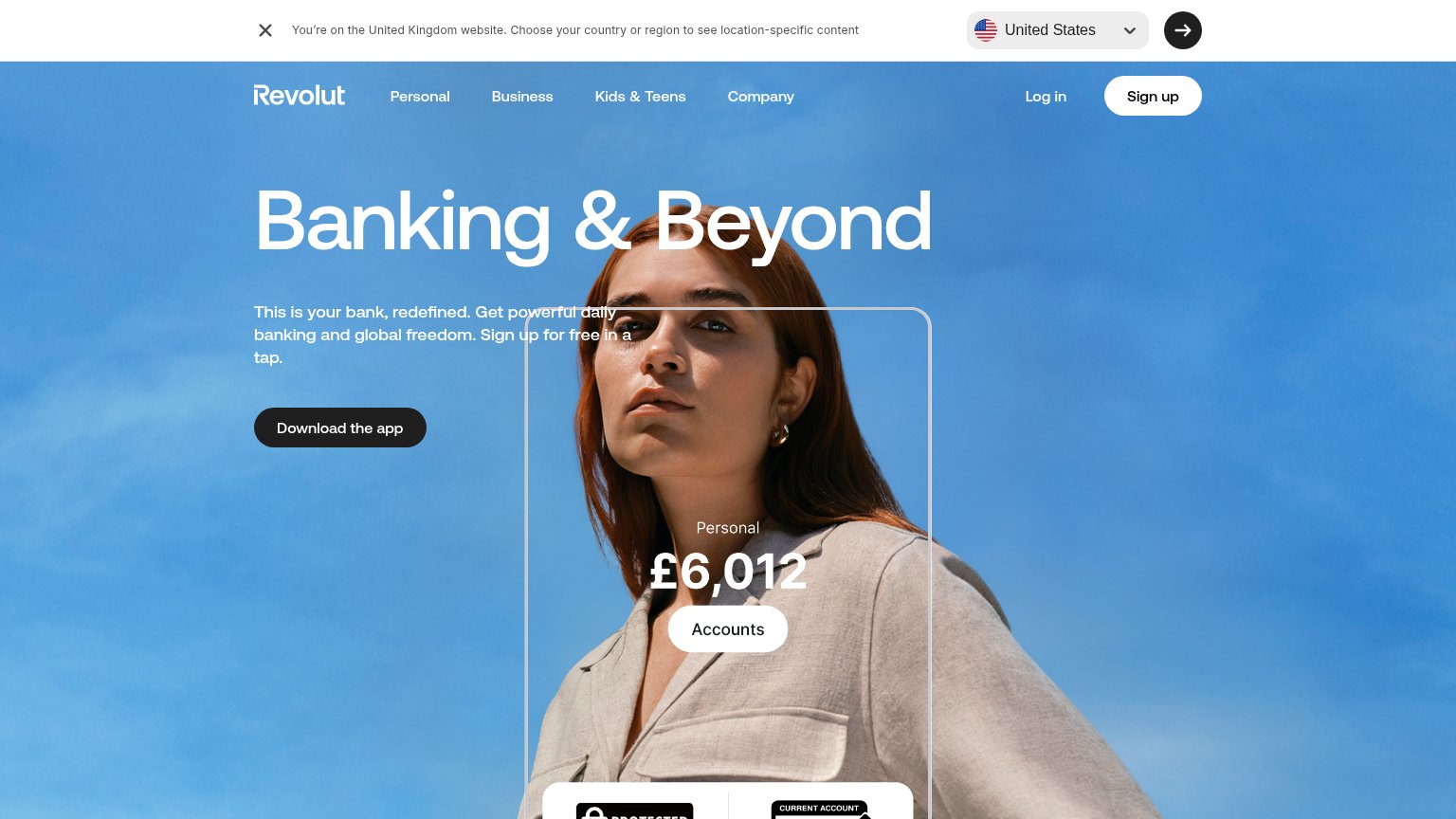
| Trust read | |
|---|---|
| Munify | No visible trust signal identified. |
| Live transfer calculator showing "1 USD = 0.8717 EUR" with lock icon and USD currency selector | |
| App Store 4.9 stars 4.2M+ ratings | |
| In-app balance UI overlay showing "Personal £6,012" with an "Accounts" button | |
| Trustpilot badge: "Great — 82,565+ reviews" | |
| 4.8 on App Store 118k reviews / 4.8 on Google Play 380k reviews |
CTA
68FairCopy, size, verb, cost-feel — does the primary CTA earn the click?
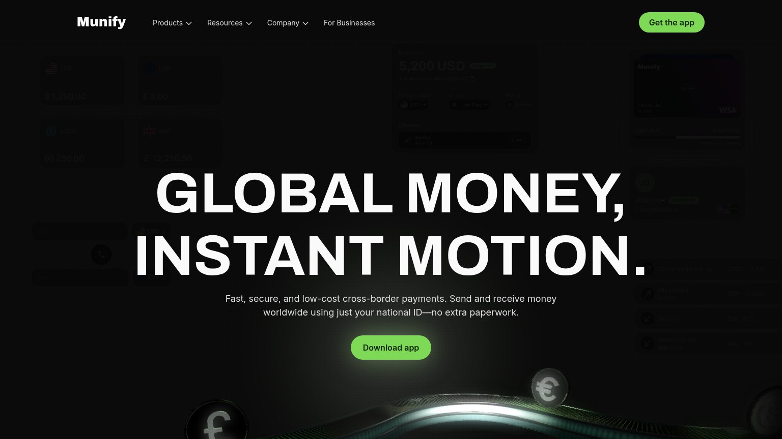
Problems
- install feels costly, no value promise
- label differs from header 'Get the app'
- no echo of headline promise
Value props
72FairTitle, subtitle, hero — do they sell the product's true value?
Munify’s headline undersells
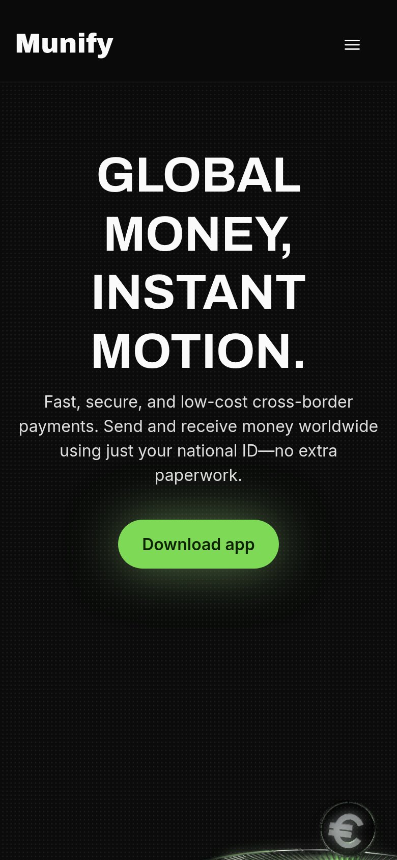
GLOBAL MONEY, INSTANT MOTION.
Fast, secure, and low-cost cross-border payments. Send and receive money worldwide using just your national ID—no extra paperwork.
Working
- Subhead names a real differentiator: national ID only
- "No extra paperwork" hits the felt pain
- Outcome-first framing: send and receive worldwide
Could improve
- Headline is a slogan, not a claim
- No numbers: fees, speed, or countries
- Hero mockups too dim to demonstrate product
Mobile web
72FairThe phone experience as a first-class citizen.
 12
- Oversized hero headline — Desktop-scale type wraps four words into six lines, eating half the first viewport.
- Download app button — Desktop-proportioned pill floats narrow in the column instead of a full-bleed thumb target.
Information hierarchy
76FairDoes the design help or inhibit what the page is trying to say?
1- Get the app button — Duplicates the primary action at near-equal weight, splitting attention between two green CTAs in the fold.