
Your landing page’s weakest score is Value props.
How Remitly ranks
68Growth scoreupdated
category scores
category scoresShowHide
Value props
62FairTitle, subtitle, hero — do they sell the product's true value?
Remitly’s headline undersells
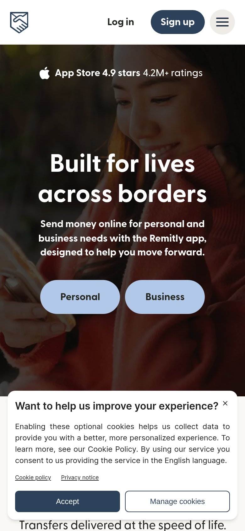
Built for lives across borders
Send money with the Remitly app, designed to help you close the distance.
Working
- Emotional resonance for immigrant senders
- Massive app-rating proof (4.9 stars, 4.2M+)
- Hero image shows a real sender, not stock gloss
Could improve
- Headline never says what Remitly does
- No speed, fee, or rate specifics in fold
- No country count or delivery-time claim
Information hierarchy
68FairDoes the design help or inhibit what the page is trying to say?
 1234
- Cookie consent banner — Full-width overlay with two same-weight buttons hijacks the fold's bottom third and competes with 'Send money'.
- Send money button — Pale blue on a dark photo reads as a secondary chip, not the primary action — weakest-contrast element in the hero.
- Header nav row — Eight interactive items (tabs, three dropdowns, Help, Log in, Sign up) offer more exits than the hero offers actions.
- Sign up button — Dark high-contrast pill outweighs the hero's 'Send money' CTA, splitting the primary action across two competing buttons.
Mobile web
68FairThe phone experience as a first-class citizen.
What works
What to improve
CTA
72FairCopy, size, verb, cost-feel — does the primary CTA earn the click?
How Remitly compares
Recommended rewrites
Trust
72FairProof that the product is real, competent, and safe to try.
How Remitly compares
Trust read