
Your landing page’s weakest score is Mobile web.
How WorldRemit ranks
70Growth scoreupdated
category scores
category scoresShowHide
Mobile web
58FairThe phone experience as a first-class citizen.
 1234
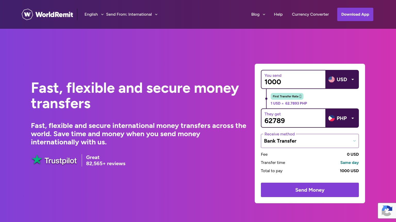
- Below-fold calculator CTA — The send-money calculator and its primary CTA start below the first viewport, leaving no conversion action in the fold.
- Six-line duplicate subhead — Repeats the H1 almost verbatim across six dense lines, pushing the calculator further down the page.
- reCAPTCHA badge overlap — The badge sits on top of the calculator's First Transfer Rate tag, obscuring the rate promotion.
- Download App header button — The only tappable CTA in the fold routes to app install instead of the transfer flow.
Value props
62FairTitle, subtitle, hero — do they sell the product's true value?
WorldRemit’s headline undersells
Fast, flexible and secure money transfers
Fast, flexible and secure international money transfers across the world. Save time and money when you send money internationally with us.
Working
- Calculator widget demonstrates product live
- Trustpilot 82,565+ reviews adds proof
- Fee 0 USD and same-day shown in widget
Could improve
- Subhead duplicates headline word-for-word
- Adjectives could caption any transfer app
- Zero-fee and same-day buried in widget
Information hierarchy
72FairDoes the design help or inhibit what the page is trying to say?
What works
What to improve
Trust
74FairProof that the product is real, competent, and safe to try.
How WorldRemit compares
Trust read
CTA
82StrongCopy, size, verb, cost-feel — does the primary CTA earn the click?
How WorldRemit compares
Recommended rewrites