
Your landing page’s weakest score is CTA.
How Metis ranks
47Growth scoreupdated
category scores
category scoresShowHide
Score over time
CTA
32PoorCopy, size, verb, cost-feel — does the primary CTA earn the click?
Problems
- no CTA in hero, nav link only
- hidden behind hamburger on mobile
- no action verb, gated feel
- Careers button outweighs it
Trust
38PoorProof that the product is real, competent, and safe to try.
| Trust read | |
|---|---|
| Metis | No visible trust signal identified. |
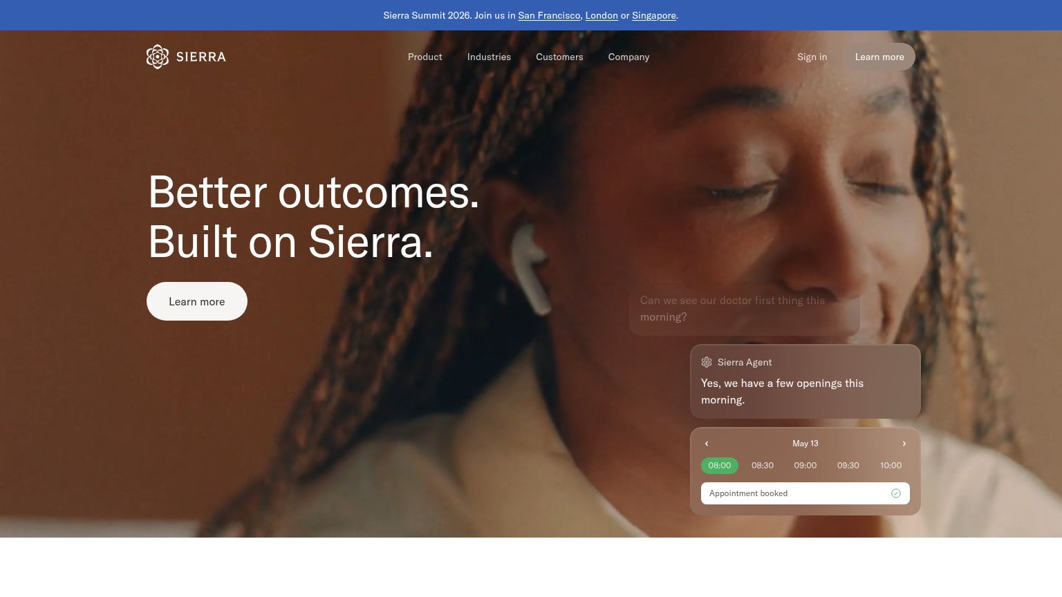
| Sierra Agent chat demo resolving "I don't recognize this $95 charge" and booking "Appointment booked" | |
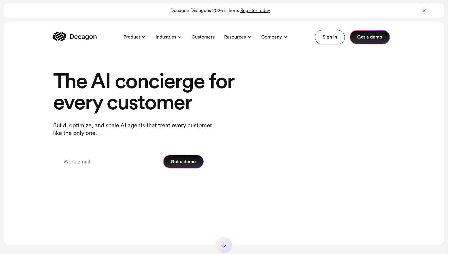
| implicit context Decagon may benefit from pre-existing familiarity among its target audience. | |
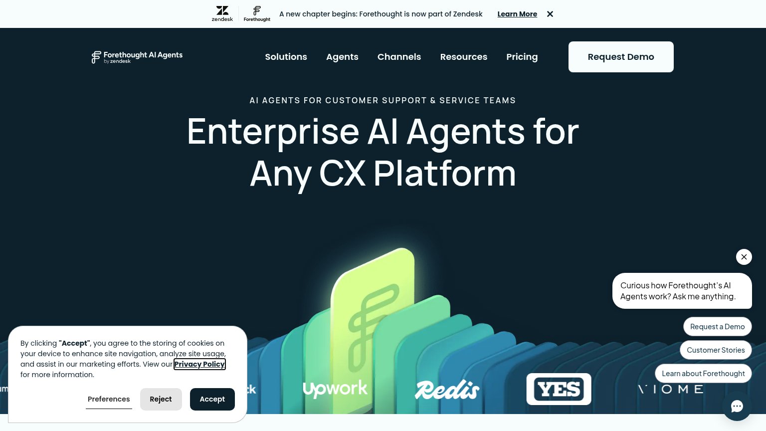
| Customer logo strip featuring Upwork, Redis, YES, and Viome | |
| No visible trust signal identified. |
Value props
48PoorTitle, subtitle, hero — do they sell the product's true value?
Metis’s headline undersells
Training agents to work reliably for your customers.
Working
- Names a real outcome: reliability
- Speaks to agent-trust anxiety
- Plain language, no buzzword stack
Could improve
- No subhead explaining how
- Zero numbers or proof points
- Hero art decorates, shows nothing
Information hierarchy
58FairDoes the design help or inhibit what the page is trying to say?
 123
- Careers button — The only boxed, button-styled element in the fold is an exit to hiring, outranking the conversion action.
- Request Access link — The sole conversion path is low-contrast grey nav text, easy to miss on first scan.
- Hero headline block — Headline has no action beneath it — visitors who buy the promise have nowhere to click.
Mobile web
58FairThe phone experience as a first-class citizen.
 12
- Hero without CTA — No button or link accompanies the headline — the first viewport offers no tappable action.
- Hamburger hides all actions — "Request Access" and "Careers" are buried behind the menu icon, removing every visible conversion path.