LarkYC S25 landing page report.
← Back to YC S25

Your landing page’s weakest score is Mobile web.

Fix Mobile web

Score over time

90807060504030QA Wolf 77 on Apr 1 (Wayback)QA Wolf 74 on Apr 10 (Wayback)QA Wolf 74 on Apr 21 (Wayback)QA Wolf 72 on May 26 (Wayback)QA Wolf 74 on Jun 28 (Wayback)QA Wolf 70 on Aug 29 (Wayback)QA Wolf 73 on Sep 20 (Live)Momentic 68 on Apr 7 (Wayback)Momentic 74 on May 14 (Wayback)Momentic 75 on Jun 6 (Wayback)Momentic 80 on Aug 10 (Wayback)Momentic 80 on Sep 16 (Wayback)Momentic 82 on Sep 20 (Live)Spur 60 on Apr 18 (Wayback)Spur 58 on May 12 (Wayback)Spur 60 on May 21 (Wayback)Spur 59 on Sep 20 (Live)Meticulous 77 on Apr 22 (Wayback)Meticulous 77 on Apr 30 (Wayback)Meticulous 70 on Jul 16 (Wayback)Meticulous 76 on Sep 20 (Live)Ranger 66 on Apr 15 (Wayback)Ranger 65 on May 7 (Wayback)Ranger 66 on May 19 (Wayback)Ranger 74 on Jun 18 (Wayback)Ranger 72 on Aug 17 (Wayback)Ranger 74 on Aug 25 (Wayback)Ranger 72 on Sep 22 (Live)Lark 45 on Apr 21 (Wayback)Lark 64 on May 20 (Wayback)Lark 70 on Sep 22 (Live)Apr 21May 20Sep 22
Past reportsShow past reportsHide past reports
  1. Sep 22, 202670LiveOverall +6 · Value props +14 · Information hierarchy +12Viewing
  2. May 20, 202664Overall +19 · Trust +48 · Information hierarchy +20View →
  3. Apr 21, 202645First tracked report — strongest CTA 66, weakest Trust 28View →

Mobile web

58Fair

The phone experience as a first-class citizen.

Mobile web annotations on the mobile capture12
  1. Truncated workflow rows — Every test name and exec ID clips to ellipses, making the demo card unreadable on the phone width.
  2. Four-line subhead — The subhead wraps into four lines and pushes the hero visual and any CTA further down the fold.

CTA

68Fair

Copy, size, verb, cost-feel — does the primary CTA earn the click?

Lark
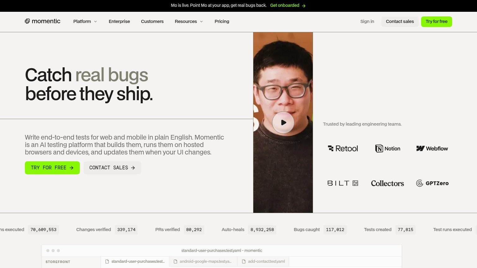
Momentic
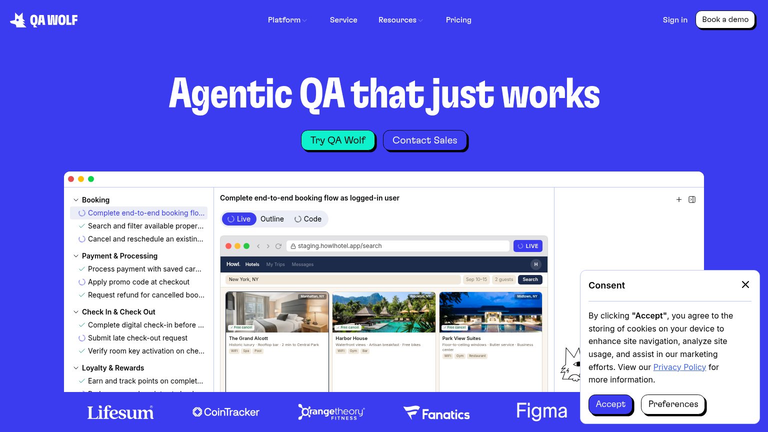
QA Wolf
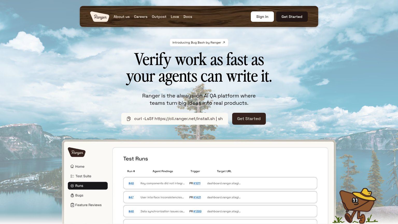
Ranger
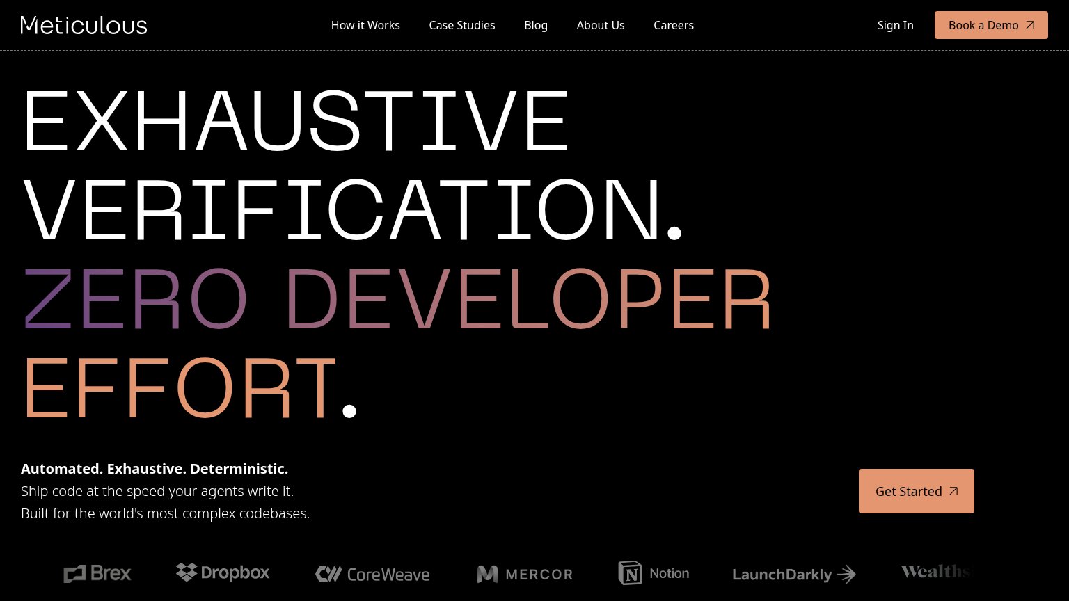
Meticulous

Problems

  • names signup work, not value
  • absent from mobile fold
  • 'Dashboard' nav label competes
  • no payoff or product language

Value props

72Fair

Title, subtitle, hero — do they sell the product's true value?

Lark’s headline undersellsEvery surface, every minute.UI, API, CLI, and mobile tests run on a continuous cadence — you watch the green, Lark watches the red. Built by ex-Stripe engineers.

Working

  • Subhead names all four test surfaces
  • Hero shows live runs + real numbers
  • 'Lark watch the green' hits the emotion

Could improve

  • H1 is vague without the subhead
  • Auto-repair buried in a stat caption
  • No outcome stated (ship faster, etc.)

Information hierarchy

74Fair

Does the design help or inhibit what the page is trying to say?

Information hierarchy annotations on the desktop capture123
  1. Dashboard nav button — Styled as a filled primary button, it outweighs the fold's real CTA and pulls existing-user traffic before 'Create account' is even visible.
  2. Create account CTA — The primary CTA sits below a tall hero image, outside the first scan path, and shares its row with an equal-size 'Get a demo' button.
  3. Run log panel — Four rows of monospaced IDs, timings, and statuses ask for more parsing than a fold demo needs; the '12,405' counter alone carries the proof.

Trust

78Fair

Proof that the product is real, competent, and safe to try.

Lark
Momentic
Trust read
Lark"TODAY · RUNS COMPLETED 12,405" with "99.6% pass" and "31 auto-repaired" over the live run-log dashboard
QA WolfCustomer logo strip: Lifesum, CoinTracker, Orangetheory Fitness, Fanatics, Figma
Momentic"Trusted by leading engineering teams." logo wall with Retool, Notion, Webflow, Bilt, Collectors, GPTZero
SpurNo visible trust signal identified.
Meticulous"Trusted by organizations including…" logo wall (Brex, Dropbox, Notion, CoreWeave, LaunchDarkly, Wealthsimple)
Ranger"Test Runs" dashboard screenshot showing real run numbers, agent findings, and linked PRs (#1611, #1431)