
Your landing page’s weakest score is Information hierarchy.
How Momentic ranks
82Growth scoreupdated
category scores
category scoresShowHide
Information hierarchy
76FairDoes the design help or inhibit what the page is trying to say?
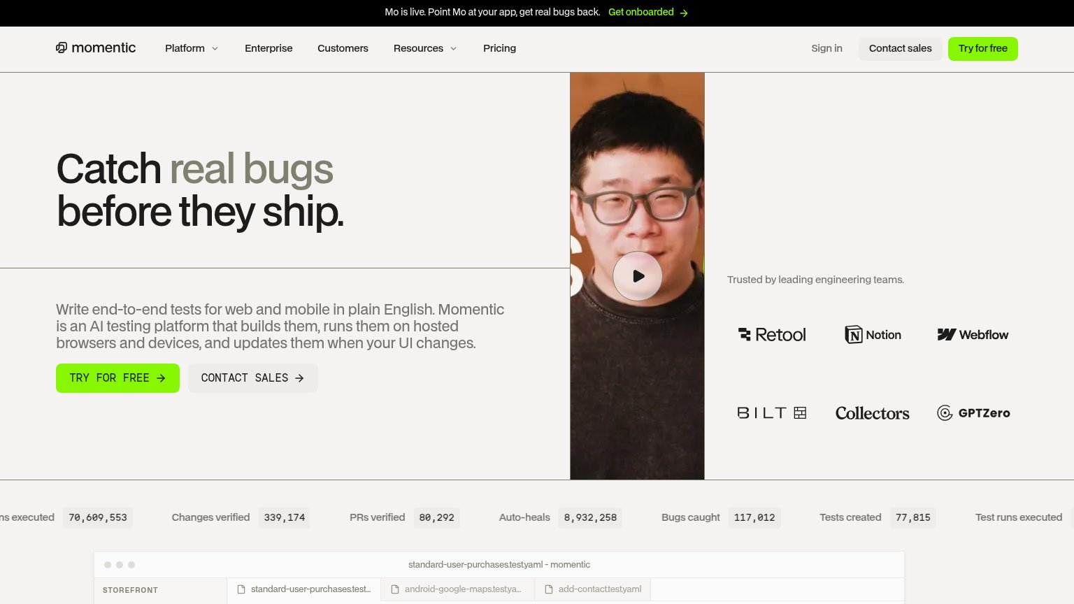 1234
- Header Contact sales button — Styled at near-equal weight to Try for free, splitting the header's one action into two.
- Get onboarded banner link — Green link at the very top pulls first attention to an exit before the headline loads.
- Contact sales secondary CTA — Sits at the same size as the primary button, duplicating the header's sales exit.
- Video play button — No caption or hook text on desktop, so the fold's biggest visual gives no message.
Mobile web
78FairThe phone experience as a first-class citizen.
 123
- Two-line promo banner — The black 'Mo is live... Get onboarded' banner wraps to two lines and eats top-of-fold space, pushing the primary CTA toward the viewport edge.
- Stacked duplicate CTAs — 'CONTACT SALES' sits full-width directly under 'TRY FOR FREE' at equal size, splitting the thumb's first tap between two actions.
- Header Try for free — A third CTA in the header duplicates the hero button, adding redundant competing green pills within one scroll.
Trust
82StrongProof that the product is real, competent, and safe to try.
How Momentic compares
Trust read
CTA
86StrongCopy, size, verb, cost-feel — does the primary CTA earn the click?
How Momentic compares
Recommended rewrites
Value props
86StrongTitle, subtitle, hero — do they sell the product's true value?
Momentic’s headline
Catch real bugs before they ship.
Write end-to-end tests for web and mobile in plain English. Momentic is an AI testing platform that builds them, runs them on hosted browsers and devices, and updates them when your UI changes.
Working
Could improve