
Your landing page’s weakest score is Mobile web.
How Spur ranks
Mobile web
48PoorThe phone experience as a first-class citizen.
 12
- Modal description block — Eleven cramped lines of desktop copy push the Register Now button to the bottom of the viewport.
- Top promo banner — Banner text is clipped and unreadable at mobile width, wasting the sticky bar's space.
Trust
54FairProof that the product is real, competent, and safe to try.
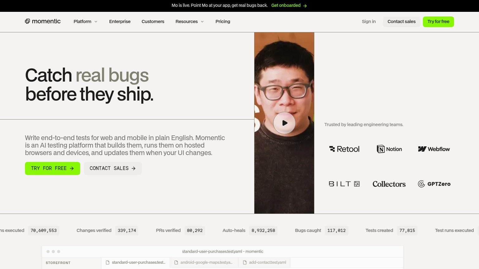
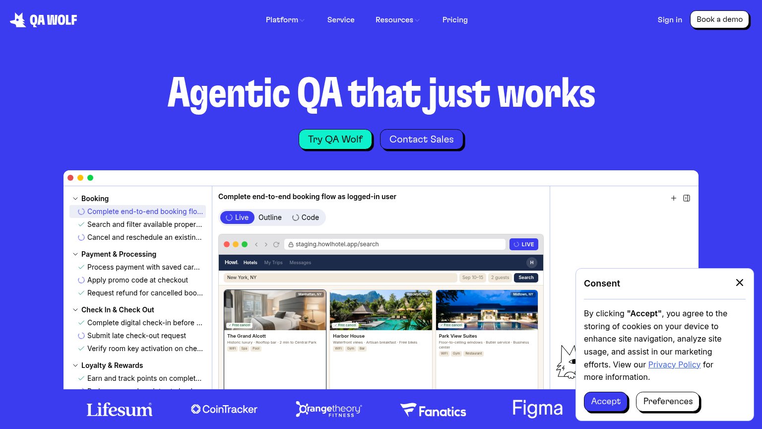
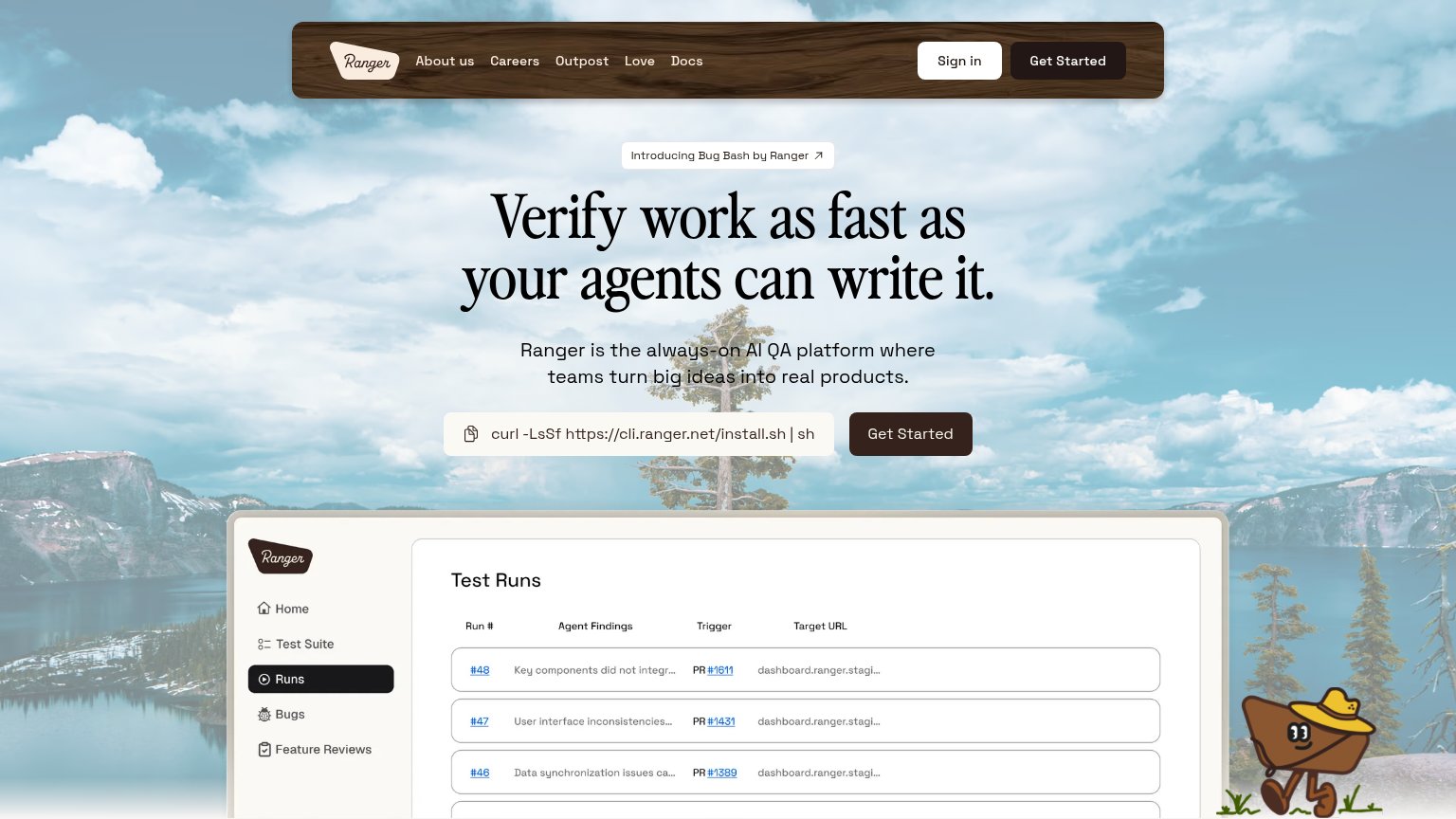

| Trust read | |
|---|---|
| Spur | No visible trust signal identified. |
| "Backed by Y Combinator" badge under the hero CTA | |
| Customer logo strip: Lifesum, CoinTracker, Orangetheory Fitness, Fanatics, Figma | |
| "Trusted by leading engineering teams." logo wall with Retool, Notion, Webflow, Bilt, Collectors, GPTZero | |
| "Test Runs" product dashboard screenshot showing agent findings, PR links, and target URLs | |
| Terminal demo showing "npx checkly test … 1 passed, 1 total" and "Successfully deployed to 4 locations" with region late |
Value props
58FairTitle, subtitle, hero — do they sell the product's true value?
Spur’s headline
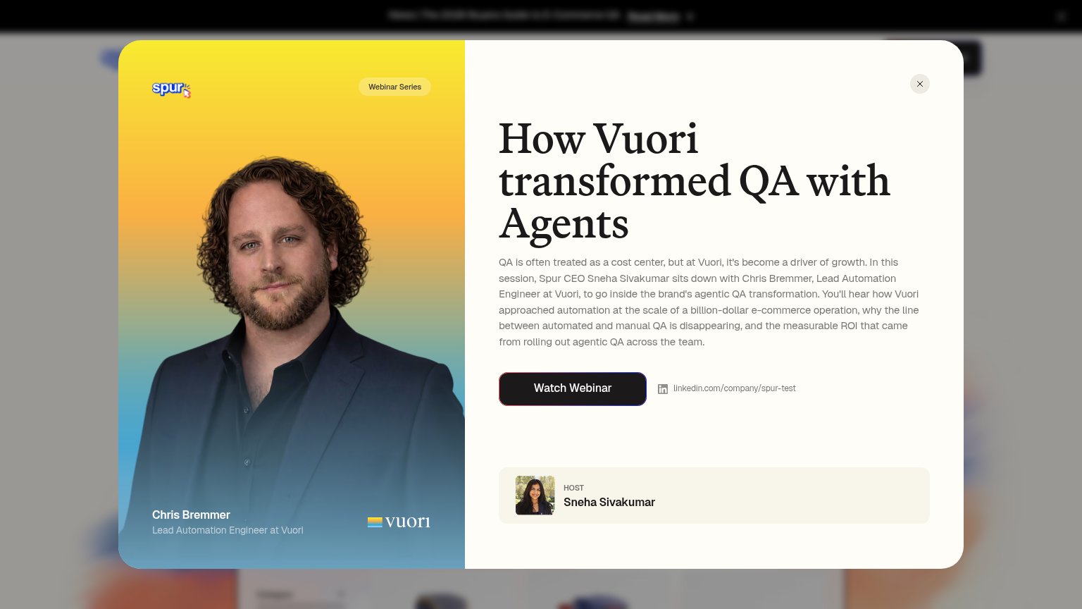
How Vuori transformed QA with Agents
QA is often treated as a cost center, but at Vuori, it's become a driver of growth. In this session, Spur CEO Sneha Sivakumar sits down with Chris Bremmer, Lead Automation Engineer at Vuori, to go inside the brand's agentic QA transformatio
Working
Could improve
CTA
62FairCopy, size, verb, cost-feel — does the primary CTA earn the click?
How Spur compares
Recommended rewrites
Information hierarchy
72FairDoes the design help or inhibit what the page is trying to say?
What works
What to improve