
Your landing page’s weakest score is Trust.
How Bizzy AI ranks
70Growth scoreupdated
category scores
category scoresShowHide
Score over time
Trust
52FairProof that the product is real, competent, and safe to try.
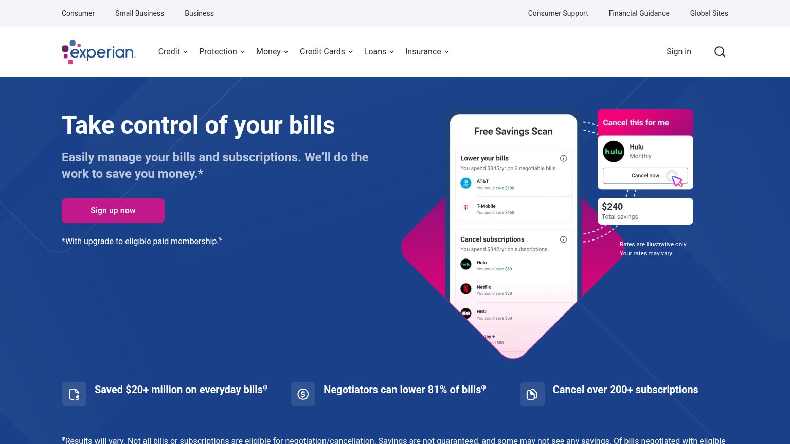
| Trust read | |
|---|---|
| Bizzy AI | No visible trust signal identified. |
| Detailed in-app screenshot showing 'Current spend this month $3,298' and 'Payday in 8 days' | |
| "Success Rate 90%" and "Avg. Savings per Successful Bills $450" stat callouts | |
| "Saved $20+ million on everyday bills" stat strip | |
| implicit context Experian BillFixer may benefit from pre-existing familiarity among its target audience. |
CTA
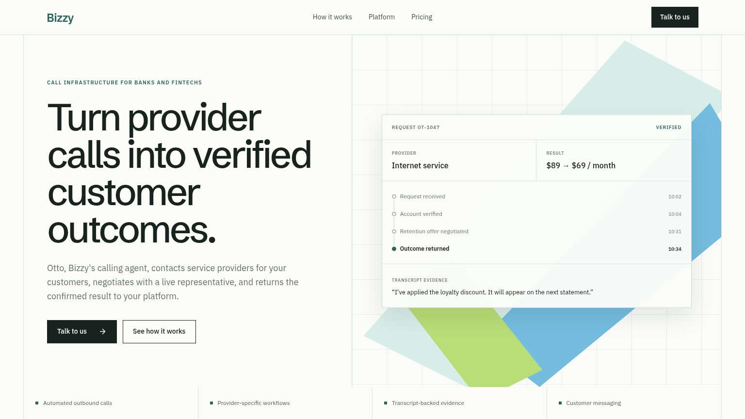
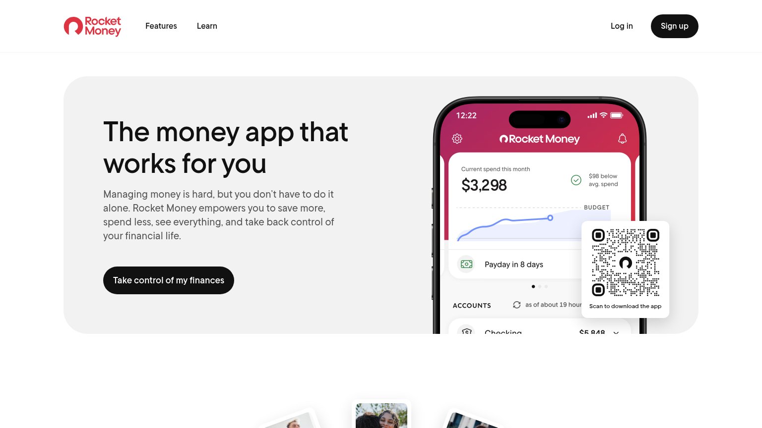
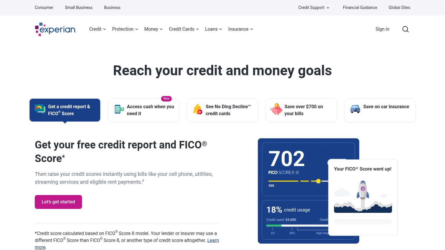
64FairCopy, size, verb, cost-feel — does the primary CTA earn the click?
Problems
- click feels like a sales call
- no value promised for the click
- secondary CTA feels cheaper
- verb signals cost, not payoff
Mobile web
68FairThe phone experience as a first-class citizen.
 123
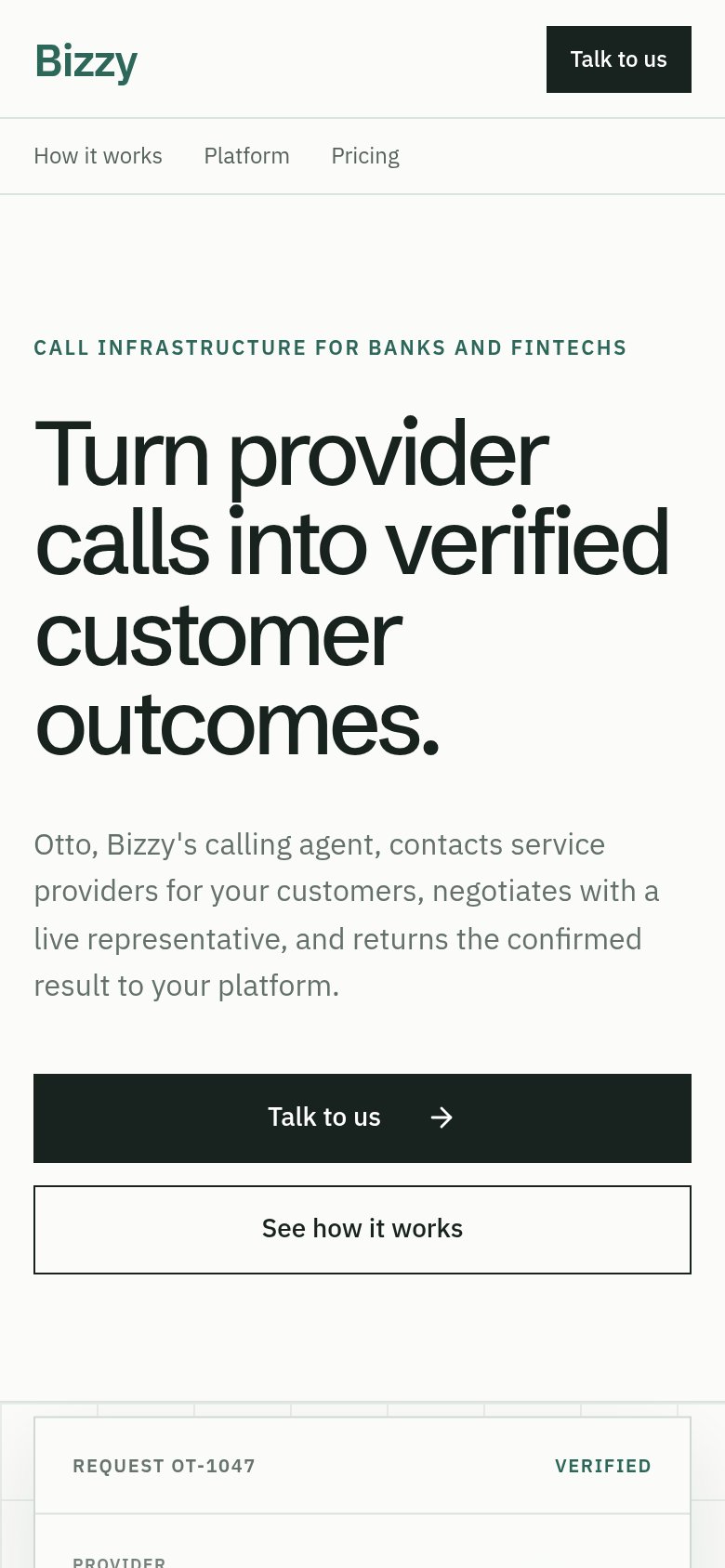
- Uncollapsed nav link row — The desktop links "How it works / Platform / Pricing" render as a second header row instead of a hamburger, stacking a double-decker header that eats the top of the fold.
- Oversized hero headline — "Turn provider calls into verified customer outcomes." wraps into four huge lines, pushing the CTA to the very bottom edge of the viewport.
- Talk to us button — Duplicates the header's "Talk to us", spending fold space on a redundant action while the proof card below is cut off.
Value props
82StrongTitle, subtitle, hero — do they sell the product's true value?
Bizzy AI’s headline sells
Turn provider calls into verified customer outcomes.
Otto, Bizzy's calling agent, contacts service providers for your customers, negotiates with a live representative, and returns the confirmed result to your platform.
Working
- Headline names the real outcome, not a buzzword
- Hero demo shows $89 → $69 negotiated result
- Subhead explains the full loop concretely
Could improve
- No aggregate numbers or proof stats in fold
- Copy is precise but emotionally flat
- "Verified outcomes" is abstract without the visual
Information hierarchy
83StrongDoes the design help or inhibit what the page is trying to say?
123- See how it works button — Outline button sits at near-equal weight and size beside the primary CTA, splitting the one action into two.
- Nav Talk to us — Duplicates the hero CTA at full dark-button weight, creating two identical primary targets in one viewport.
- Feature strip row — Four same-weight bullet items intrude into the fold as an extra beat competing with the hero's single argument.