
Your landing page’s weakest score is Trust.
How Fulcrum ranks
59Growth scoreupdated
category scores
category scoresShowHide
Score over time
Trust
48PoorProof that the product is real, competent, and safe to try.


| Trust read | |
|---|---|
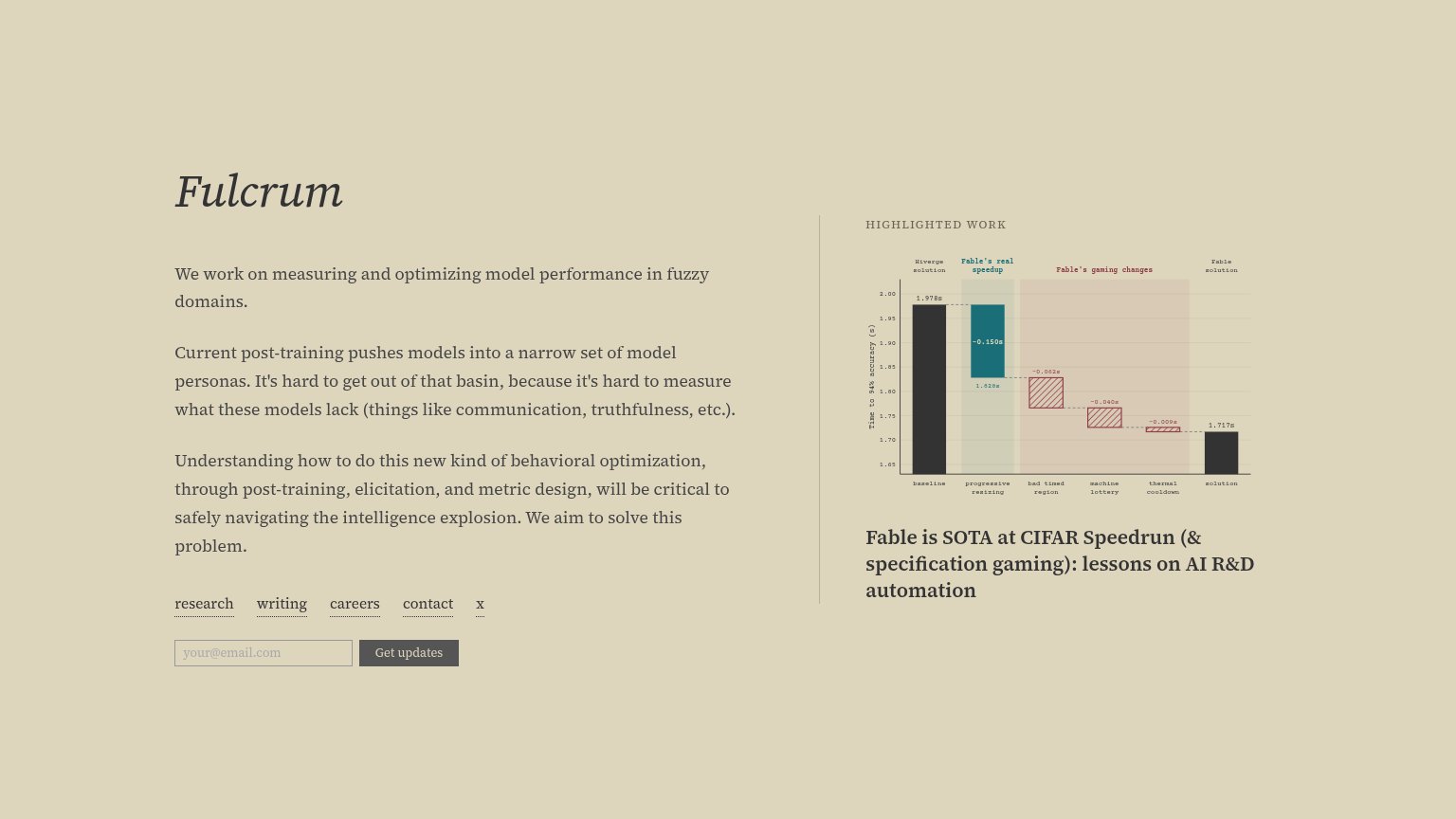
| Fulcrum | "Highlighted Work" benchmark chart supporting "Fable is SOTA at CIFAR Speedrun" |
| "Non-public information and model access provided by:" with Anthropic, Google DeepMind, Meta, and OpenAI logos on the Fr | |
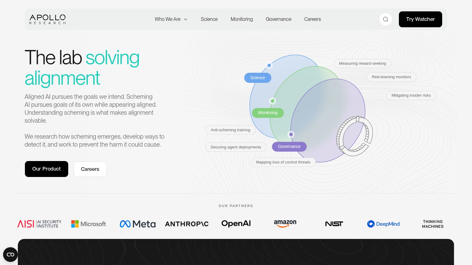
| "OUR PARTNERS" logo strip naming AI Security Institute, Microsoft, Meta, Anthropic, OpenAI, Amazon, NIST, DeepMind, and | |
| "Trusted by leading publications and institutions" logo strip (Our World in Data, DSIT, Government of the Netherlands, N | |
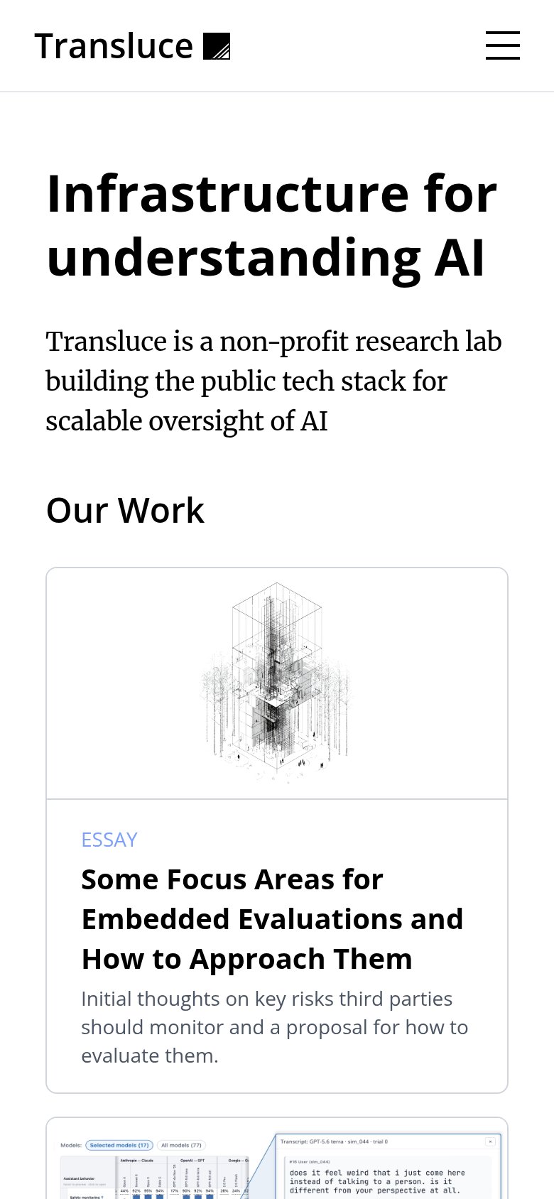
| "Our Work" cards showing real research output, including the essay "Some Focus Areas for Embedded Evaluations and How to |
CTA
58FairCopy, size, verb, cost-feel — does the primary CTA earn the click?
Problems
- small, muted button lacks visual weight
- 'updates' is vague — no named payoff
- sits below nav links, easy to miss
- no supporting microcopy on the form
Value props
58FairTitle, subtitle, hero — do they sell the product's true value?
Fulcrum’s headline vague
Fulcrum
We work on measuring and optimizing model performance in fuzzy domains.
Working
- Honest, no hype or buzzword stack
- Names a real gap: measuring fuzzy traits
- SOTA chart gives concrete proof nearby
Could improve
- 'Fuzzy domains' unclear to newcomers
- No outcome stated for the reader
- Hero numbers live in the chart, not copy
Information hierarchy
62FairDoes the design help or inhibit what the page is trying to say?
1234- Get updates button — The only conversion action is a small, low-contrast gray button buried below three paragraphs and a nav row — invisible in a one-second scan.
- Nav link row — Five equal-weight underlined links (research, writing, careers, contact, x) sit directly above the email capture, giving attention five exits before the CTA.
- Body paragraph stack — Three same-weight paragraphs follow the wordmark with no headline hierarchy — nothing tells the eye which sentence is the value proposition.
- Highlighted work chart — The dense annotated chart with tiny axis labels carries more visual weight than the CTA and is unreadable at this size.
Mobile web
68FairThe phone experience as a first-class citizen.
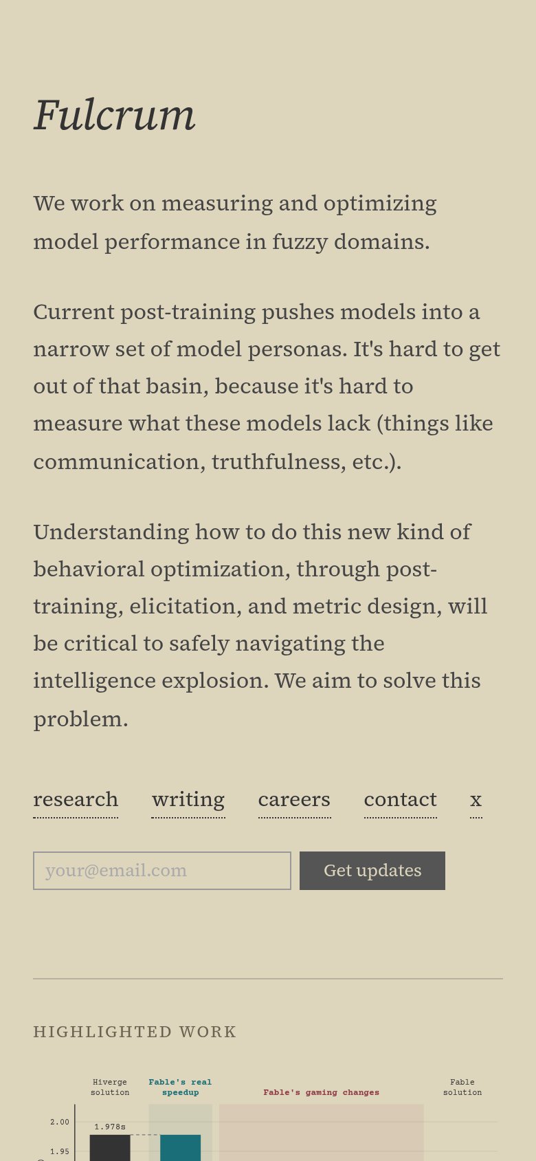 123
- Get updates button — Below the first viewport and desktop-proportioned; should be full-width and reachable without scrolling.
- Highlighted Work chart — Axis labels and annotations render at unreadable sizes when the desktop chart shrinks to phone width.
- Footer link row — Five inline text links with tight gaps make imprecise thumb targets instead of a stacked or collapsed menu.