
Your landing page’s weakest score is CTA.
How Altur ranks
76Growth scoreupdated
category scores
category scoresShowHide
Score over time
CTA
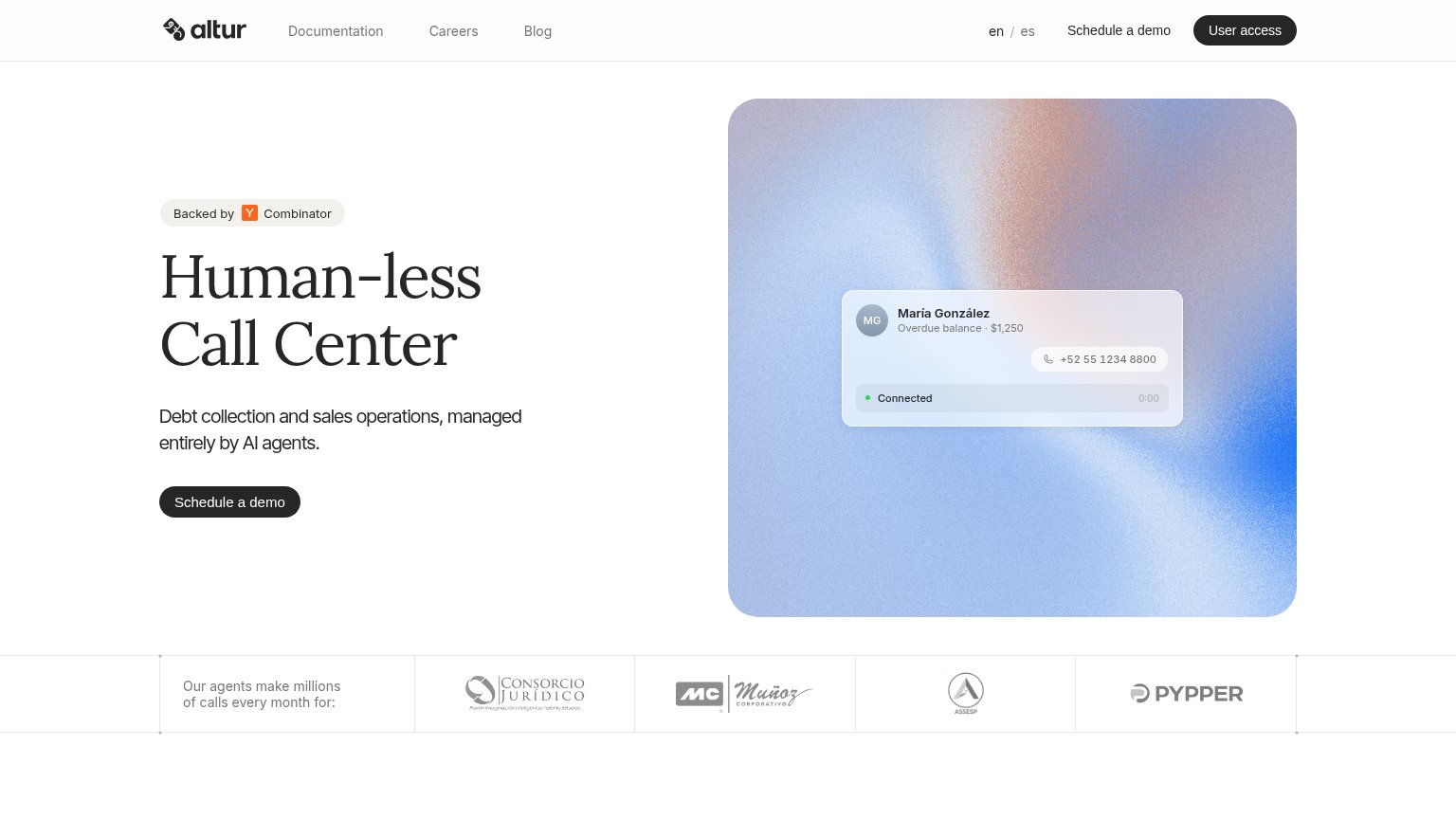
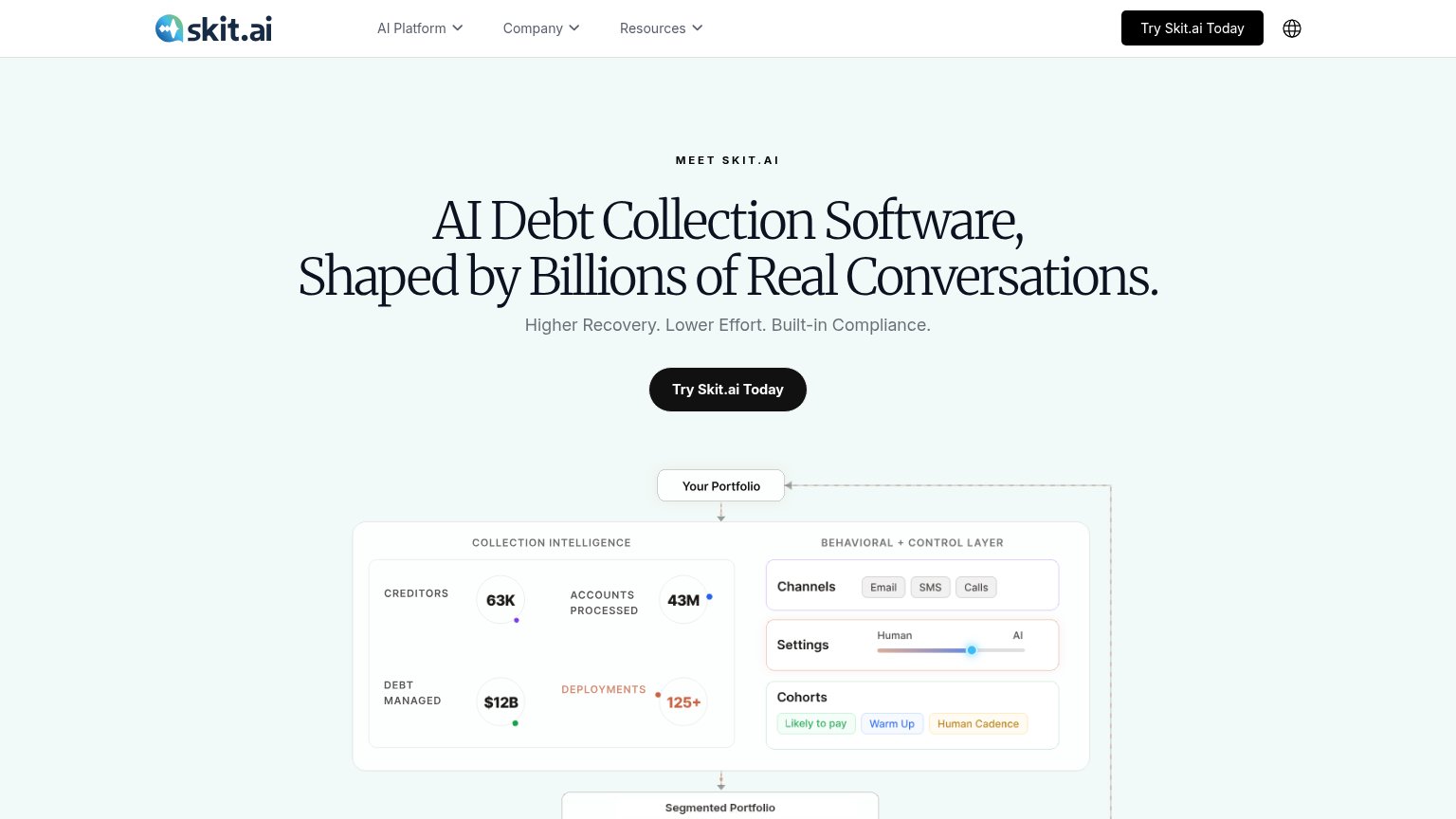
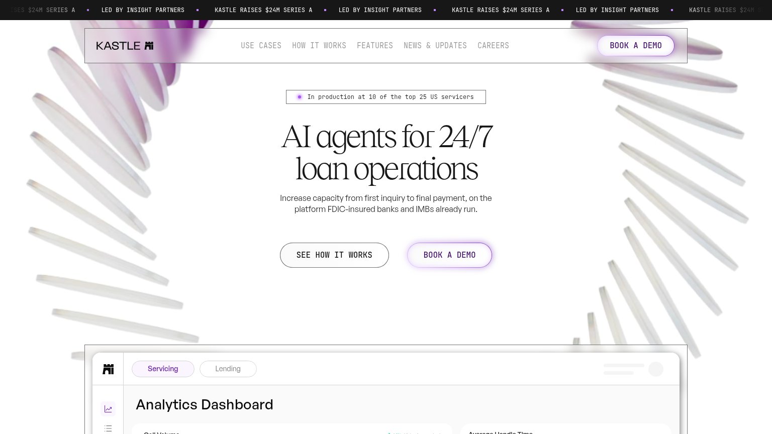
68FairCopy, size, verb, cost-feel — does the primary CTA earn the click?
Problems
- 'Schedule' feels time-costly
- no instant value on click
- demo gate, no self-serve path
Trust
72FairProof that the product is real, competent, and safe to try.
| Trust read | |
|---|---|
| Altur | Logo strip: "Our agents make millions of calls every month for:" with Consorcio Jurídico, Muñoz Corporativo, Assesp, and |
| Usage stats panel: "63K Creditors, 43M Accounts Processed, $12B Debt Managed, 125+ Deployments" | |
| Product roster card listing named AI agents with use cases ("Taylor — Omnichannel Servicing & Collections", "Marshall — | |
| "Talk to our AI Agent in real time" live demo form | |
| "In production at 10 of the top 25 US servicers" badge above the hero headline | |
| "346,047,069 Conversations Handled" counter above the CTA |
Information hierarchy
76FairDoes the design help or inhibit what the page is trying to say?
123- Schedule a demo duplicates — Nav 'Schedule a demo' text link competes with the hero button and sits beside 'User access', splitting the top-right action zone.
- User access button — Styled identically to the hero's primary CTA (black pill), so the most visually dominant button in the fold leads existing users away, not prospects forward.
- Hero CTA button — 'Schedule a demo' is small relative to the oversized serif headline and shares its black-pill style with 'User access', weakening its claim as the one action.
Value props
76FairTitle, subtitle, hero — do they sell the product's true value?
Altur’s headline sells
Human-less Call Center
Debt collection and sales operations, managed entirely by AI agents.
Working
- Bold, instantly parseable category claim
- Subhead names exact use cases
- Hero shows a real AI call in action
Could improve
- No outcome metric (recovery %, cost saved)
- Emotional payoff left implicit
- 'Human-less' may read cold to some buyers
Mobile web
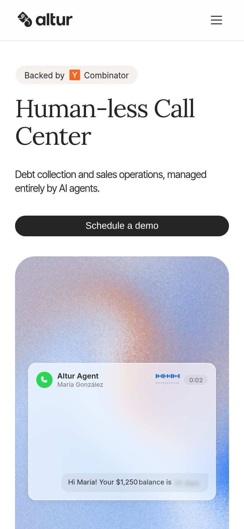
86StrongThe phone experience as a first-class citizen.
 1
- Headline wraps four lines — "Human-less Call Center" serif headline scales down only slightly and eats a third of the fold before the CTA.