
Your landing page’s weakest score is CTA.
How ValCtrl ranks
- 1.
Lago76
- 2.
Orb74
- 3.
Schematic74
- 4.
Metronome73
- 5.
ValCtrl41
41Growth scoreupdated
category scores
category scoresShowHide
Score over time
CTA
30PoorCopy, size, verb, cost-feel — does the primary CTA earn the click?



Problems
- no primary CTA anywhere on fold
- only action is tiny nav CONTACT link
- no action verb, no offer, no payoff
- hero space spent on badge, not action
Value props
32PoorTitle, subtitle, hero — do they sell the product's true value?
ValCtrl’s headline vague
PRICE WHAT HAPPENS.
Working
- Punchy, memorable three-word hook
- Hints at outcome-based pricing
- YC badge adds early credibility
Could improve
- No subhead explaining the product
- Hero image decorates, demonstrates nothing
- Zero specifics, numbers, or audience
Trust
42PoorProof that the product is real, competent, and safe to try.

| Trust read | |
|---|---|
| ValCtrl | "Backed by Y Combinator" badge |
| "Metronome is now part of Stripe" banner with "a stripe product" badge in the header | |
| Customer logo bar with Neo4j, Vercel, Replit, Supabase, Redis, LaunchDarkly | |
| "Lago helps companies like CoreWeave, Mistral AI and PayPal manage and scale any pricing model" | |
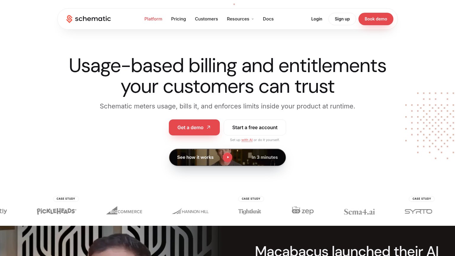
| Customer logo strip with CASE STUDY badges (Pickleheads, BigCommerce, Hannon Hill, Tightknit, Zep, Sema4.ai, Syrto) |
Mobile web
44PoorThe phone experience as a first-class citizen.
 12
- Contact text link — The only action on the page is a tiny header text link, not a thumb-friendly CTA button.
- Footer over sphere — The "© 2026 VALCTRL INC." line collides with the sphere graphic, reading as a layout bug.
Information hierarchy
58FairDoes the design help or inhibit what the page is trying to say?
123- CONTACT nav link — The sole conversion path is 10px letterspaced text at the extreme top-right, outside the natural scan path and easy to miss entirely.
- PRICE WHAT HAPPENS headline — The tagline is a riddle with no subtitle beneath it; the layout gives the visitor nowhere to learn what ValCtrl actually does.
- Purple dithered sphere — The largest element on the page communicates nothing about pricing or outcomes, yet it visually outranks everything except the headline.