
Your landing page’s weakest score is Trust.
How Oddpool ranks
68Growth scoreupdated
category scores
category scoresShowHide
Score over time
Trust
58FairProof that the product is real, competent, and safe to try.


| Trust read | |
|---|---|
| Oddpool | "Backed by Y Combinator" badge above the headline |
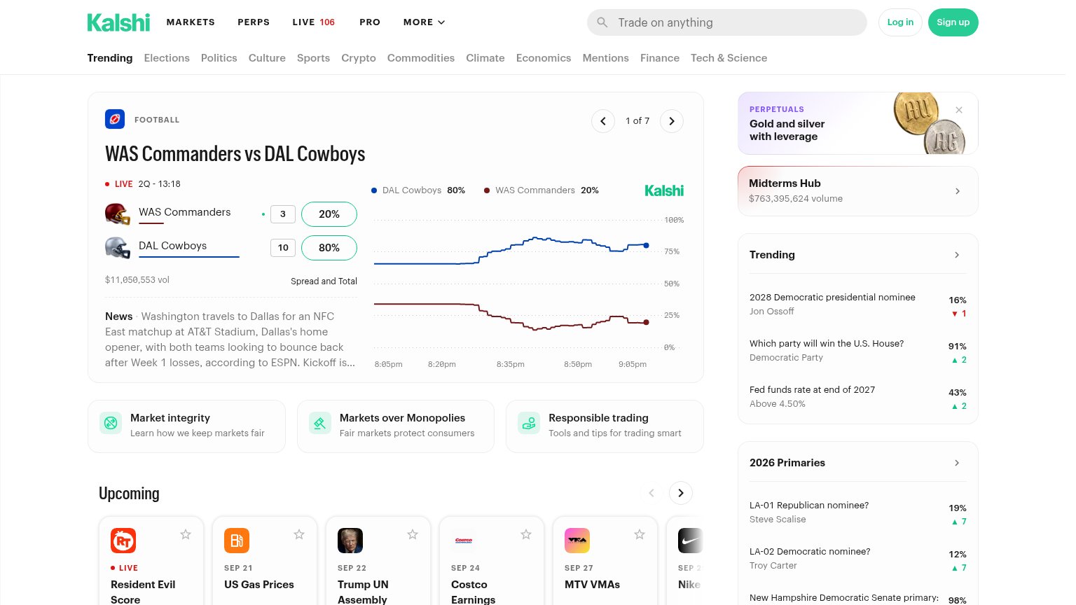
| Live market volume figures — "$7M Vol." on the NATO x Russia market and Hot Topics showing "$614K today" traded | |
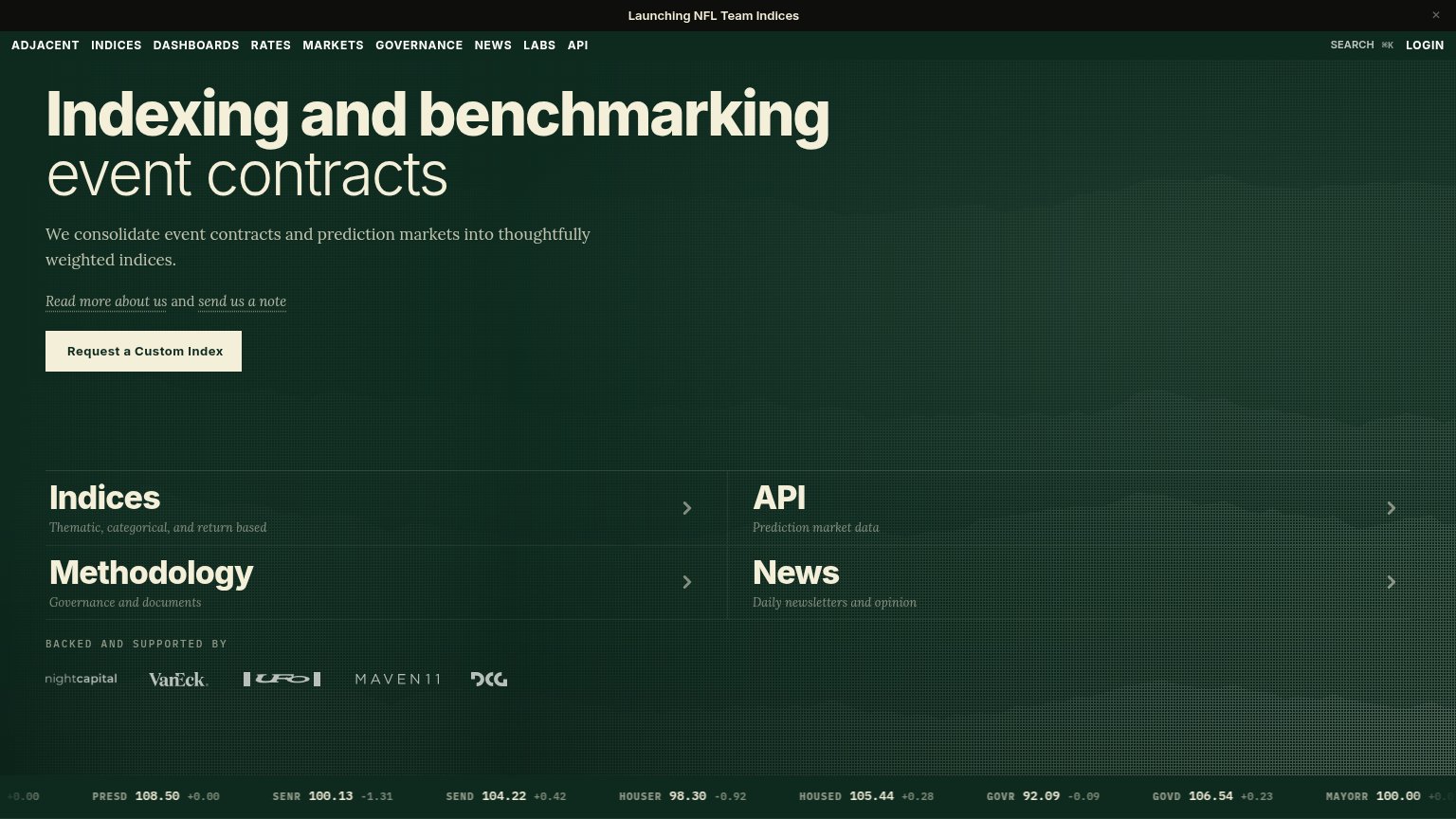
| "BACKED AND SUPPORTED BY" logo strip with nightcapital, VanEck, Maven11, and DCG | |
| Live market card showing "$11,050,553 vol" with a real-time price chart for WAS Commanders vs DAL Cowboys |
Information hierarchy
68FairDoes the design help or inhibit what the page is trying to say?
1234- Nav link row — Nine equal-weight links (Chat, Search, Hub, Tools, Pricing, Docs, Markets, X, Sign in) leak attention before either hero CTA.
- Get API Key button — Sized and positioned as a near-equal twin to 'Book a call', splitting the visitor's single next action.
- Announcement banner — 'Oddpool is joining Kalshi!' is the highest-contrast band on the page and outranks the headline in the scan path.
- Explore offering pill — A third clickable pill below the CTA pair adds another same-zone choice competing with the primary action.
CTA
68FairCopy, size, verb, cost-feel — does the primary CTA earn the click?
Problems
- calendar click feels costly
- product-value CTA demoted
- sales-first for a dev audience
Value props
68FairTitle, subtitle, hero — do they sell the product's true value?
Oddpool’s headline sells
Institutional connectivity for prediction markets
Direct, normalized access for trading and research desks.
Working
- Names the exact buyer: trading desks
- "Normalized" signals real technical value
- YC badge and Kalshi news add proof
Could improve
- Zero numbers: venues, latency, markets
- No named outcome or pain relieved
- Dot-map hero shows nothing of product
Mobile web
78FairThe phone experience as a first-class citizen.
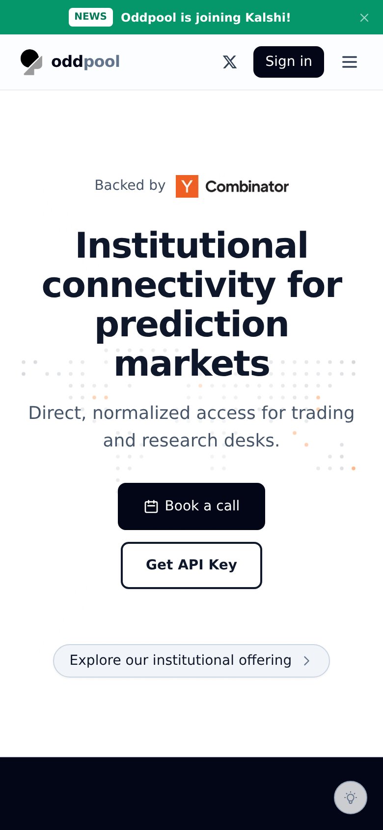 123
- Hero headline size — Desktop-scale type wraps into four heavy lines, pushing the CTAs deep into the viewport.
- Book a call button — Desktop-proportioned button floats at ~65% column width instead of a thumb-friendly full-bleed tap target.
- Kalshi announcement banner — Sticky promo bar with no conversion CTA eats the top of the first viewport before the hero.