
Your landing page’s weakest score is Trust.
How Manicule ranks
- 1.
Athena80
- 2.
Peec AI77
- 3.
Manicule71
- 4.
Profound70
- 5.
Goodie AI70
71Growth scoreupdated
category scores
category scoresShowHide
Score over time
Trust
52FairProof that the product is real, competent, and safe to try.


| Trust read | |
|---|---|
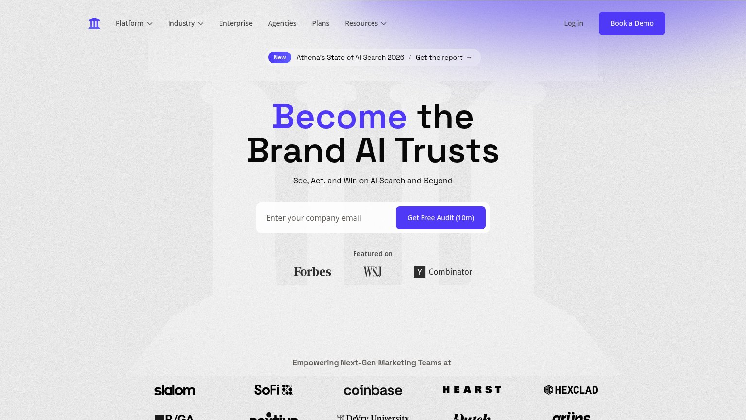
| Manicule | "Backed by Y Combinator" badge beneath the hero CTA |
| Real product workflow UI titled "AEO-Optimized FAQ Generator" showing nodes like "Web Page Scrape" with a Succeeded stat | |
| Customer logo wall under 'Empowering Next-Gen Marketing Teams at' featuring SoFi, Coinbase, Hearst, and Hexclad | |
| No visible trust signal identified. | |
| "TRUSTED BY LEADING BRANDS:" logo strip with Unilever, Lancôme, Dermalogica, SteelSeries, Rathbones, Skylum, Sanity, Vec |
CTA
68FairCopy, size, verb, cost-feel — does the primary CTA earn the click?
Problems
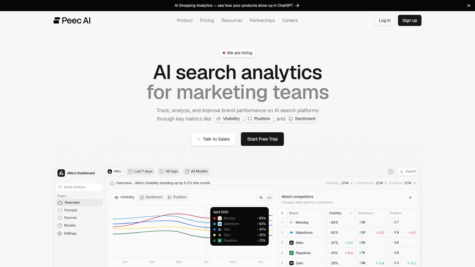
- click feels like a sales call
- no value promised for the click
- no low-commitment alternative path
Value props
68FairTitle, subtitle, hero — do they sell the product's true value?
Manicule’s headline sells
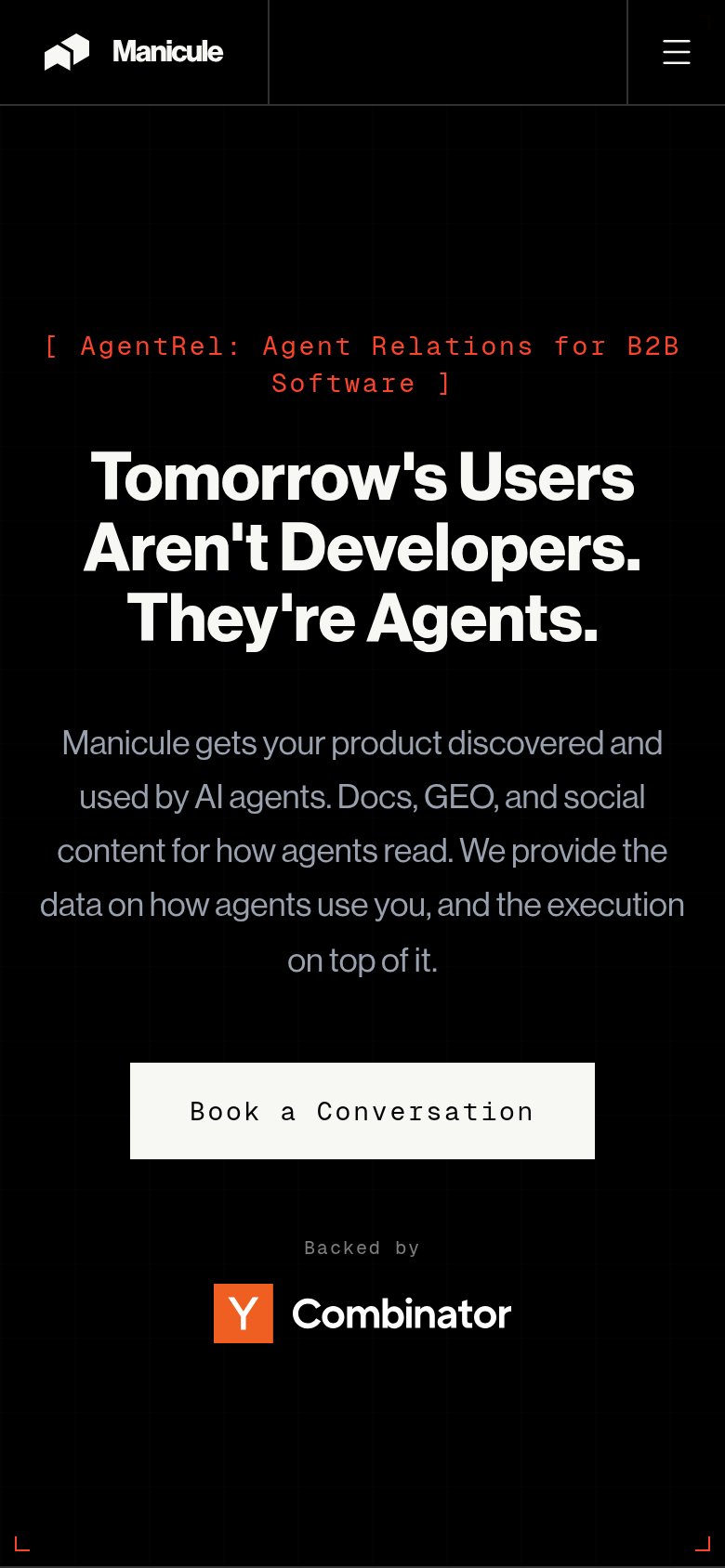
Tomorrow's Users Aren't Developers. They're Agents.
Manicule gets your product discovered and used by AI agents. Docs, GEO, and social content for how agents read. We provide the data on how agents use you, and the execution on top of it.
Working
- Provocative reframe creates urgency
- Subhead names concrete deliverables
- "AgentRel" coins a memorable category
Could improve
- Headline states trend, not the product
- No numbers or proof points in fold
- No hero visual demonstrating the work
Mobile web
82StrongThe phone experience as a first-class citizen.
 123
- Primary CTA button — "Book a Conversation" sits inset in the column instead of near-full-bleed, shrinking the tap target.
- Red eyebrow tag — "[ AgentRel: Agent Relations for B2B Software ]" wraps to two wide-tracked monospace lines and competes with the headline.
- Subheadline paragraph — Five lines of edge-to-edge gray copy is dense for a phone fold and delays the scan to the CTA.
Information hierarchy
84StrongDoes the design help or inhibit what the page is trying to say?
123- Careers nav link — An HR exit path in the conversion fold pulls prospects away before the pitch lands.
- Nav Book a Conversation — Duplicates the hero CTA as plain text at the same weight, splitting the single action into two targets.
- Red kicker line — Thin red monospace on black is low-contrast and hard to read at a glance, weakening the category framing.