JunoYC P26 landing page report.
← Back to YC P26

Your landing page’s weakest score is Trust.

Fix Trust

Score over time

908070605040Bearable 68 on May 4 (Wayback)Bearable 67 on May 15 (Wayback)Bearable 68 on Jun 5 (Wayback)Bearable 68 on Jun 16 (Wayback)Bearable 70 on Jul 10 (Wayback)Bearable 68 on Aug 9 (Wayback)Bearable 66 on Sep 20 (Live)Guava Health 72 on Mar 12 (Wayback)Guava Health 71 on Mar 29 (Wayback)Guava Health 71 on Apr 6 (Wayback)Guava Health 71 on Apr 24 (Wayback)Guava Health 70 on Jun 23 (Wayback)Guava Health 72 on Jul 6 (Wayback)Guava Health 71 on Aug 8 (Live)Visible 75 on May 3 (Wayback)Visible 78 on May 12 (Wayback)Visible 76 on Jun 12 (Wayback)Visible 76 on Jul 4 (Wayback)Visible 75 on Aug 24 (Wayback)Visible 76 on Sep 2 (Wayback)Visible 76 on Sep 20 (Live)Flaredown 62 on Jul 10 (Wayback)Flaredown 59 on Sep 20 (Live)CareClinic 61 on Apr 1 (Wayback)CareClinic 52 on May 13 (Wayback)CareClinic 62 on Sep 20 (Live)Juno 55 on May 30 (Wayback)Juno 61 on Jun 13 (Wayback)Juno 58 on Jun 22 (Wayback)Juno 71 on Sep 20 (Live)May 30Jun 13Jun 22Sep 20
Past reportsShow past reportsHide past reports
  1. Sep 20, 202671LiveOverall +13 · Trust +30 · Value props +18Viewing
  2. Jun 22, 202658Overall −3 · Mobile web −8 · Information hierarchy −4View →
  3. Jun 13, 202661Overall +6 · Mobile web +16 · CTA +6View →
  4. May 30, 202655First tracked report — strongest Information hierarchy 72, weakest Trust 22View →

Trust

58Fair

Proof that the product is real, competent, and safe to try.

Juno
Bearable
Visible
Trust read
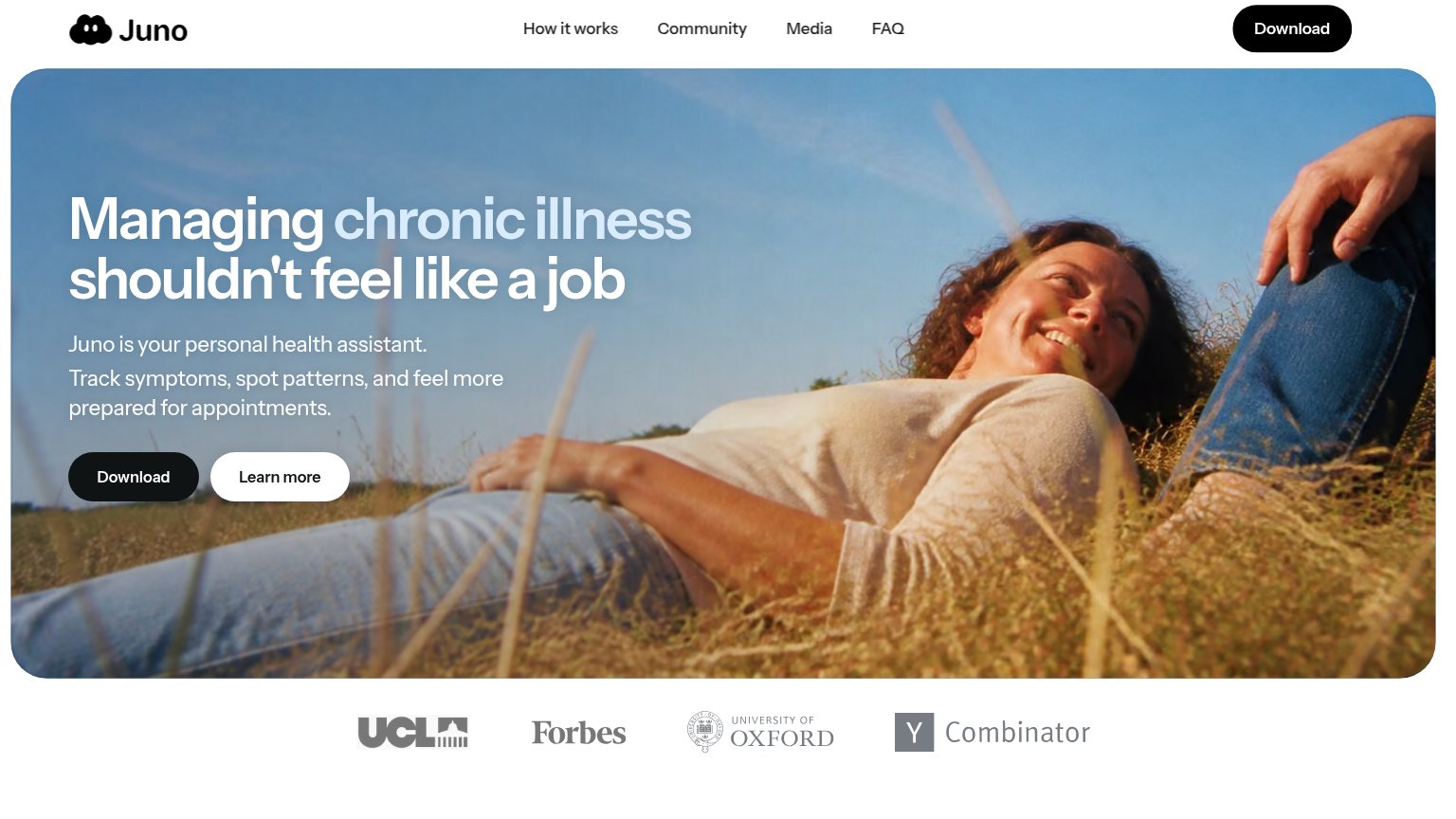
JunoLogo strip featuring UCL, Forbes, University of Oxford, and Y Combinator below the hero
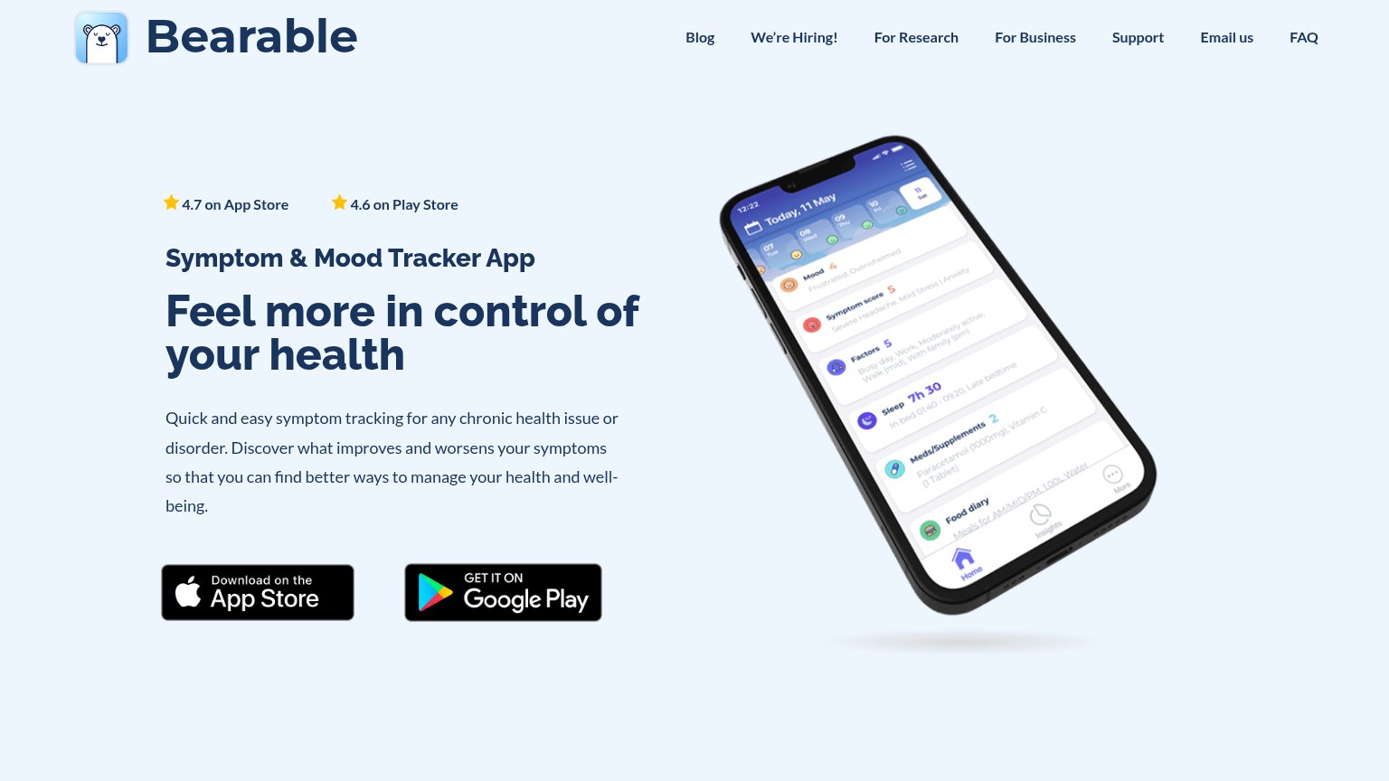
Bearable"4.7 on App Store" and "4.6 on Play Store" star ratings above the headline
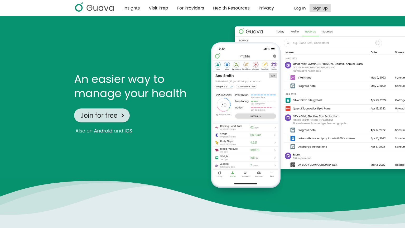
Guava HealthDetailed app UI screenshots showing a health records table with entries like 'Quest Diagnostics Lipid Panel' and a profi
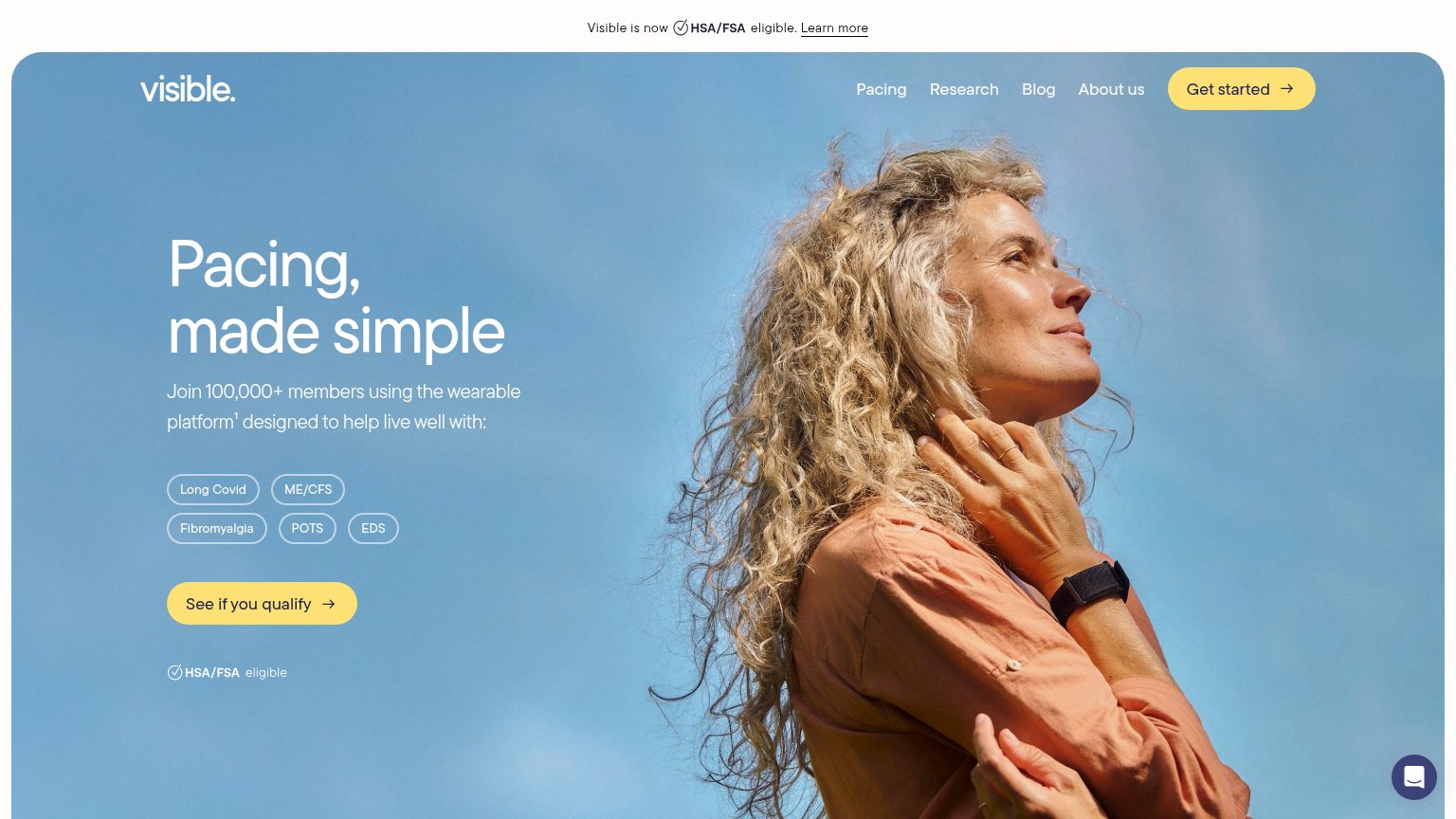
VisibleJoin 100,000+ members using the wearable platform¹
FlaredownProduct mockup showing symptom-tracking UI with specific stats like "23% of days in remission" and "47 total doses of Pr
CareClinic4.8/5 ★ rating • 500K+ users

Mobile web

70Fair

The phone experience as a first-class citizen.

Mobile web annotations on the mobile capture12
  1. Hero Download button — Primary CTA sits ~1,100px down the tall hero card, below the first viewport for most phones.
  2. Learn more button — Same size and width as Download, splitting tap emphasis between two competing actions.

CTA

72Fair

Copy, size, verb, cost-feel — does the primary CTA earn the click?

Juno
Guava Health
Visible

Problems

  • generic label, no benefit
  • install feels effortful
  • no 'free' or price signal visible

Value props

76Fair

Title, subtitle, hero — do they sell the product's true value?

Juno’s headline sellsManaging chronic illness shouldn't feel like a jobJuno is your personal health assistant. Track symptoms, spot patterns, and feel more prepared for appointments.

Working

  • Names the real emotional pain: illness as unpaid work
  • Subhead lists three concrete actions
  • Trust logos back a sensitive health claim

Could improve

  • Hero photo decorates, never shows the product
  • Zero numbers or specifics in the fold
  • "Personal health assistant" is a soft category label

Information hierarchy

78Fair

Does the design help or inhibit what the page is trying to say?

Information hierarchy annotations on the desktop capture123
  1. Learn more button — White pill sits directly beside the primary Download CTA at nearly equal weight, splitting the click decision.
  2. Duplicate Download buttons — Header Download repeats the hero Download; two identically styled black pills dilute the single scan target.
  3. Hero headline contrast — White 'Managing' and pale-blue 'chronic illness' sit over a bright sky, thinning legibility at the most important line.