
Your landing page’s weakest score is Trust.
How Gravy ranks
75Growth scoreupdated
category scores
category scoresShowHide
Score over time
Trust
58FairProof that the product is real, competent, and safe to try.

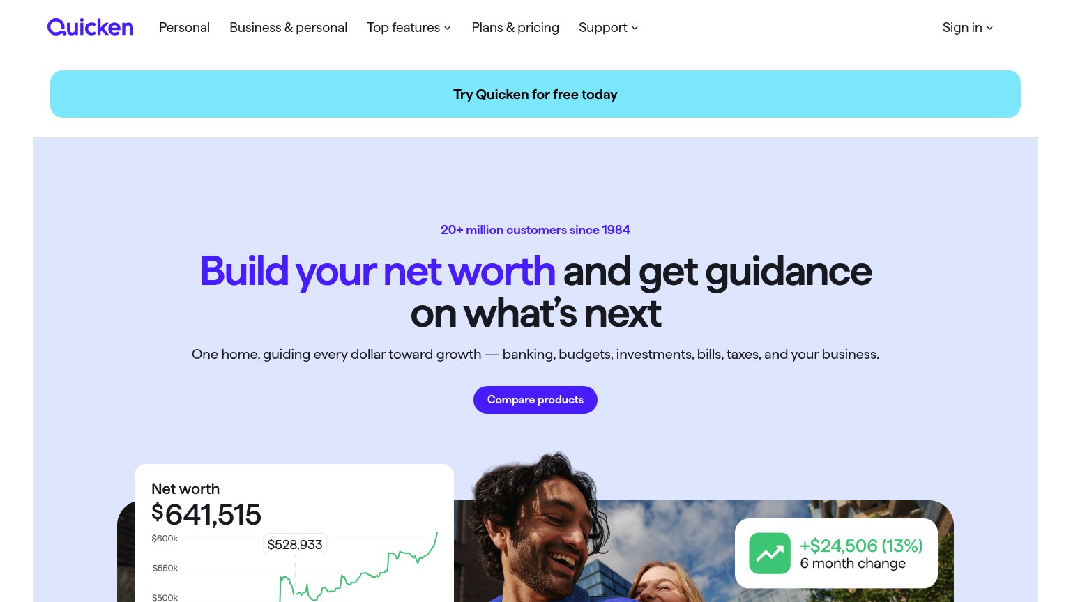
| Trust read | |
|---|---|
| Gravy | "Backed by Y Combinator" badge above the hero headline |
| "Apple Design Awards Finalist" laurel badge (mobile fold) | |
| Synced-accounts UI overlay listing "Mark Checking $5,562.00 · 1 minute ago" and "Sarah 401k $127,816.45" with a "NET WOR | |
| Phone mockup showing "We found 14 actions that can save you $3,457" with a Tax Strategy card: "Save $2,200 on childcare" | |
| 20+ million customers since 1984 | |
| Illustrated spending breakdown showing "$7,690.76 THIS MONTH" with category tooltip "Groceries (14.5%) ($1,115.37)" |
Value props
76FairTitle, subtitle, hero — do they sell the product's true value?
Gravy’s headline sells
Automate your finances
Gravy connects every account, categorizes every transaction, and answers the questions you actually have — all in one local-first AI workspace.
Working
- Subhead lists three concrete jobs
- Hero shows agent actually working
- Local-first is a real differentiator
Could improve
- Headline is a generic fintech phrase
- No numbers quantify the payoff
- Copy misses the relief/emotion angle
CTA
78FairCopy, size, verb, cost-feel — does the primary CTA earn the click?
Problems
- install feels costly upfront
- platform-gated: excludes non-Mac
- no free/cost signal on page
Mobile web
78FairThe phone experience as a first-class citizen.
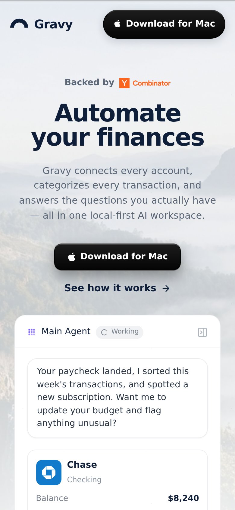 123
- Download for Mac CTA — Mac-only download is un-actionable on a phone; the duplicate header button compounds the dead end.
- See how it works link — The only action a mobile visitor can complete is styled as a low-contrast text link, not a button.
- Header without menu — Desktop nav links vanish entirely on mobile with no hamburger, stranding visitors who want Product or Business pages.
Information hierarchy
84StrongDoes the design help or inhibit what the page is trying to say?
1234- Four-item nav bar — Product, Individuals, Business, and Resources dropdowns give attention four exits before the hero CTA gets read.
- Duplicate nav CTA — Second black 'Download for Mac' pill splits primary-CTA weight with the identical hero button below.
- See how it works — Secondary link sits at the same size and weight beside the hero CTA, competing on the scan path.
- Mockup sidebar list — Small-type agent and page labels add fine-grained detail the fold asks visitors to parse.