
Your landing page’s weakest score is Trust.
How Monarch Money ranks
Trust
58FairProof that the product is real, competent, and safe to try.
| Trust read | |
|---|---|
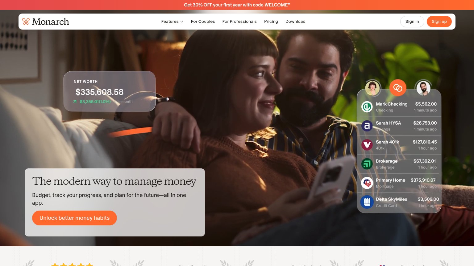
| Monarch Money | Synced-accounts UI overlay listing "Mark Checking $5,562.00 · 1 minute ago" and "Sarah 401k $127,816.45" with a "NET WOR |
| "Ask Behold AI" assistant screen showing real feature UI ("Understand my spending", "Plan for the future", "Take action" | |
| "Apple Design Awards Finalist" laurel badge (mobile fold) | |
| YNAB has a New York Times Bestselling book! Order it today. | |
| Phone mockup showing "We found 14 actions that can save you $3,457" with a Tax Strategy card: "Save $2,200 on childcare" | |
| Detailed in-app screenshot showing 'Current spend this month $3,298' and 'Payday in 8 days' |
Mobile web
62FairThe phone experience as a first-class citizen.
 1
- Net worth widget — The only content in the first viewport is a stat overlay with no value statement or tappable action.
CTA
68FairCopy, size, verb, cost-feel — does the primary CTA earn the click?
How Monarch Money compares
Recommended rewrites
Value props
72FairTitle, subtitle, hero — do they sell the product's true value?
Monarch Money’s headline
The modern way to manage money
Budget, track your progress, and plan for the future—all in one app.
Working
Could improve
Information hierarchy
78FairDoes the design help or inhibit what the page is trying to say?
What works
What to improve