
Your landing page’s weakest score is Information hierarchy.
How Quicken Simplifi ranks
72Growth scoreupdated
category scores
category scoresShowHide
Information hierarchy
68FairDoes the design help or inhibit what the page is trying to say?
 1234
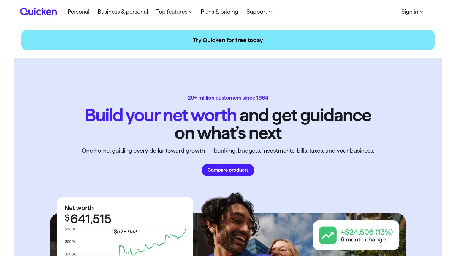
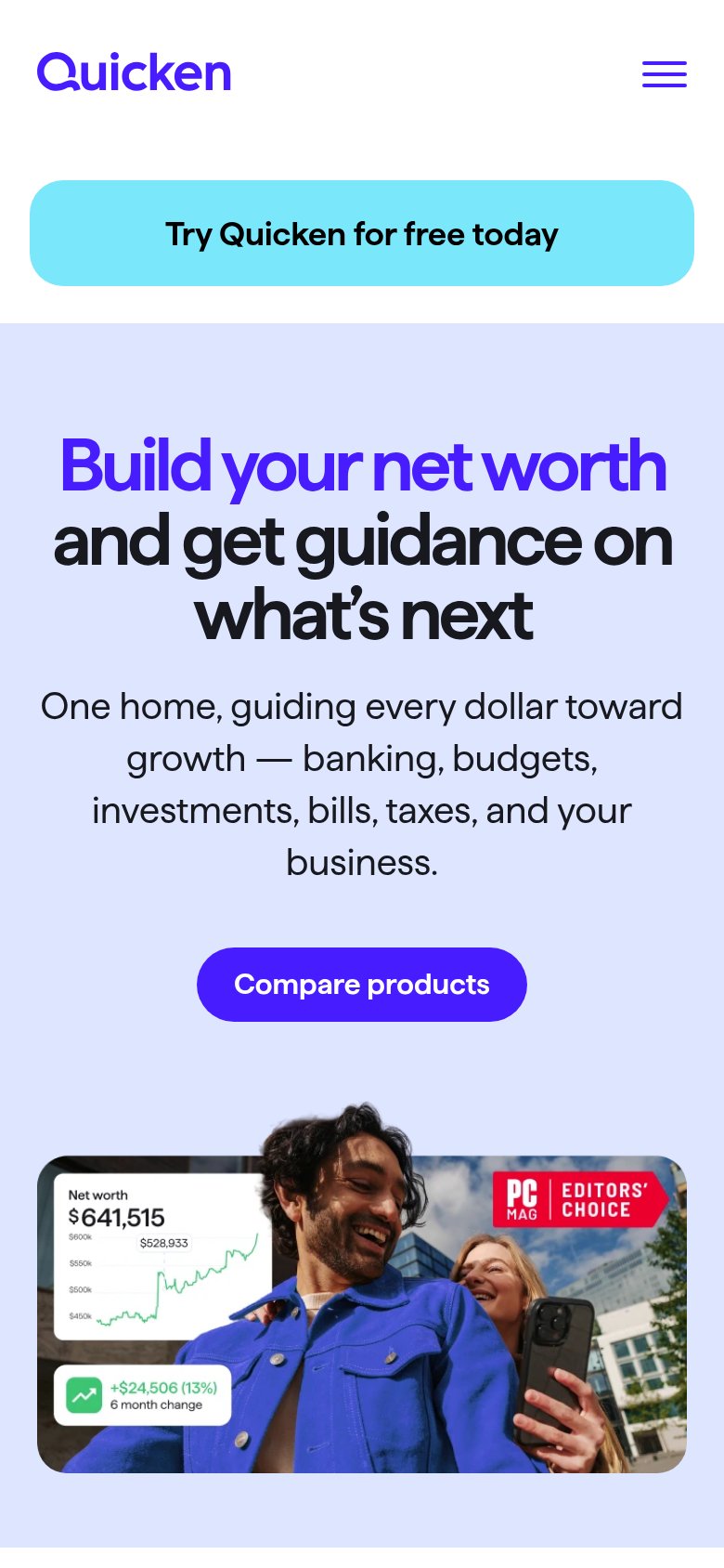
- Two competing CTAs — The cyan "Try Quicken for free today" banner and purple "Compare products" button carry equal weight, splitting the visitor's one action into two.
- Full-width banner CTA — The primary conversion action is styled as a dismissible promo strip above the hero, a pattern visitors are trained to skim past as an ad.
- Top navigation row — Seven nav items plus Sign in offer exits before the headline, several with dropdowns multiplying leak paths.
- Compare products button — The only in-hero button routes to a comparison page instead of starting the free trial, sending motivated visitors sideways.
CTA
68FairCopy, size, verb, cost-feel — does the primary CTA earn the click?
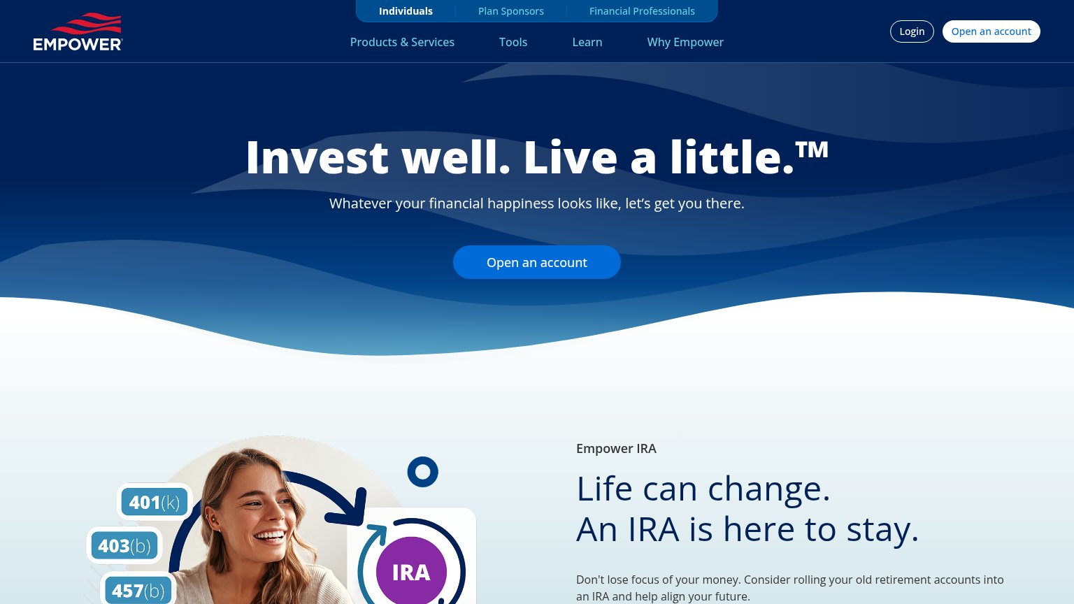
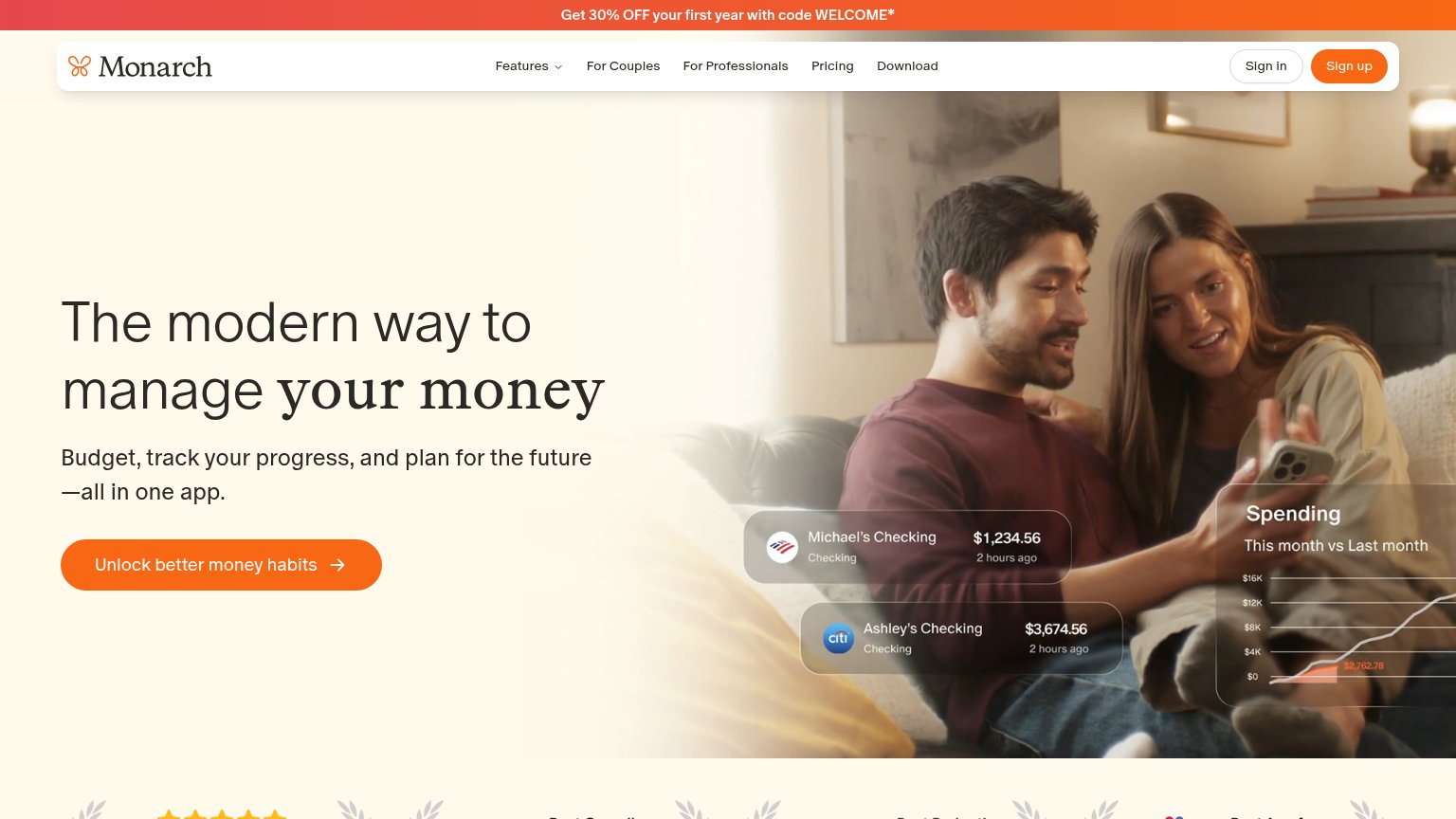
Problems
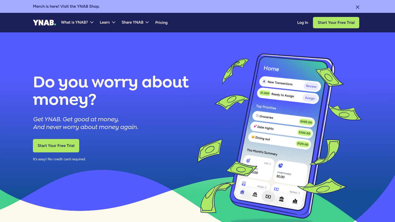
- 5 words — over the 3-word limit
- styled as banner, not hero button
- hero button pushes research instead
- two CTAs split visitor intent
Trust
72FairProof that the product is real, competent, and safe to try.
How Quicken Simplifi compares
Trust read
Mobile web
72FairThe phone experience as a first-class citizen.
What works
What to improve
Value props
82StrongTitle, subtitle, hero — do they sell the product's true value?
Quicken Simplifi’s headline
Build your net worth and get guidance on what's next
One home, guiding every dollar toward growth — banking, budgets, investments, bills, taxes, and your business.
Working
Could improve