
Your landing page’s weakest score is Trust.
How CharacterQuilt ranks
- 1.
Icon82
- 2.
AdCreative.ai80
- 3.
Arcads77
- 4.
Omneky76
- 5.
CharacterQuilt64
- 6.
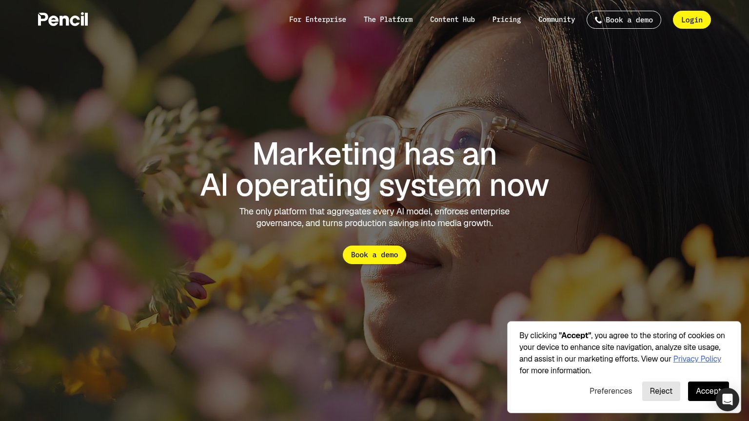
Pencil59
64Growth scoreupdated
category scores
category scoresShowHide
Score over time
Trust
38PoorProof that the product is real, competent, and safe to try.

| Trust read | |
|---|---|
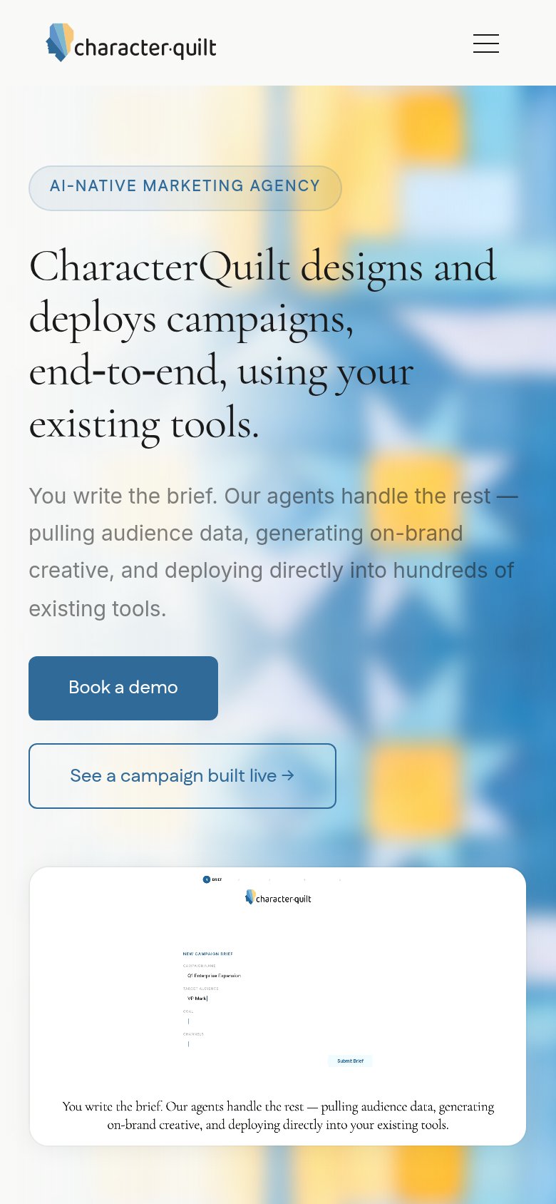
| CharacterQuilt | Embedded product screenshot showing the 'New Campaign Brief' form UI |
| Named customer cards with logos, LinkedIn icons and metrics, e.g. "Daryl Luke, Creative, IM8 Health — $120M ARR in 12 mo | |
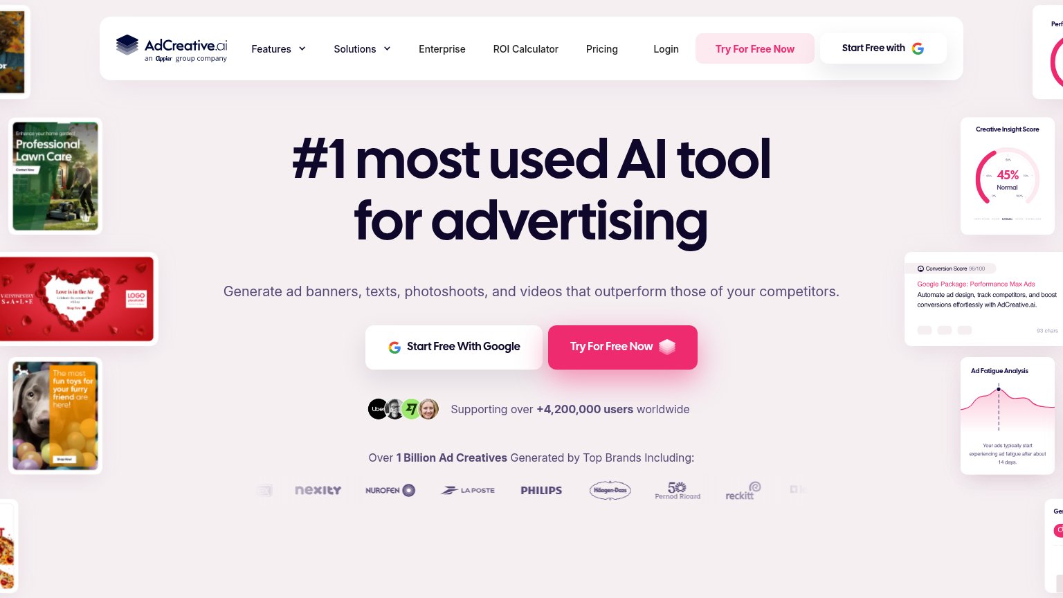
| "Over 1 Billion Ad Creatives Generated by Top Brands Including:" logo row with Philips, Nurofen, La Poste, Häagen-Dazs, | |
| No visible trust signal identified. | |
| No visible trust signal identified. | |
| No visible trust signal identified. |
CTA
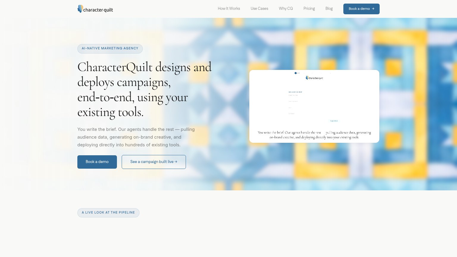
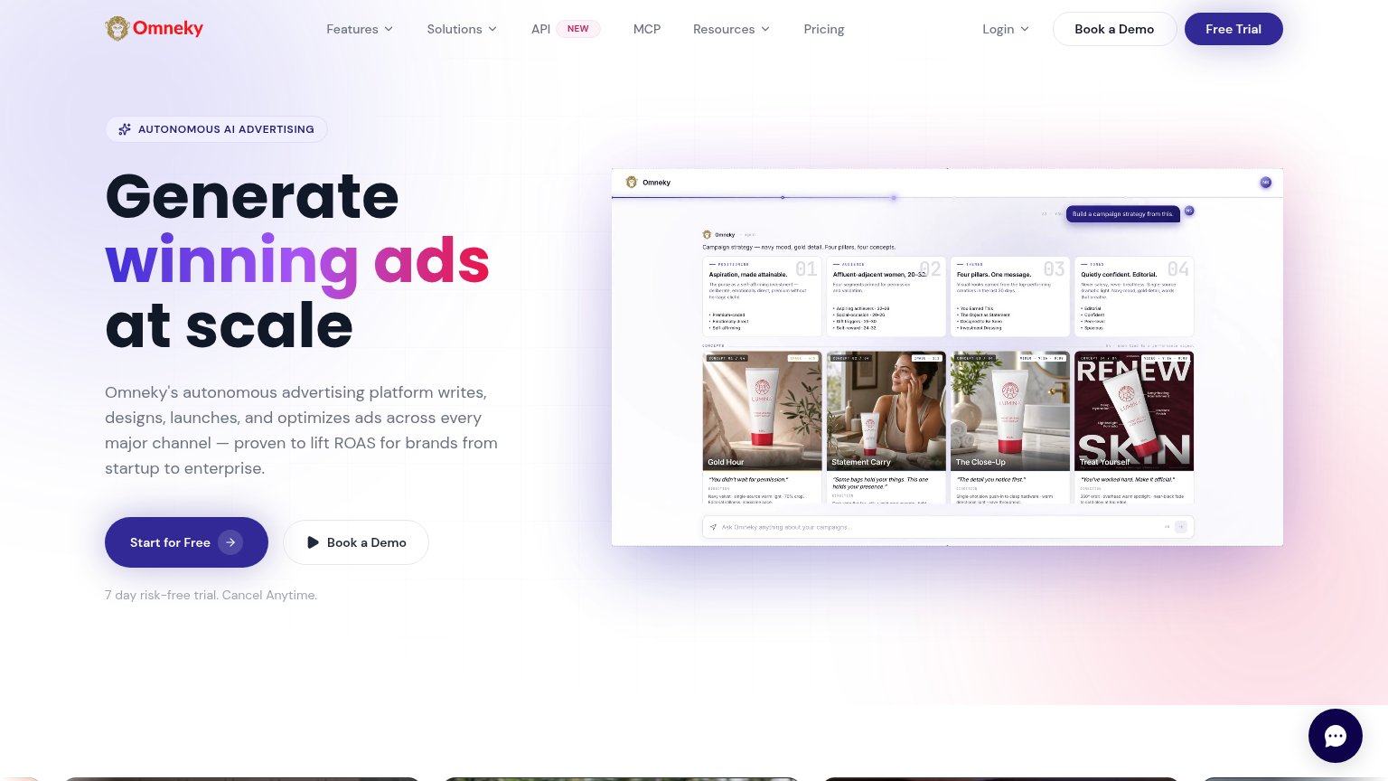
64FairCopy, size, verb, cost-feel — does the primary CTA earn the click?

Problems
- high-cost feel: demo = sales call
- stronger promise buried in secondary
- small footprint vs. huge headline
Information hierarchy
72FairDoes the design help or inhibit what the page is trying to say?
1234- Duplicate Book a demo — Nav and hero both style "Book a demo" as filled primary buttons, splitting the eye between two equal-weight targets.
- Secondary CTA equal size — "See a campaign built live" is sized and positioned as a peer of "Book a demo", diluting the single-action scan path.
- Hero product screenshot — The embedded app card renders its form labels and duplicated subhead copy at illegible size, so it communicates nothing at a glance.
- Five-link nav row — How It Works, Use Cases, Why CQ, Pricing, and Blog offer five exits before the visitor reaches the hero promise.
Value props
72FairTitle, subtitle, hero — do they sell the product's true value?
CharacterQuilt’s headline sells
CharacterQuilt designs and deploys campaigns, end-to-end, using your existing tools.
You write the brief. Our agents handle the rest — pulling audience data, generating on-brand creative, and deploying directly into hundreds of existing tools.
Working
- Names the end-to-end outcome plainly
- Subhead maps who does what
- Hero shows the real brief workflow
Could improve
- No hard numbers or proof points
- 'Hundreds of tools' is vague — name them
- Copy is flat; no emotional payoff
Mobile web
72FairThe phone experience as a first-class citizen.
1234- Book a demo button — Desktop-proportioned button at ~1/3 column width, pushed below the first viewport by the long hero copy.
- Secondary outline CTA — "See a campaign built live" is wider than the primary button, inverting the visual hierarchy of the two actions.
- Product screenshot embed — Desktop UI shrunk into the phone column; form labels and "Submit Brief" text are unreadably small.
- Hero headline block — Serif headline wraps into four tall lines, consuming most of the fold before any action appears.