
Your landing page’s weakest score is Information hierarchy.
How AdCreative.ai ranks
- 1.
Icon82
- 2.
AdCreative.ai80
- 3.
Omneky76
- 4.
Lapis65
- 5.
Pencil59
80Growth scoreupdated
category scores
category scoresShowHide
Information hierarchy
73FairDoes the design help or inhibit what the page is trying to say?
 1234
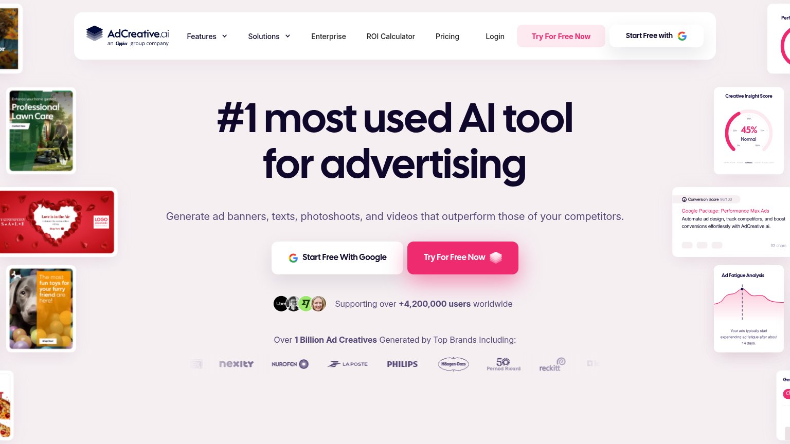
- Start Free With Google — Equal size and adjacency to the pink 'Try For Free Now' splits the primary click into two same-weight choices.
- Header CTA pair — 'Try For Free Now' and 'Start Free with Google' repeat the hero buttons, putting four signup CTAs in one fold.
- Clipped Conversion Score card — Right-edge card is cut mid-sentence, adding half-readable visual noise instead of a legible product proof.
- Six-link nav row — Features, Solutions, Enterprise, ROI Calculator, Pricing, and Login all offer exits before the signup action.
Value props
76FairTitle, subtitle, hero — do they sell the product's true value?
AdCreative.ai’s headline vague
#1 most used AI tool for advertising
Generate ad banners, texts, photoshoots, and videos that outperform those of your competitors.
Working
- Subhead names outputs and outcome
- Heavy proof: 4.2M users, 1B creatives, brand logos
- Side cards demonstrate the product scoring ads
Could improve
- H1 is a popularity claim, not a value claim
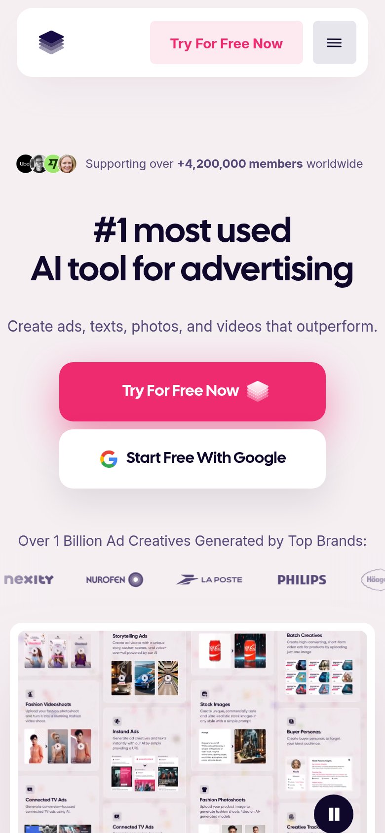
- Mobile subhead cuts 'competitors' and reads truncated
- No performance number (CTR/conversion lift) cited
CTA
82StrongCopy, size, verb, cost-feel — does the primary CTA earn the click?
How AdCreative.ai compares
Recommended rewrites
Trust
84StrongProof that the product is real, competent, and safe to try.
How AdCreative.ai compares
Trust read
Mobile web
86StrongThe phone experience as a first-class citizen.
What works
What to improve