ArmatureYC P26 landing page report.
← Back to YC P26

Your landing page’s weakest score is Information hierarchy.

How Armature ranks

  1. 1.Athena80
  2. 2.Peec AI77
  3. 3.Armature75
  4. 4.Profound70
Fix Information hierarchy

Score over time

85807570656055Profound 68 on Jul 1 (Wayback)Profound 63 on Jul 15 (Wayback)Profound 70 on Aug 3 (Live)Profound 62 on Aug 10 (Wayback)Athena 80 on Aug 3 (Live)Peec AI 74 on May 16 (Wayback)Peec AI 74 on May 28 (Wayback)Peec AI 75 on Jun 8 (Wayback)Peec AI 73 on Jun 23 (Wayback)Peec AI 73 on Jul 17 (Wayback)Peec AI 77 on Aug 3 (Live)Peec AI 74 on Aug 10 (Wayback)Armature 75 on May 12 (Wayback)Armature 69 on Jun 7 (Wayback)Armature 74 on Aug 3 (Wayback)Armature 72 on Sep 4 (Wayback)Armature 75 on Sep 20 (Live)May 12Jun 7Aug 3Sep 4Sep 20
Past reportsShow past reportsHide past reports
  1. Sep 20, 202675LiveOverall +3 · Mobile web +8 · Information hierarchy +4Viewing
  2. Sep 4, 202672Overall −2 · Trust +20 · CTA −10View →
  3. Aug 3, 202674Overall +5 · CTA +24 · Trust −6View →
  4. Jun 7, 202669Overall −6 · CTA −16 · Value props −6View →
  5. May 12, 202675First tracked report — strongest Value props 84, weakest Trust 64View →

Information hierarchy

72Fair

Does the design help or inhibit what the page is trying to say?

Information hierarchy annotations on the desktop capture1234
  1. Leaderboard sector tab row — Eight tab links plus search, filters, share and fullscreen controls flood the fold with exits competing against Get discovered.
  2. Book a call button — Styled at near-equal weight beside Get discovered, splitting the primary action into two choices.
  3. Announcement bar link — Read the article is the first clickable element on the page and routes attention away before the pitch lands.
  4. Explore the comparison banner — An orange in-widget promo link steals the accent color reserved for the primary CTA.

CTA

72Fair

Copy, size, verb, cost-feel — does the primary CTA earn the click?

Armature
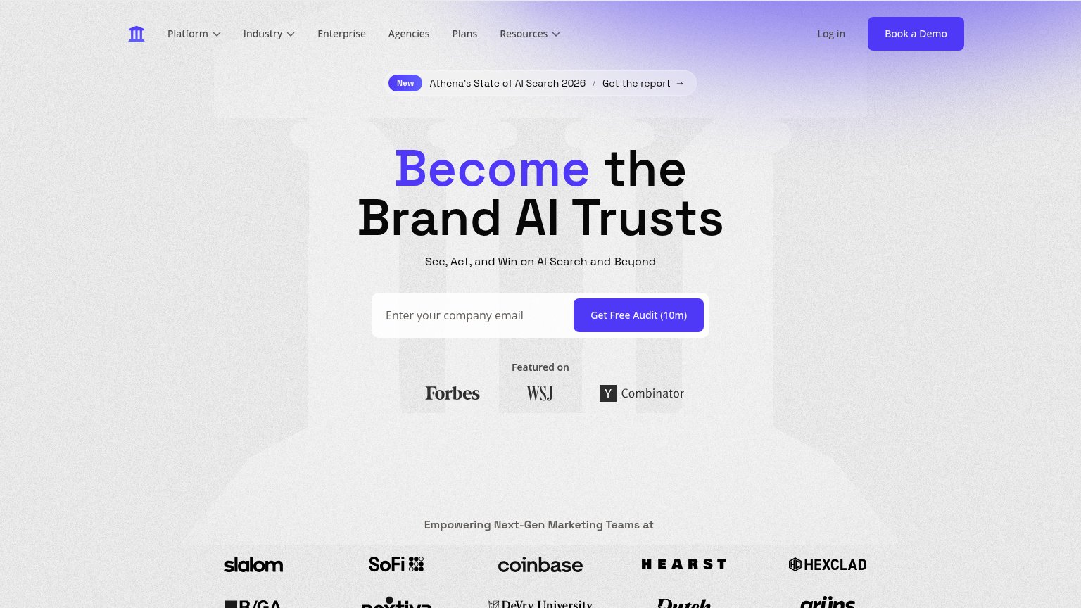
Athena
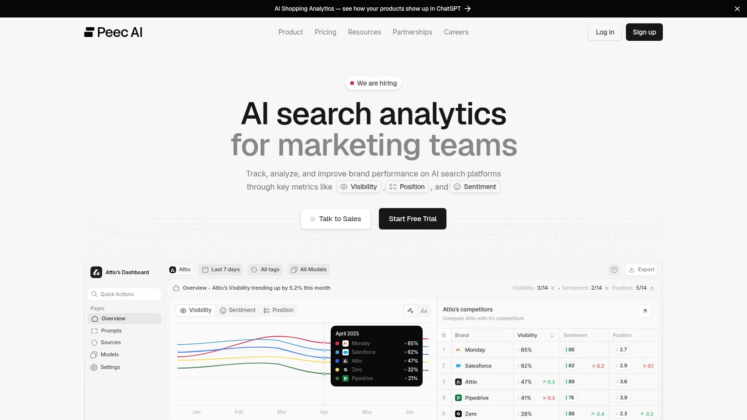
Peec AI

Problems

  • 'Book a call' equal-weight beside it
  • vague payoff — discovered by whom?
  • hero button small vs huge headline

Trust

72Fair

Proof that the product is real, competent, and safe to try.

Armature
Athena
Trust read
Armature"7,958 judged runs across 29 sectors, on real agent CLIs at pinned versions" in the embedded leaderboard widget
ProfoundReal product workflow UI titled "AEO-Optimized FAQ Generator" showing nodes like "Web Page Scrape" with a Succeeded stat
AthenaCustomer logo wall under 'Empowering Next-Gen Marketing Teams at' featuring SoFi, Coinbase, Hearst, and Hexclad
Peec AINo visible trust signal identified.

Mobile web

76Fair

The phone experience as a first-class citizen.

Mobile web annotations on the mobile capture123
  1. Announcement bar — Wraps to three lines plus a link, consuming the top of the fold before the brand or value prop appears.
  2. Hero CTA pair — "Get discovered" sits at half column width beside "Book a call" instead of a full-bleed thumb target, and duplicates the header CTA.
  3. Leaderboard search row — Desktop-density dark toolbar (search, filters, sector tabs) crams into the phone column with truncated "Observability" tab and tiny tap targets.

Value props

82Strong

Title, subtitle, hero — do they sell the product's true value?

Armature’s headline sellsBe the tool Cursor choosesWith Armature get recommended and implemented for any user in any context. Then see what users do, and run evals so it keeps working.

Working

  • Names Cursor — instantly concrete audience hook
  • Outcome-first headline, not a feature list
  • Live leaderboard demos the product in the fold

Could improve

  • Subhead's "any user in any context" is vague
  • Proof numbers buried below hero, not in copy
  • Emotional stakes of losing agent picks untapped

Competitors

inferred from product, audience, and value prop