ANORIAYC P26 landing page report.
← Back to YC P26

Your landing page’s weakest score is Trust.

Fix Trust

Score over time

8070605040Amazfit Helio Ring 63 on Apr 3 (Wayback)Amazfit Helio Ring 61 on Jun 4 (Wayback)Amazfit Helio Ring 62 on Jun 25 (Wayback)Amazfit Helio Ring 62 on Jul 30 (Wayback)Amazfit Helio Ring 62 on Sep 6 (Wayback)Amazfit Helio Ring 50 on Sep 21 (Live)Ultrahuman 67 on Sep 22 (Live)WHOOP 58 on Apr 22 (Wayback)WHOOP 70 on Sep 22 (Live)Oura 58 on May 31 (Wayback)Oura 54 on Jun 29 (Wayback)Oura 54 on Jul 11 (Wayback)Oura 58 on Jul 26 (Wayback)Oura 66 on Aug 10 (Wayback)Oura 59 on Sep 8 (Wayback)Oura 69 on Sep 21 (Live)Bee 67 on May 16 (Wayback)Bee 66 on May 25 (Wayback)Bee 67 on Jun 18 (Wayback)Bee 66 on Jul 12 (Wayback)Bee 65 on Jul 25 (Wayback)Bee 67 on Aug 16 (Wayback)Bee 62 on Sep 20 (Live)ANORIA 58 on May 7 (Wayback)ANORIA 59 on May 17 (Wayback)ANORIA 61 on Jun 16 (Wayback)ANORIA 59 on Sep 20 (Live)May 7May 17Jun 16Sep 20
Past reportsShow past reportsHide past reports
  1. Sep 20, 202659LiveOverall −2 · CTA −4 · Value props −4Viewing
  2. Jun 16, 202661Overall +2 · Information hierarchy +8 · Mobile web −4View →
  3. May 17, 202659Overall +1 · Information hierarchy −8 · CTA +8View →
  4. May 7, 202658First tracked report — strongest Information hierarchy 76, weakest Trust 32View →

Trust

38Poor

Proof that the product is real, competent, and safe to try.

Amazfit Helio Ring
Bee
Oura
Ultrahuman
WHOOP
Trust read
ANORIANo visible trust signal identified.
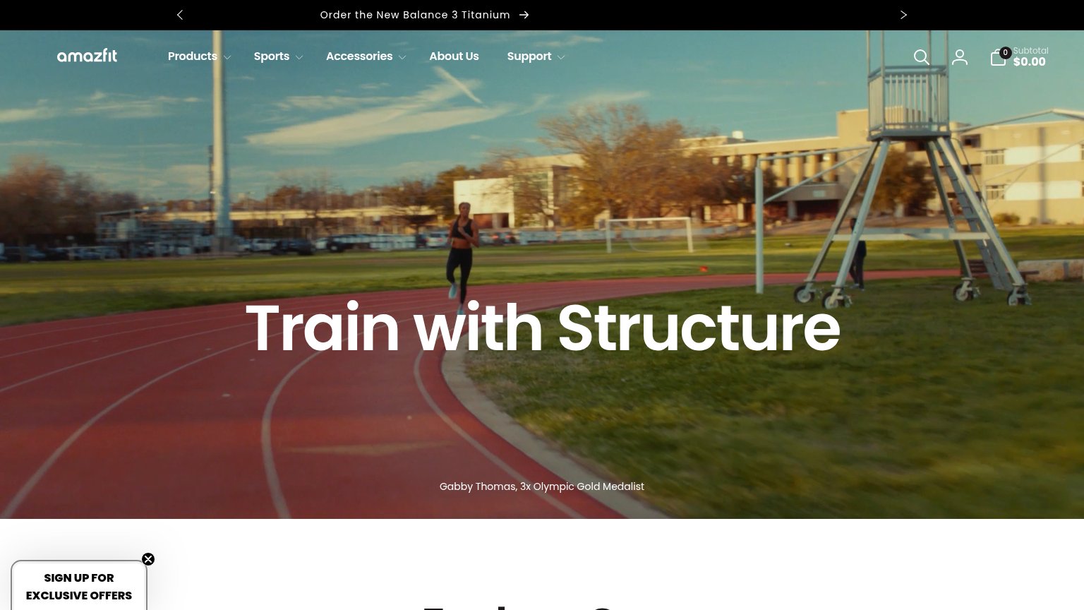
Amazfit Helio Ring"Gabby Thomas, 3x Olympic Gold Medalist" athlete endorsement caption in the hero
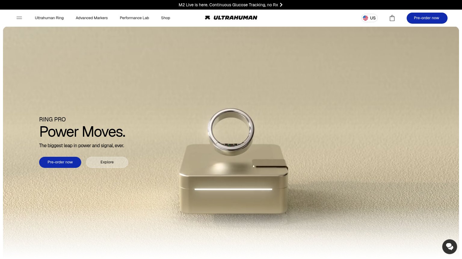
UltrahumanPhotorealistic product shot of the Ring Pro on its charging case
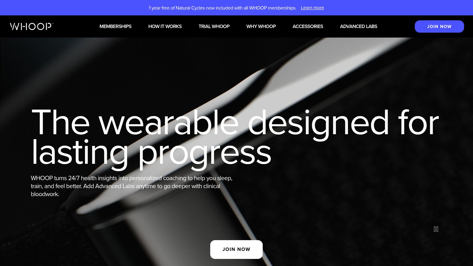
WHOOP"1 year free of Natural Cycles now included with all WHOOP memberships." partnership banner
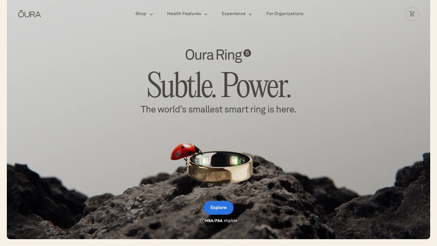
Oura"HSA/FSA eligible" badge directly beneath the Explore CTA
BeeAmazon logo paired with the Bee mark in the "Bee is hiring" banner

Value props

48Poor

Title, subtitle, hero — do they sell the product's true value?

ANORIA’s headline vagueRead Your Emotions, Write Your Story.A WEARABLE FOR THE EQ ERA.

Working

  • Evocative, emotionally toned phrasing
  • Names the category: a wearable
  • Memorable parallel structure

Could improve

  • Never says what the device does
  • 'EQ era' jargon blocks first-time parse
  • Hero image hides the product

CTA

62Fair

Copy, size, verb, cost-feel — does the primary CTA earn the click?

ANORIA
Ultrahuman
WHOOP
Bee
Oura

Problems

  • text link, not a button
  • 'sign up' feels like work
  • 5 words — too long
  • low contrast on busy image

Mobile web

68Fair

The phone experience as a first-class citizen.

Mobile web annotations on the mobile capture123
  1. Early access text link — Primary CTA is a thin underlined text link, not a thumb-friendly full-width button.
  2. Uncollapsed header row — Three social icons, logo, and CONTACT crammed on one row instead of a hamburger; social links leak taps off-site before the pitch.
  3. Tracked eyebrow headline — Wide letter-spacing forces 'A WEARABLE FOR THE EQ ERA.' to wrap awkwardly and slows reading.

Information hierarchy

78Fair

Does the design help or inhibit what the page is trying to say?

Information hierarchy annotations on the desktop capture1234
  1. Early access CTA — Underlined text-link styling over a busy photo gives the primary action no more weight than the labels around it.
  2. WATCH FILM link — Styled in the same uppercase letterspaced treatment as the primary CTA, creating a competing action in the same column.
  3. Social icon row — Instagram, X, and YouTube exits sit at the top of the scan path before the visitor ever reaches the signup CTA.
  4. Headline over photo — White type crosses light sand and dark fabric with no scrim, thinning legibility mid-sentence.