
Your landing page’s weakest score is Trust.
How Bee ranks
62Growth scoreupdated
category scores
category scoresShowHide
Trust
56FairProof that the product is real, competent, and safe to try.


| Trust read | |
|---|---|
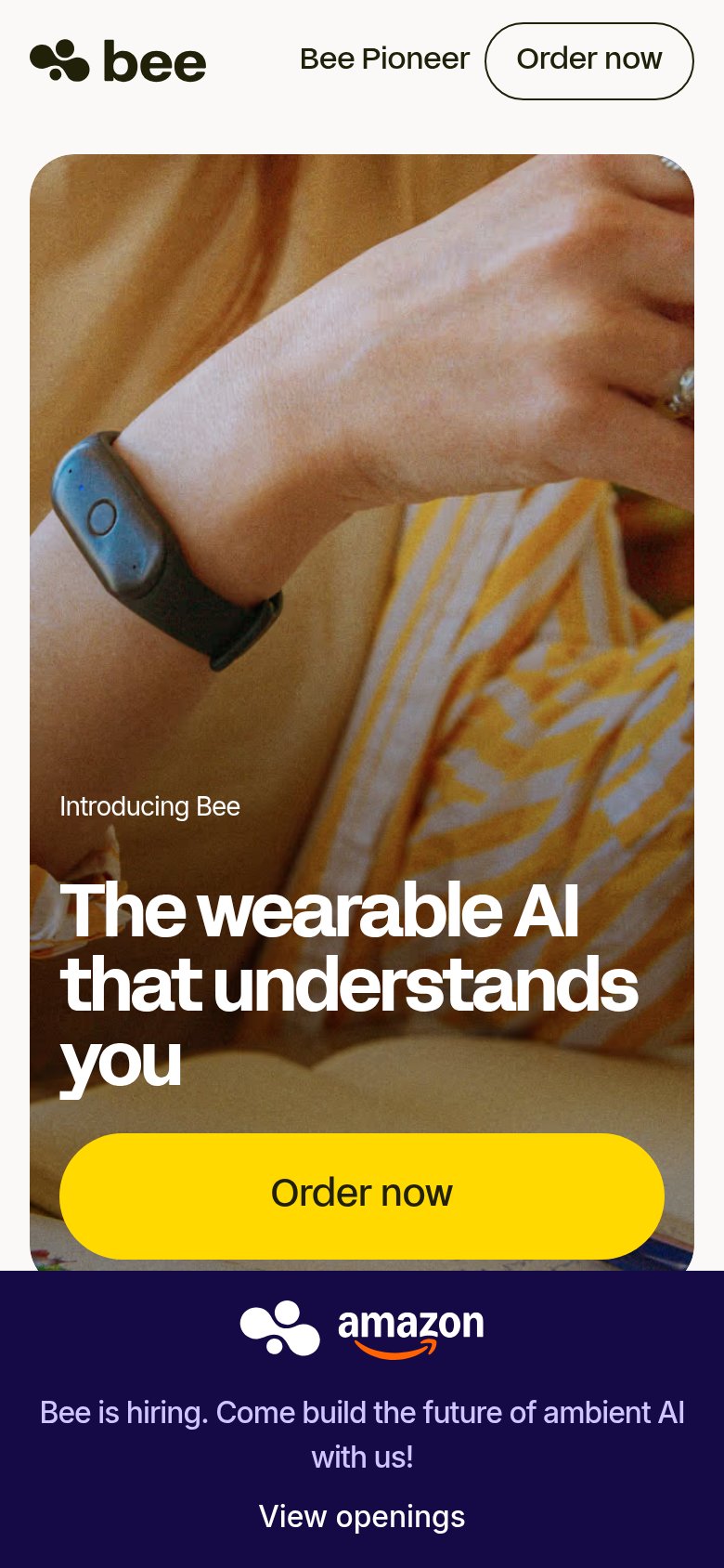
| Bee | Amazon logo paired with the Bee mark in the "Bee is hiring" banner |
| Video thumbnail showing the physical Pocket device held in-hand | |
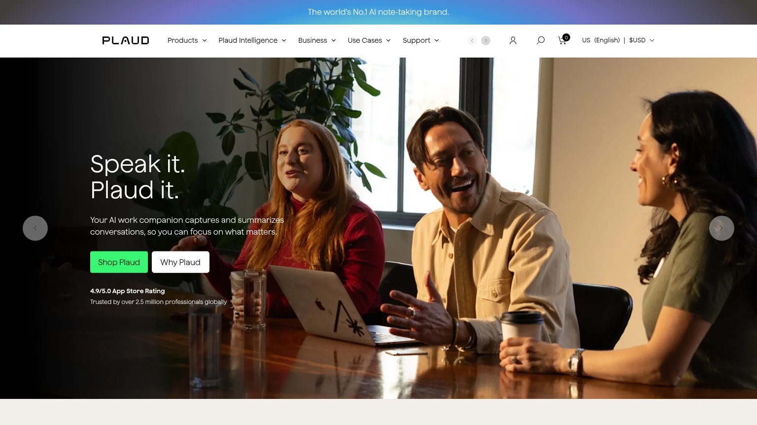
| "4.9/5.0 App Store Rating — Trusted by over 2.5 million professionals globally" under the Shop Plaud CTA | |
| Headline "Limitless has been acquired by Meta" paired with the founder video "Message from Dan Siroker, Co-Founder & CEO |
Information hierarchy
58FairDoes the design help or inhibit what the page is trying to say?
1234- Truncated hero headline — "The wearable AI that" cuts off mid-sentence, so the desktop fold never delivers the value proposition.
- Hiring banner — The Amazon recruiting strip with "View openings" occupies the bottom of the fold and pulls attention to an exit unrelated to buying Bee.
- Video overlay panel — The dark "Bee" play-button card sits at the same visual height as the headline zone and competes with the value prop before it resolves.
- Order now outline button — The primary CTA is a small, low-contrast outlined pill in the top-right corner, outside the hero's natural scan path.
Value props
58FairTitle, subtitle, hero — do they sell the product's true value?
Bee’s headline
The wearable AI that understands you
Working
Could improve
CTA
68FairCopy, size, verb, cost-feel — does the primary CTA earn the click?
How Bee compares
Recommended rewrites
Mobile web
72FairThe phone experience as a first-class citizen.
What works
What to improve