
Your landing page’s weakest score is Trust.
How Andustry ranks
68Growth scoreupdated
category scores
category scoresShowHide
Score over time
Trust
52FairProof that the product is real, competent, and safe to try.
| Trust read | |
|---|---|
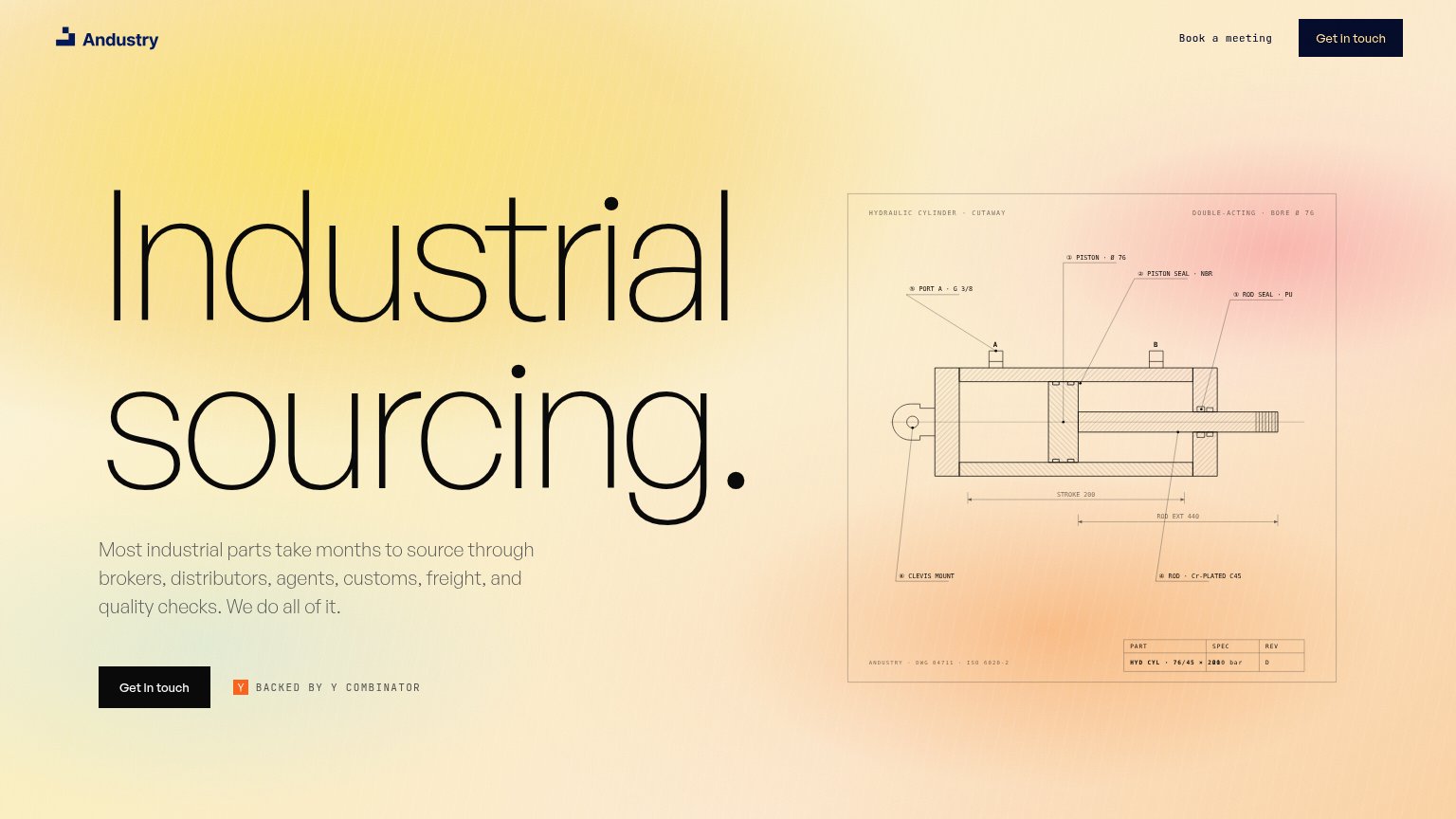
| Andustry | BACKED BY Y COMBINATOR badge beside the Get in touch CTA |
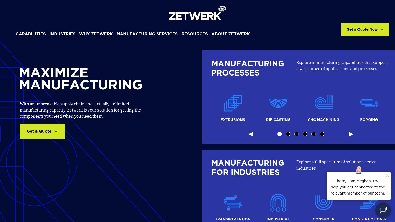
| No visible trust signal identified. | |
| No visible trust signal identified. | |
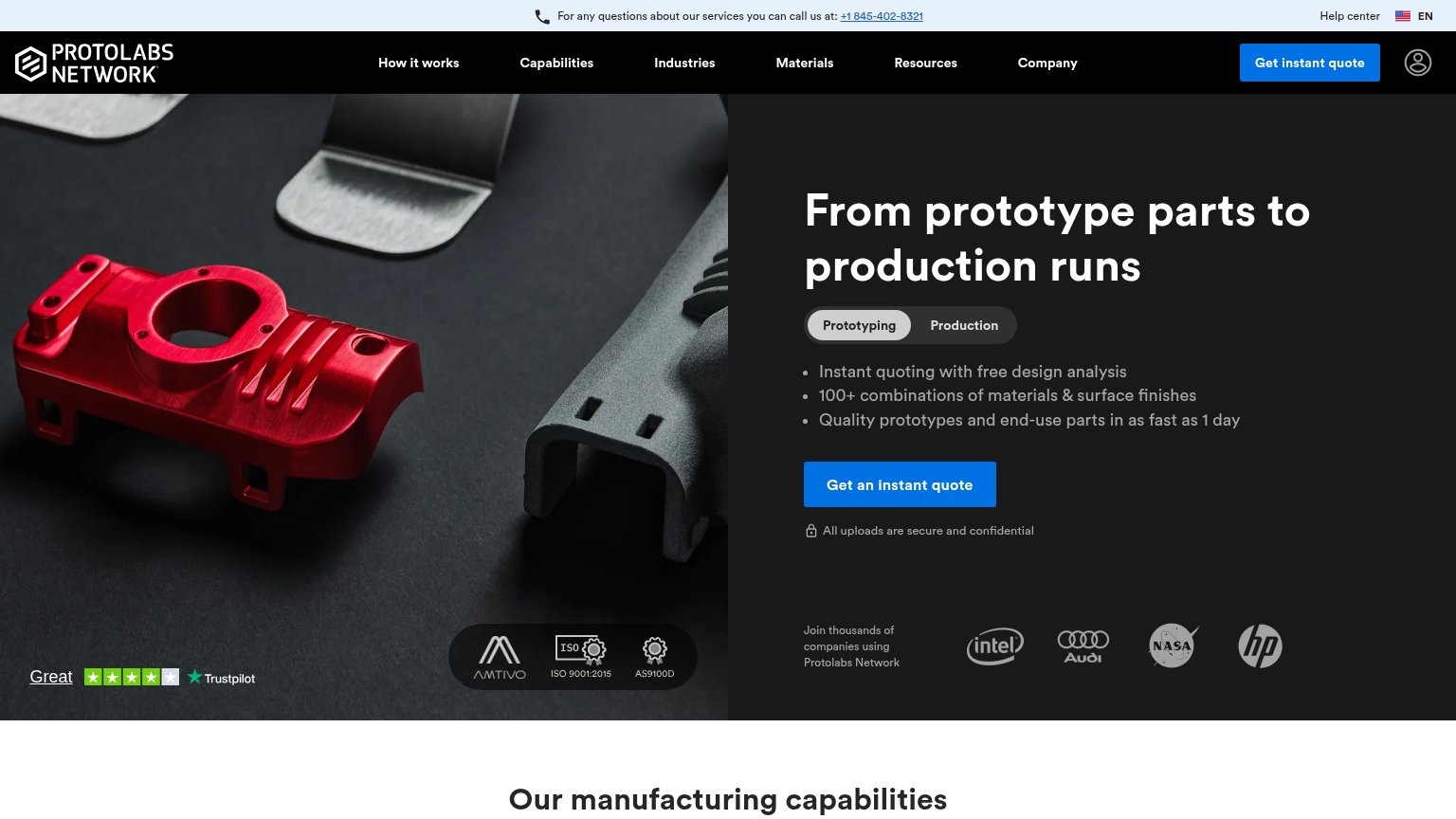
| Customer logo strip (Intel, Audi, NASA, HP) captioned "Join thousands of companies using Protolabs Network" | |
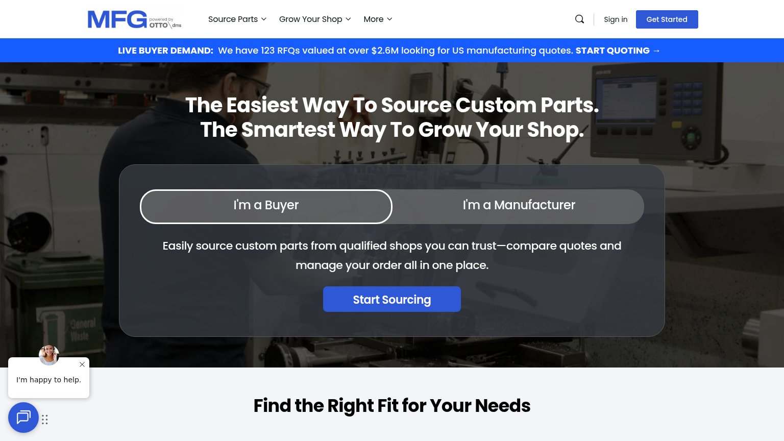
| "We have 123 RFQs valued at over $2.6M looking for US manufacturing quotes" live-demand banner |
CTA
62FairCopy, size, verb, cost-feel — does the primary CTA earn the click?

Problems
- click feels like a sales call
- no value promised for the click
- secondary CTA is same costly ask
- hero button is small vs headline
Value props
64FairTitle, subtitle, hero — do they sell the product's true value?
Andustry’s headline undersells
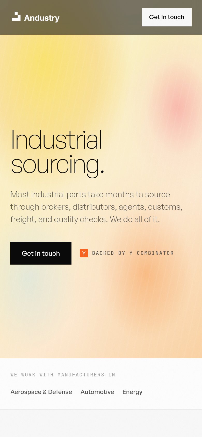
Industrial sourcing.
Most industrial parts take months to source through brokers, distributors, agents, customs, freight, and quality checks. We do all of it.
Working
- Subhead names the real pain: months, six middlemen
- "We do all of it" is a clear, ownable promise
- Blueprint hero signals genuine domain expertise
Could improve
- Headline is a category label, not a value claim
- No number for how much faster Andustry is
- Emotional payoff (relief, speed) never stated
Mobile web
78FairThe phone experience as a first-class citizen.
 123
- Hero Get in touch — Desktop-proportioned button floating at a third of the column width instead of a full-bleed, thumb-friendly tap target.
- YC badge beside CTA — Sits on the same row as the primary CTA, splitting attention and constraining the button's width.
- Muddy header bar — The olive-brown sticky header clashes with the warm gradient and dulls the logo against the hero.
Information hierarchy
82StrongDoes the design help or inhibit what the page is trying to say?
123- Duplicate Get in touch — Header 'Get in touch' repeats the hero CTA at equal visual weight, splitting the click between two identical actions.
- Book a meeting link — A second conversion verb next to 'Get in touch' forces a choice between two near-identical actions instead of one clear path.
- Blueprint diagram labels — Tiny mono-font callouts ('PISTON · Ø 76', 'ROD SEAL · PU') are illegible at this size and add processing load without advancing the promise.