
Your landing page’s weakest score is Mobile web.
How MFG.com ranks
Mobile web
48PoorThe phone experience as a first-class citizen.
 123
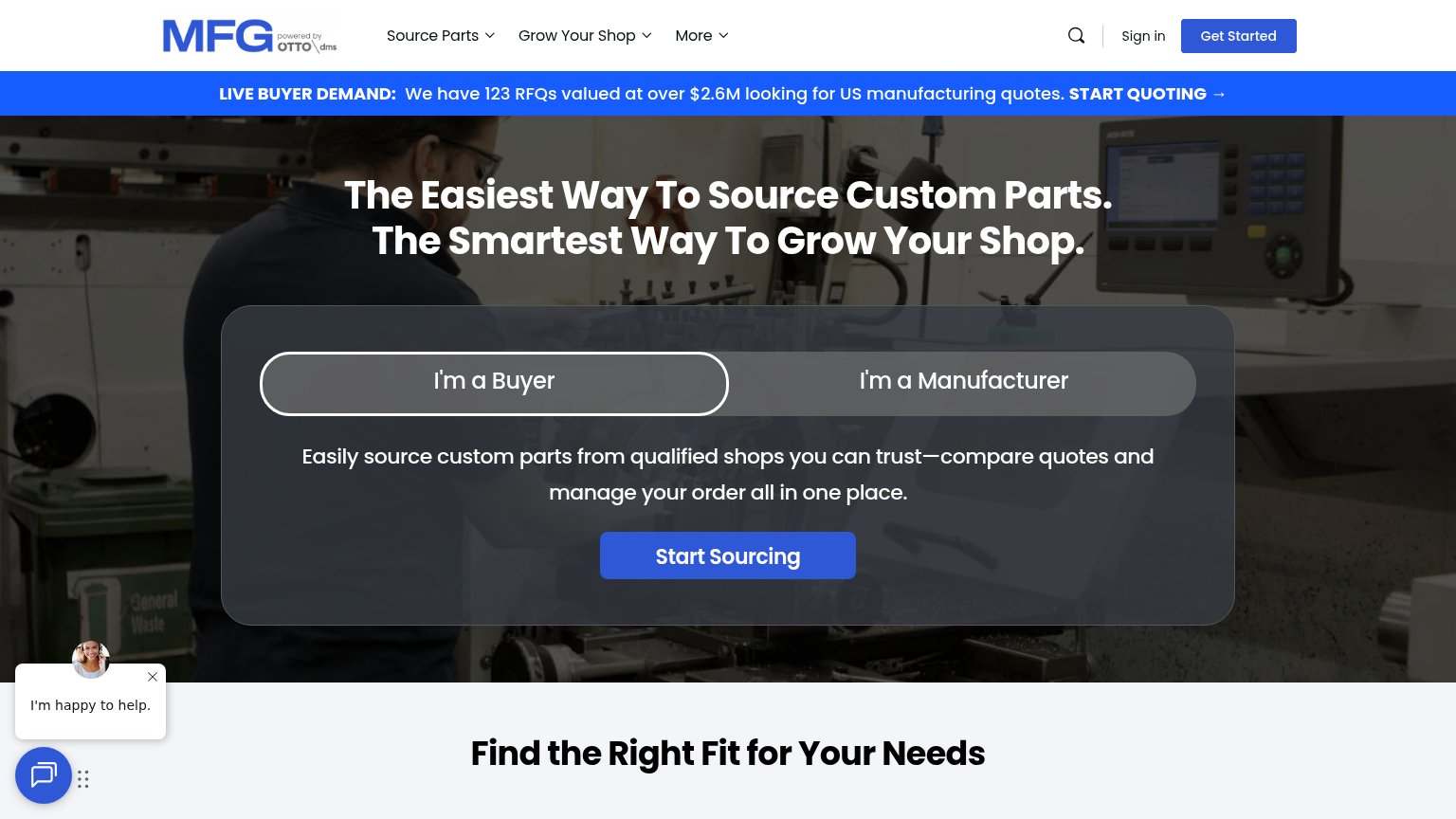
- Chat pop-up overlays CTA — The "I'm happy to help" chat bubble sits directly on top of the "Start Sourcing" button, hiding half its label and blocking the tap.
- LIVE BUYER DEMAND banner — The blue promo banner consumes roughly a quarter of the first viewport, pushing the headline and CTA far down the page.
- Oversized hero headline — The desktop headline wraps into six tall lines on mobile, forcing the segmented control and CTA below the fold.
Trust
52FairProof that the product is real, competent, and safe to try.
| Trust read | |
|---|---|
| MFG.com | "We have 123 RFQs valued at over $2.6M looking for US manufacturing quotes" live-demand banner |
| BACKED BY Y COMBINATOR badge beside the Get in touch CTA | |
| No visible trust signal identified. | |
| No visible trust signal identified. | |
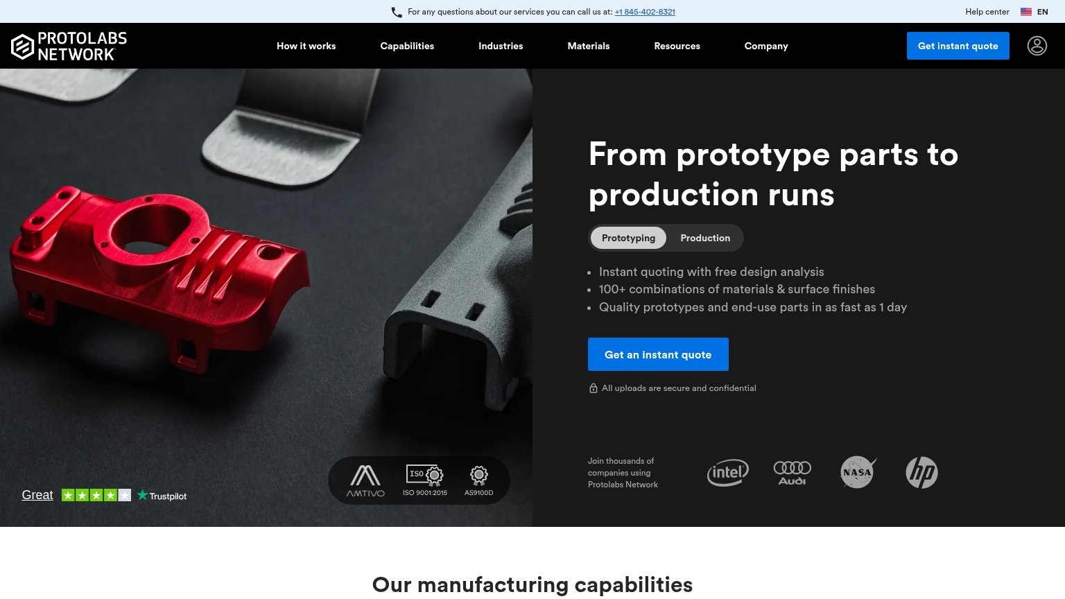
| Customer logo strip (Intel, Audi, NASA, HP) captioned "Join thousands of companies using Protolabs Network" |
Information hierarchy
64FairDoes the design help or inhibit what the page is trying to say?
What works
What to improve
CTA
72FairCopy, size, verb, cost-feel — does the primary CTA earn the click?
How MFG.com compares
Recommended rewrites
Value props
78FairTitle, subtitle, hero — do they sell the product's true value?
MFG.com’s headline
The Easiest Way To Source Custom Parts. The Smartest Way To Grow Your Shop.
Easily source custom parts from qualified shops you can trust—compare quotes and manage your order all in one place.
Working
Could improve