
Your landing page’s weakest score is Trust.
How Kestral ranks
66Growth scoreupdated
category scores
category scoresShowHide
Score over time
Trust
38PoorProof that the product is real, competent, and safe to try.
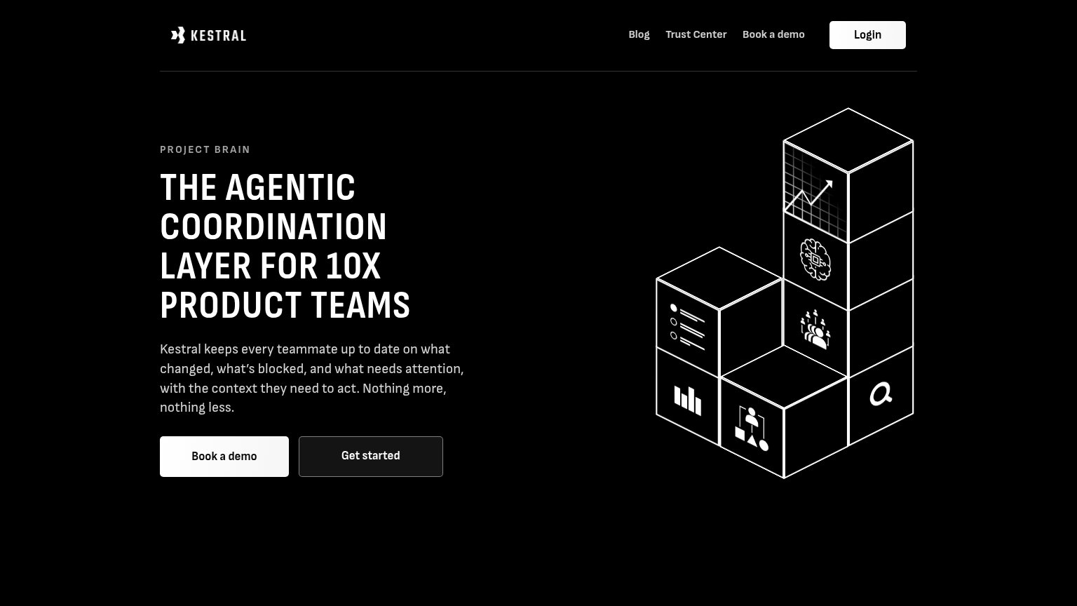
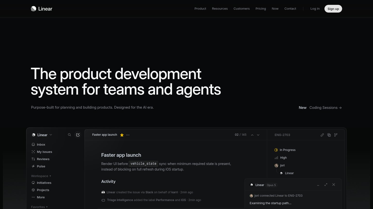
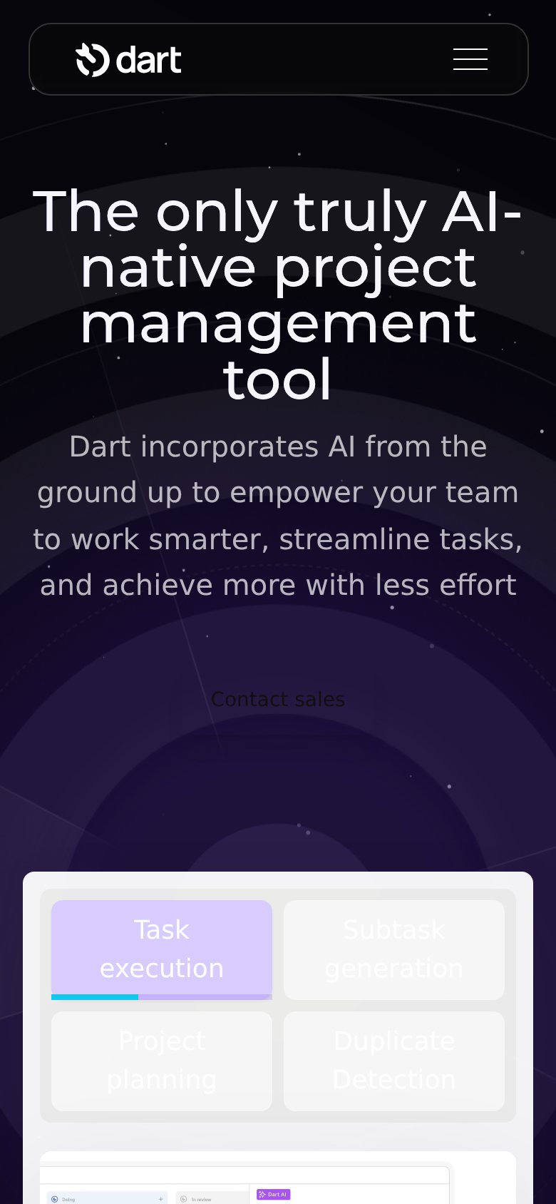
| Trust read | |
|---|---|
| Kestral | "Trust Center" navigation link |
| No visible trust signal identified. | |
| implicit context Zenhub AI may benefit from pre-existing familiarity among its target audience. | |
| Tabbed product demo panel with feature tabs "Task execution", "Subtask generation", "Project planning", "Duplicate Detec | |
| Embedded real product UI showing the "Faster app launch" issue with live activity feed and agent panel |
Value props
62FairTitle, subtitle, hero — do they sell the product's true value?
Kestral’s headline vague
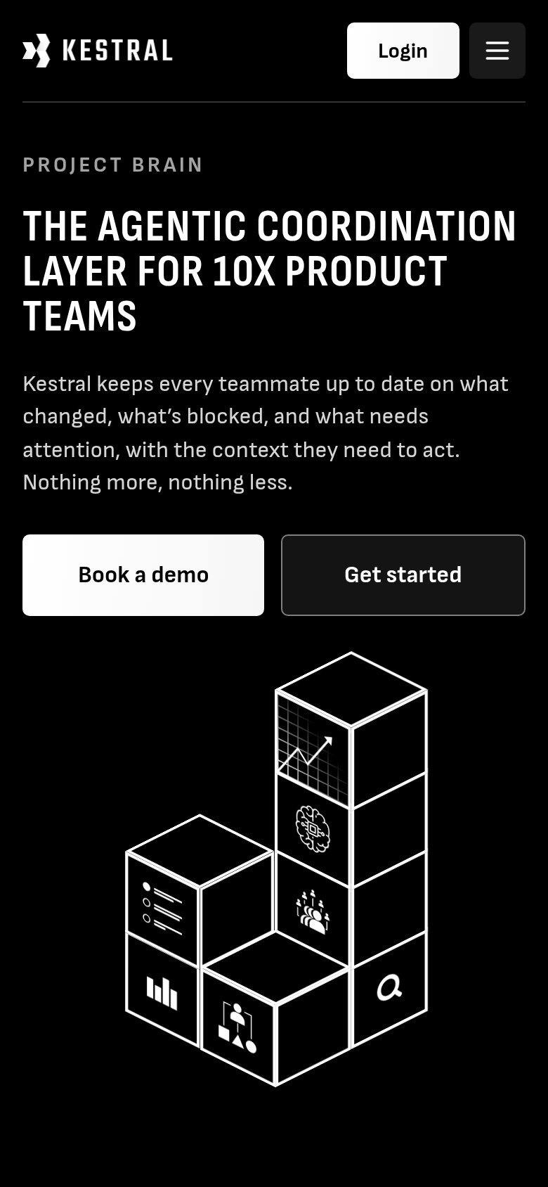
THE AGENTIC COORDINATION LAYER FOR 10X PRODUCT TEAMS
Kestral keeps every teammate up to date on what changed, what’s blocked, and what needs attention, with the context they need to act. Nothing more, nothing less.
Working
- Subhead names concrete outcomes: changed, blocked, attention
- 'Nothing more, nothing less' counters noise fatigue
- Clear audience callout: product teams
Could improve
- 'Agentic coordination layer' is insider jargon
- '10X' is an empty multiplier claim
- Hero art decorates, never shows the product
CTA
68FairCopy, size, verb, cost-feel — does the primary CTA earn the click?
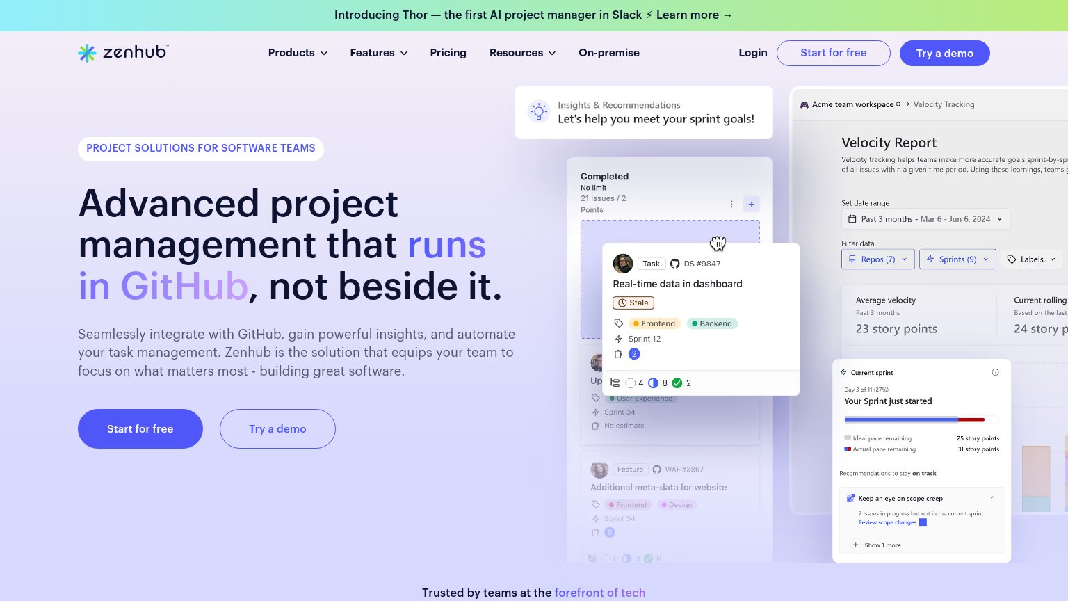
Problems
- demo click feels costly
- cheaper 'Get started' is demoted
- no payoff named in label
Information hierarchy
78FairDoes the design help or inhibit what the page is trying to say?
123- White Login button — Styled identically to the primary 'Book a demo' pill, so the strongest visual weight in the fold points to an exit.
- Get started button — Second equal-size CTA beside 'Book a demo' with an unclear distinction, splitting the click decision.
- Nav Book a demo link — Duplicates the hero CTA as a plain text link, diluting the single conversion path.
Mobile web
82StrongThe phone experience as a first-class citizen.
 12
- Side-by-side CTA pair — Two equal-weight half-width buttons split the tap decision; the primary should be full-bleed with the secondary stacked below.
- Header Login button — A prominent Login next to the hamburger gives an existing-customer action top billing over the conversion path.