
Your landing page’s weakest score is Trust.
How Zenhub AI ranks
- 1.
Zenhub AI72
- 2.
Linear71
- 3.
Kestral66
- 4.
Stepsize AI65
- 5.
Dart56
72Growth scoreupdated
category scores
category scoresShowHide
Trust
56FairProof that the product is real, competent, and safe to try.
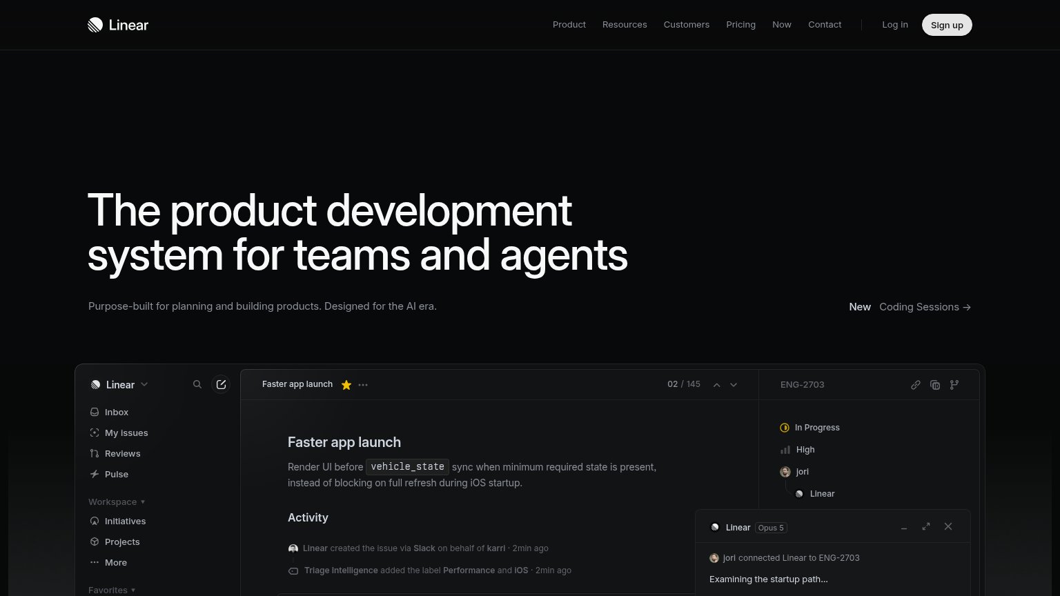
| Trust read | |
|---|---|
| Zenhub AI | implicit context Zenhub AI may benefit from pre-existing familiarity among its target audience. |
| "Trust Center" navigation link | |
| No visible trust signal identified. | |
| Tabbed product demo panel with feature tabs "Task execution", "Subtask generation", "Project planning", "Duplicate Detec | |
| Embedded real product UI showing the "Faster app launch" issue with live activity feed and agent panel |
Information hierarchy
72FairDoes the design help or inhibit what the page is trying to say?
 1234
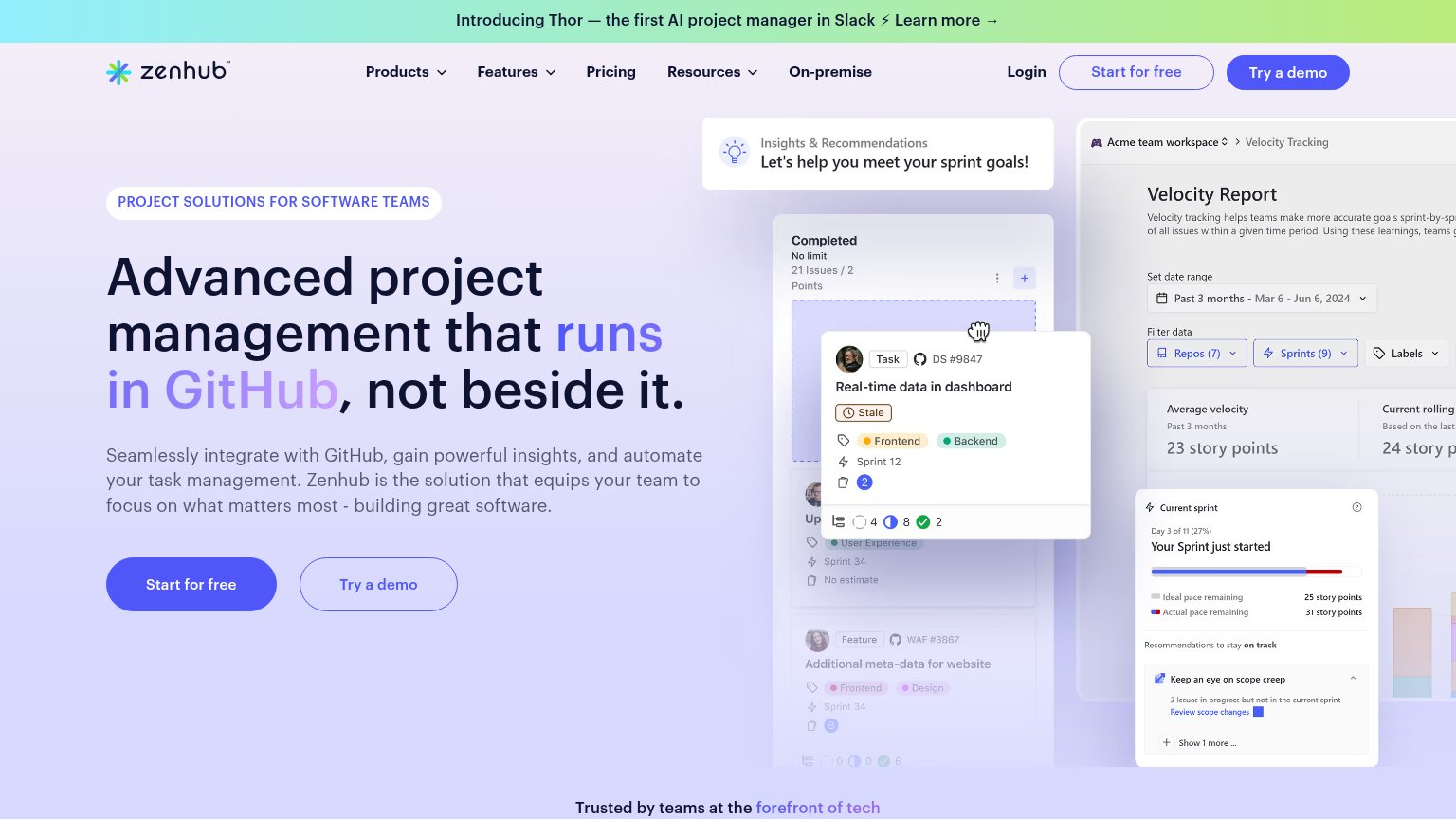
- Duplicate hero CTA pair — "Try a demo" is styled at near-equal weight to "Start for free" and both are duplicated in the nav, splitting the primary click four ways.
- Thor announcement banner — Full-width gradient banner with a "Learn more" link outranks the headline in scan order and exits visitors before the value prop.
- Overlapping dashboard collage — Three stacked product panels plus a floating task card compete at once, so no single product proof point is readable.
- Nav dropdown cluster — Products, Features, Pricing, Resources, and On-premise plus Login give seven exit paths before the hero CTA.
Mobile web
72FairThe phone experience as a first-class citizen.
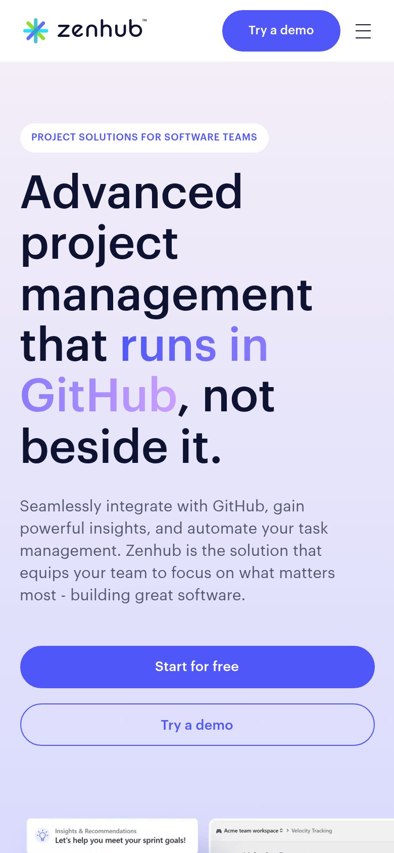
What works
What to improve
Value props
76FairTitle, subtitle, hero — do they sell the product's true value?
Zenhub AI’s headline
Advanced project management that runs in GitHub, not beside it.
Seamlessly integrate with GitHub, gain powerful insights, and automate your task management. Zenhub is the solution that equips your team to focus on what matters most - building great software.
Working
Could improve
CTA
86StrongCopy, size, verb, cost-feel — does the primary CTA earn the click?
How Zenhub AI compares
Recommended rewrites