
Your landing page’s weakest score is Trust.
How IRBC ranks
72Growth scoreupdated
category scores
category scoresShowHide
Score over time
Trust
58FairProof that the product is real, competent, and safe to try.
| Trust read | |
|---|---|
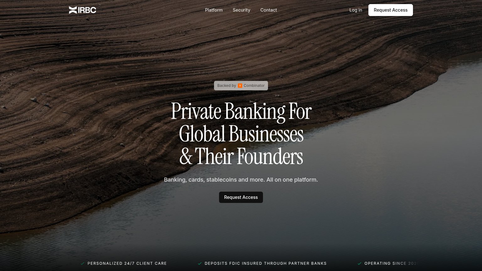
| IRBC | "DEPOSITS FDIC INSURED THROUGH PARTNER BANKS" ticker line |
| "Banking services provided through Choice Financial Group and Column N.A., Members FDIC." disclosure banner | |
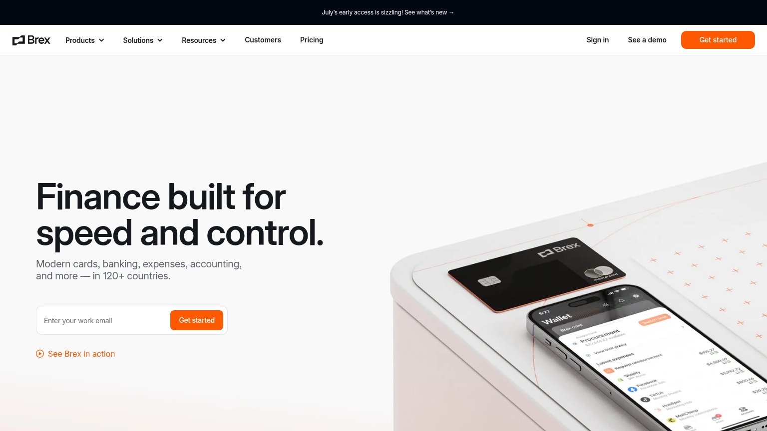
| implicit context Brex may benefit from pre-existing familiarity among its target audience. | |
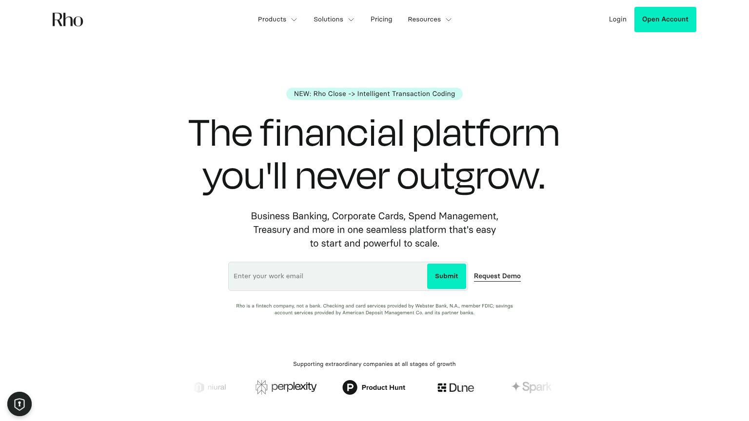
| Customer logo wall ("Supporting extraordinary companies at all stages of growth") with Niural, Perplexity, Product Hunt, | |
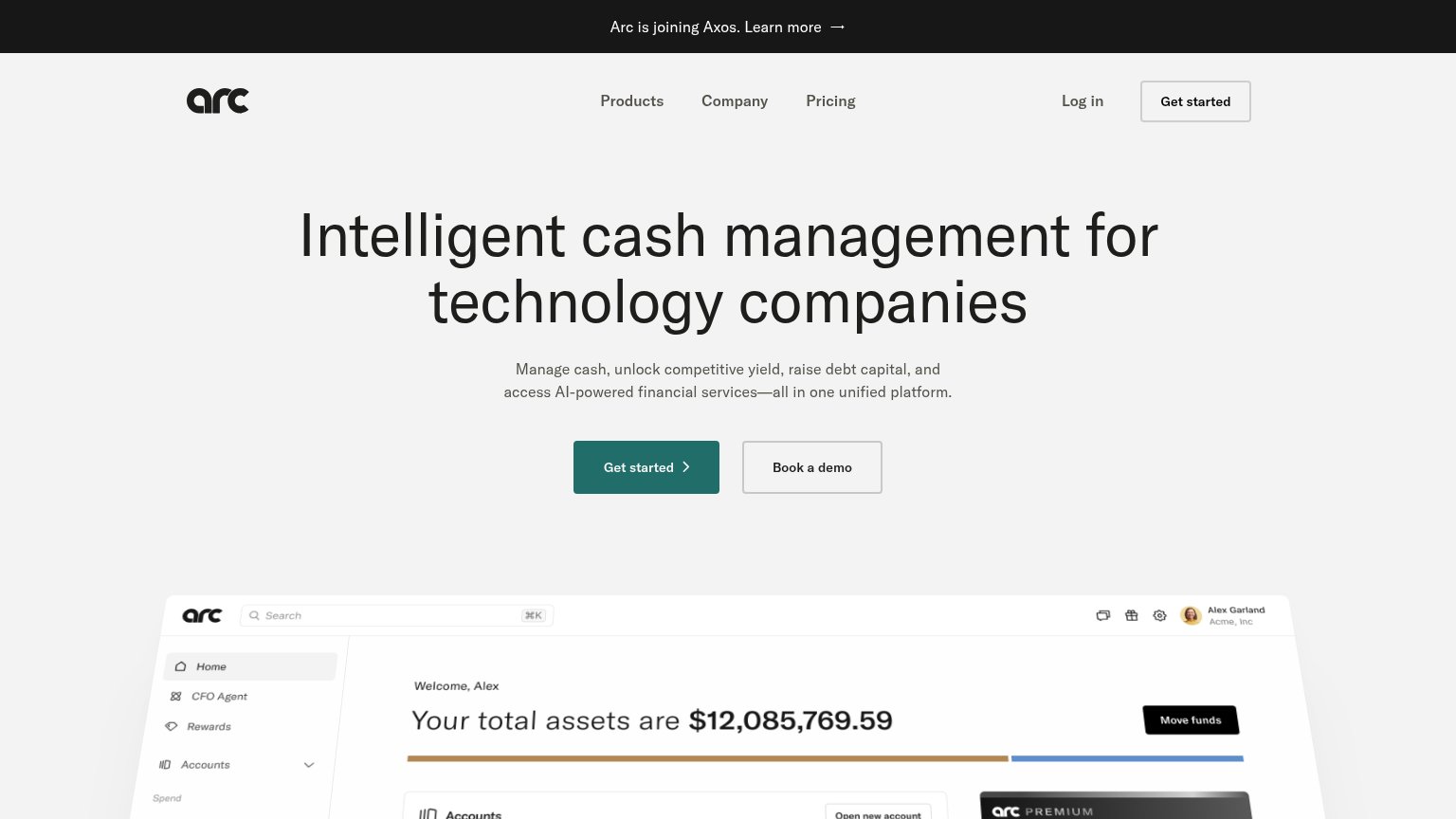
| Detailed product dashboard screenshot showing accounts, balances, treasury holdings, and a relationship manager card | |
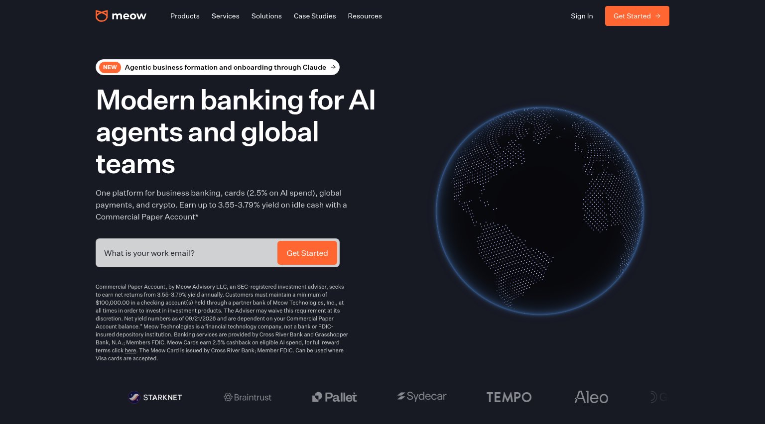
| Customer logo row: Starknet, Braintrust, Pallet, Sydecar, Tempo, Aleo |
CTA
66FairCopy, size, verb, cost-feel — does the primary CTA earn the click?

Problems
- 'Request' feels like waiting, not value
- hero button small vs. huge headline
- no payoff implied in label
Value props
70FairTitle, subtitle, hero — do they sell the product's true value?
IRBC’s headline sells
Private Banking For Global Businesses & Their Founders
Banking, cards, stablecoins and more. All on one platform.
Working
- Names exact audience: global founders
- Concrete deliverables: cards, stablecoins
- FDIC + YC proof kills trust objection
Could improve
- No numbers or outcomes anywhere
- Hero image decorates, shows nothing
- Subhead is a feature list, not a win
Mobile web
82StrongThe phone experience as a first-class citizen.
 12
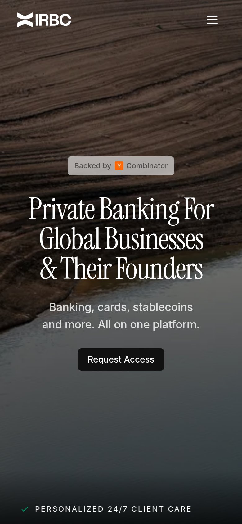
- Request Access button — Desktop-proportioned button floats narrow in the column instead of near-full-bleed for the thumb.
- Trust checkmark row — The 'PERSONALIZED 24/7 CLIENT CARE' proof item is clipped at the very bottom edge, reading as cut-off content.
Information hierarchy
86StrongDoes the design help or inhibit what the page is trying to say?
123- Hero Request Access button — Dark charcoal button sinks into the dark riverbank photo; the primary action fails the one-second find test while its white nav twin outshines it.
- Clipped trust ticker — "OPERATING SINCE 202..." is cut off at the right edge, truncating a credibility claim mid-number.
- Y Combinator badge — Gray text on a translucent gray pill has weak contrast against the sediment texture, so the strongest trust signal reads as faded.